Week #3 Report #
TODO #
Todo list of required parts to ensure that nothing missed
- Prototype Features: Outline the features and functionalities that you have successfully implemented in your prototype. Include any core interactions, user flows, or data management capabilities that are essential to your project’s goals.
- User Interface: Showcase the user interface design of your prototype through screenshots or interactive prototypes. Highlight the key screens and explain how users will interact with your application. If your project has no UI elements, you may skip this part.
- Challenges and Solutions: Share any challenges or obstacles you encountered during the development of your prototype. Describe how you addressed these challenges and provide insights into the solutions you implemented.
- Next Steps: Discuss your plans for the upcoming weeks and outline the features or improvements you intend to focus on. Create a priority list of features needed to be implemented. This will demonstrate your project’s trajectory and provide a glimpse into the future development phases.
Prototype Features #
The prototype features section showcases the progress made during the third week of development. This week proved to be highly productive, with the successful implementation of various features and functionalities.
During this phase of development, the team accomplished the following key milestones:
- Successfully completed the development of a mobile app, which effectively incorporates its underlying business logic template and seamlessly integrates a NoSQL database.
- Implemented the essential elements of the mobile app’s user interface, ensuring a solid foundation for further interface enhancements.
- Adapted the Figma design to facilitate ongoing UI development, allowing for a streamlined and consistent visual experience.
- The team successfully implemented the core data structures of the Todo Library in Rust, which will serve as the foundation for the library’s API.
- Conducted a proof-of-concept validation of an ability to run Rust on mobile devices, paving the way for potential future utilization of Rust’s capabilities.
- Established a minimum viable product (MVP) backend, laying the groundwork for further scalability and functionality.
- Developed a machine learning component specifically designed for searching and discovering similar tasks, enhancing the app’s overall intelligence and user interaction.
Todo library #
In our Todo Library we have successfully implemented the main data structures that will function as the API for external interactions. As mentioned earlier, we take Org Mode as a basis. Despite the fact that Org Mode doesn’t have any specification, we’ve invastigated all the related documentation and source of initial implementation for Emacs and one of the Orgzly App. Additionally, we have conducted successful tests to validate the feasibility of executing Rust code from Flutter using Rust bindings.
Backend #
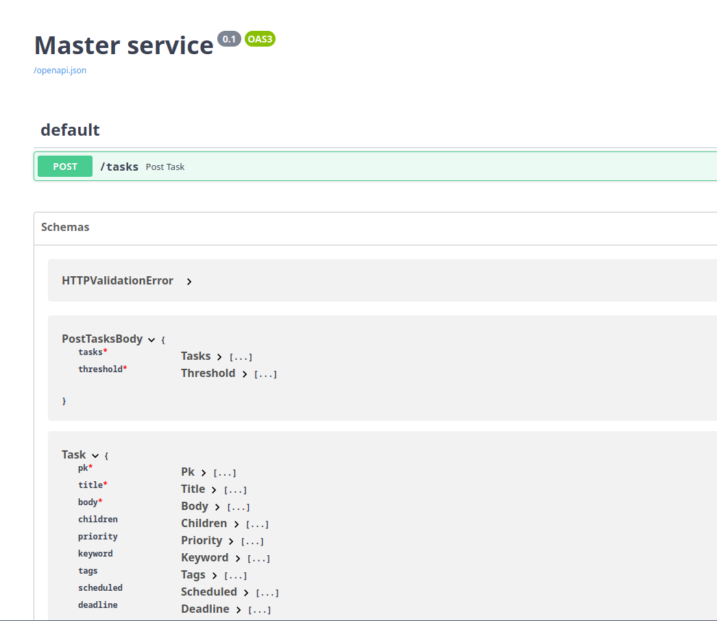
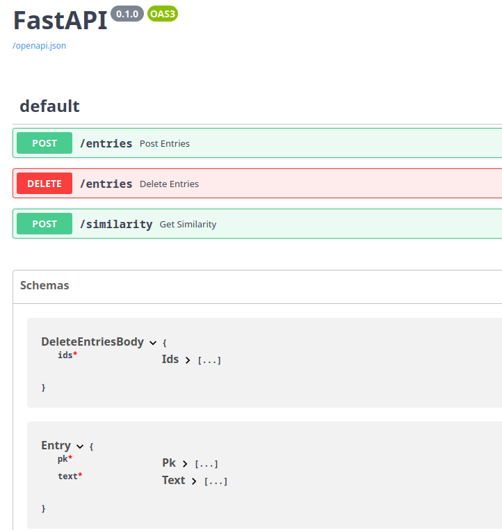
We have achieved the MVP state for the backend, establishing a master backend (facade) that offers a REST API for client interactions. Our design effectively isolates the machine learning (ML) component from direct requests, enabling us to separate changes in the AI aspect from the client and vice versa. This isolation simplifies the deployment of resource-intensive services as separate entities and sets the stage for future blue-green deployment processes.
The main prototype feature we’ve implemented is a two ready-to-use API services (ML & Master), with provided Swagger docs:
Mobile app #
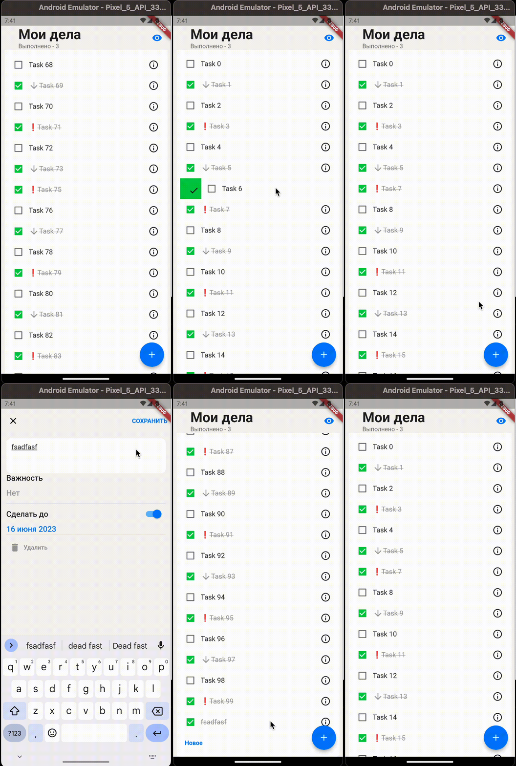
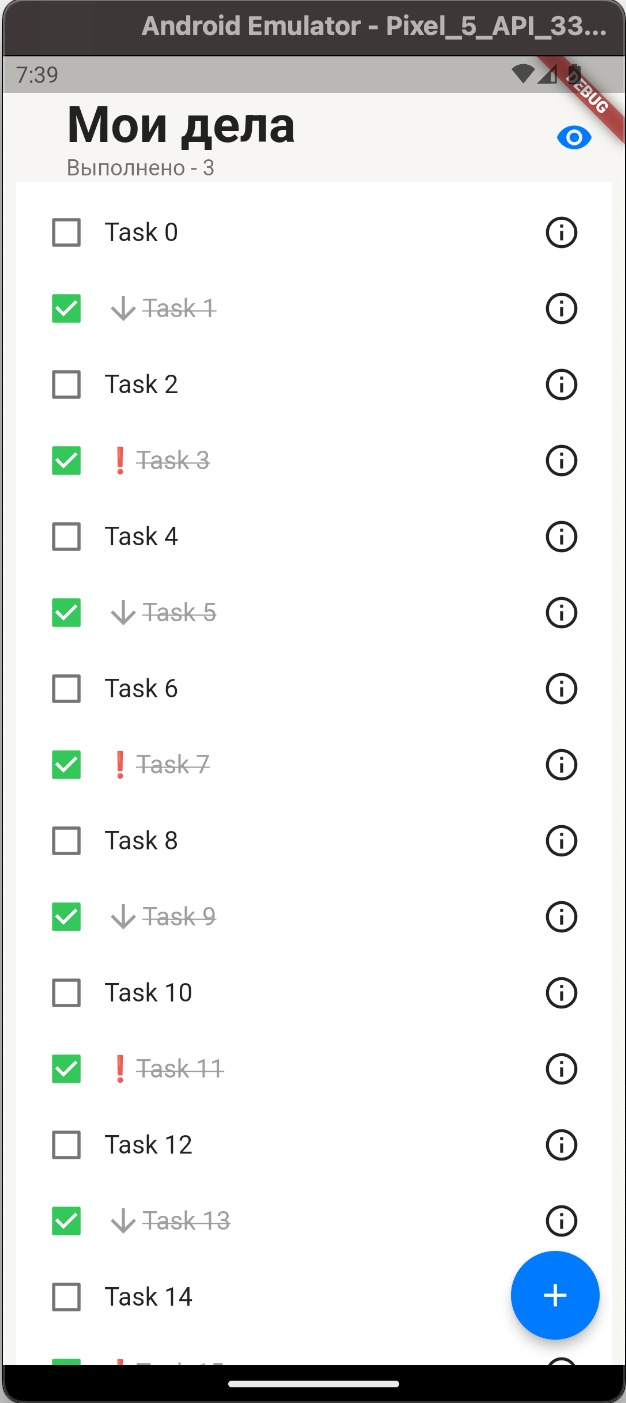
Our desired approach follows an “offline first” strategy, which emphasizes the importance of the database as a starting point. While this is indeed true, it is essential to abstract the business logic from the database. To achieve this, we initially focused on defining application-specific models that are utilized throughout all internal components. Furthermore, we developed a simple user interface that enables seamless interaction on mobile devices. Subsequently, we conducted tests with various databases and found that Isar provided an excellent development experience and cross-platform compatibility. However, to maintain flexibility and the possibility of changing our database choice in the future, we implemented an abstraction layer.
User Interface #
We have recently updated our Figma Prototype, which can be accessed at this link. In order to prioritize the essential features for our Minimum Viable Product (MVP), we intentionally focused more on enhancing the user experience (UX) rather than dedicating efforts to styling at this stage. However, we have plans to incorporate the style we developed, which can be previewed here. To better understand the primary mechanics, envision an app similar to Tinder, but designed specifically for organizing tasks. Due to the considerable time required to fully implement it in Figma, we have established the basics and entrusted the further development to our mobile developers. Please anticipate future updates for a clearer understanding of the design.
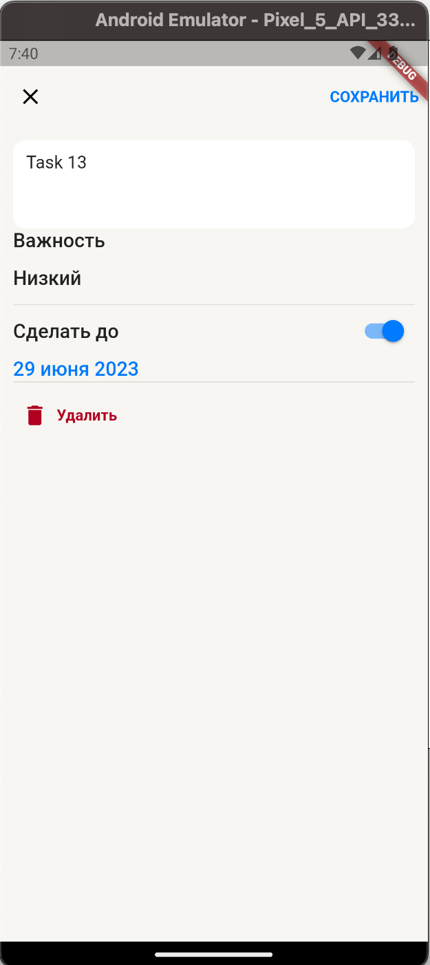
Let’s take a moment to explore the progress made within the app. Please refer to the following gallery:
Challenges and Solutions #
The development process encountered various challenges that required innovative solutions and problem-solving. In this section, we will discuss the obstacles faced during the project’s execution and provide insights into the strategies employed to overcome them.
One of the primary challenges we encountered was the complexity of running Rust on mobile devices. Initially, we underestimated the intricacies involved in this process. Currently, linking the necessary components for app publishing is a laborious and manual task. To address this, we plan to introduce scripts to streamline the process and explore the integration of Continuous Integration (CI) methods for improved efficiency. Additionally, we aim to mitigate the impact of direct native dependencies on the app by creating a separate package specifically designed for this purpose. Although this challenge has presented difficulties, it is worth noting that it is one of several obstacles we have encountered, and we are actively working towards finding suitable solutions.
Initially, our team faced a lack of synchronization and a lack of clarity regarding each team member’s contributions and understanding of the project. To address this issue, we organized a meeting dedicated to resolving these challenges. During the meeting, we collectively agreed to hold regular meetings twice a week to improve communication and ensure a shared understanding of the app’s architecture, purpose, and concept. As a result, our meetings now follow a structured approach where we begin by discussing completed tasks and then collaboratively determine the next steps. Additionally, we encourage the exploration of new ideas, such as delving deeper into the concept of swiping, which led to the innovative “wheels” solution for a specific problem. These measures have greatly enhanced our team’s cohesion and productivity.
During the development of the Rust module architecture and core data structures, which depend on the Org Mode file format, we encountered a challenge in obtaining a comprehensive specification for this format. The primary source of information available was the original implementation’s source code, written in Lisp as an Emacs plugin. However, we discovered that other developers had previously attempted to reimplement Org Mode parsers in different programming languages, such as the implementation found in the Orgzly mobile app. We examined their approach to task and repeating dateTime formats to inform our own implementation within the library.
Due to the lack of design expertise within our team, we encountered challenges in developing a prototype that is both user-friendly and aesthetically pleasing. Consequently, we sought assistance from a known designer to address this predicament. In the upcoming week, we anticipate incorporating her recommendations into the design of our application.
Next Steps #
Our next steps involve updating the user interface (UI) to address a few identified bugs and begin implementing the primary mechanics of the application. As the necessary components are already in place, we anticipate this task to be relatively straightforward.
Additionally, we aim to address the challenges associated with native code updates, which can be quite complex but not immediately critical. We have allocated a two-week timeframe to tackle this aspect of the project, allowing us to ensure a smoother and more efficient development process.
Our backend has reached a stable state where we no longer face limitations. Therefore, in the upcoming week, our developer will focus on assisting with the todo library. This collaboration will not only accelerate the overall development process but also reduce the bus factor, ensuring that knowledge and expertise are shared among team members. Additionally, we have planned some minor changes to incorporate an authentication process for the mobile app. These enhancements will enhance the security and usability of the application.
Feedback
Prototype Features
Theses are not features, those are what you did. Features in an app are specific functionalities or capabilities designed to meet user needs, such as user authentication, push notifications, social sharing, search functionality, and customization optionsUser Interface
Good, you have a prototype. But I would say that the design is very minimal and doesn’t;t reflect much creativity. Everything is default, no styling? I would advice you to seek guidance from Figma community and search to do applicationsChallenges and Solutions
Very goodNext Steps
Very goodOverall
Good report, you should focus more on the delivery now. Since your project is stable some how.Grade
5/5Feedback by Moofiy