Voyagio is an web application designed to simplify the process of finding and planning your next trip. Using artificial intelligence technologies, Voyagio offers users a reliable and efficient search experience.
Voyagio makes it easy to find a variety of interesting places, create a personalized lists of must-see places and visualize them on a map. If you are an avid traveler or just looking for new experiences, Voyagio allows you to find the perfect places to travel with ease.
If you have any suggestions, you can contact Alexandra Chupkova at telegram
Week 01 - report #
Members and contacts #
| Team Member | Telegram ID | Email Address |
|---|---|---|
| Alexandra Chupkova | KMnSO4 | a.chupkova@innopolis.university |
| Yegor Blinov | blinikar | y.blinov@innopolis.university |
| Vyacheslav Rybalchenko | slryb | v.rybalchenko@innopolis.university |
| Egor Kuziakov | KeepError | e.kuziakov@innopolis.university |
| Dzhovidon Vakhidov | d9mir | d.vakhidov@innopolis.university |
| Ayaz Sunagatullin | ayazsung | a.sunagatullin@innopolis.university |
| Karina Denisova | karinadenisova | k.denisova@innopolis.university |
Value Proposition #
Identify the Problem
The lack of a centralized resource for travelers in Russia leads to inconvenience and higher costs when using the services of private travel agencies.Solution Description
The web application will allow users to plan trips and select attractions according to location or recommendations. It allows users to make a route plan, find an attraction by recommendations or search, and save all routes in a personal account.Benefits to Users
Advantages for users in using our web application: 1. No intermediaries: This allows users to save time and avoid additional fees. 2. Personalized recommendations: The built-in artificial intelligence in our app suggests places and attractions that match the user's given parameters. 3. Place search: user-friendly interface that allows you to select a place by name or location. 4. Personal account: That provides the ability to add favourite places and plan routes of the trip.Differentiation
The main difference between our project and popular analogues is the ability to save selected places in a private account, view and save ready-made routes, and a recommendation system based on artificial intelligence.User Impact
The implementation of our application could have the following positive impacts on users, society, and the tourism industry in Russia: 1. Increased accessibility: Our solution allows users to search and choose places without intermediaries 2. Development of tourism in Russia: Travelers can increase the demand for local tourist facilities and services, because they will have an opportunity to plan and find interesting places to visit on their own 3. Enhancing the travel experience: Our solution will help users to find sights and plan trips easily. Therefore, a greater number of tourists will be interested and plan their trip.User Testimonials or Use Cases
There some use cases of our potential users:
Sasha wants to go to Kimchatka with friends this summer and has already started planning the trip. she doesn’t want to miss any of the must-see attractions. so she uses the app to create a personalized itinerary based on her favorite activities and recommendations, and can save her itinerary to her personal account for easy access during her trip.
Ayaz has a few hours of free time to explore a new city where he comes for a business conference. He uses a web app to quickly find nearby attractions based on his interests and lifestyle. he can also save the selected attractions in his personal account and share his impressions of the places already visited.
Karina is a voyager/blogger who is continuously searching for intriguing locales to visit and afterward share with her adherents. She advantages from the web app to discover secret and lesser-known attractions in the towns she visits which are put away in her own account for utilization on her blog.
Lean Startup Questionnaire #
- What problem or need does your software project address? It is hard to organize your vacation journey by yourself. It takes much time and responsibility and the fault cost is high. Analyzing yours and your friends interests and previous trips we can offer the best ways to spend your time on your vacation.
- Who are your target users or customers? People in age between 20 and 35 who are interested and have financial opportunity to see the world. So mostly those people are from the middle and higher social classes.
- How will you validate and test your assumptions about the project? Firstly we should provide market research, test our product with a group of potential users, and we can use lean startup methodology to build our startup in the future.
- What metrics will you use to measure the success of your project? We will use DAU, MAU, Retention, NPS, CAC and LTV (in the best case) to measure the success of our product. Those metrics will help us to find out if users want to use our product regularly and they need this product.
- How do you plan to iterate and pivot if necessary based on user feedback? We will use the Build-Measure-Learn model, building small MVPs and prototypes we can measure if our product is useful for people and we can sell it in the future. In case we realized that our product is useless and people don’t want to use it, we would pivot and change our plans.
Leveraging AI, Open-Source, and Experts #
AI (Artificial Intelligence): We will use AI for creating recommendations of sights and places for users. Open-Source: We do not plan to use Open-Source sources at this time. Experts in relevant domains: At the moment we do not have any experts involved.
Inviting Other Students #
Answers:
Our team is not going to invite other students.
Defining the Vision for Your Project #
Overview: Our web application will help travelers plan and organize their trips in Russia. Therefore, the main goal of our project is to allow users to find interesting sights, create routes and save them in their personal account.
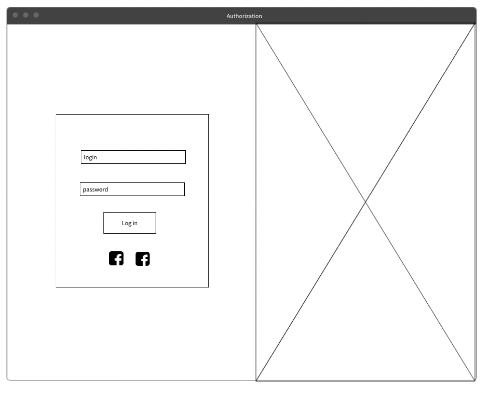
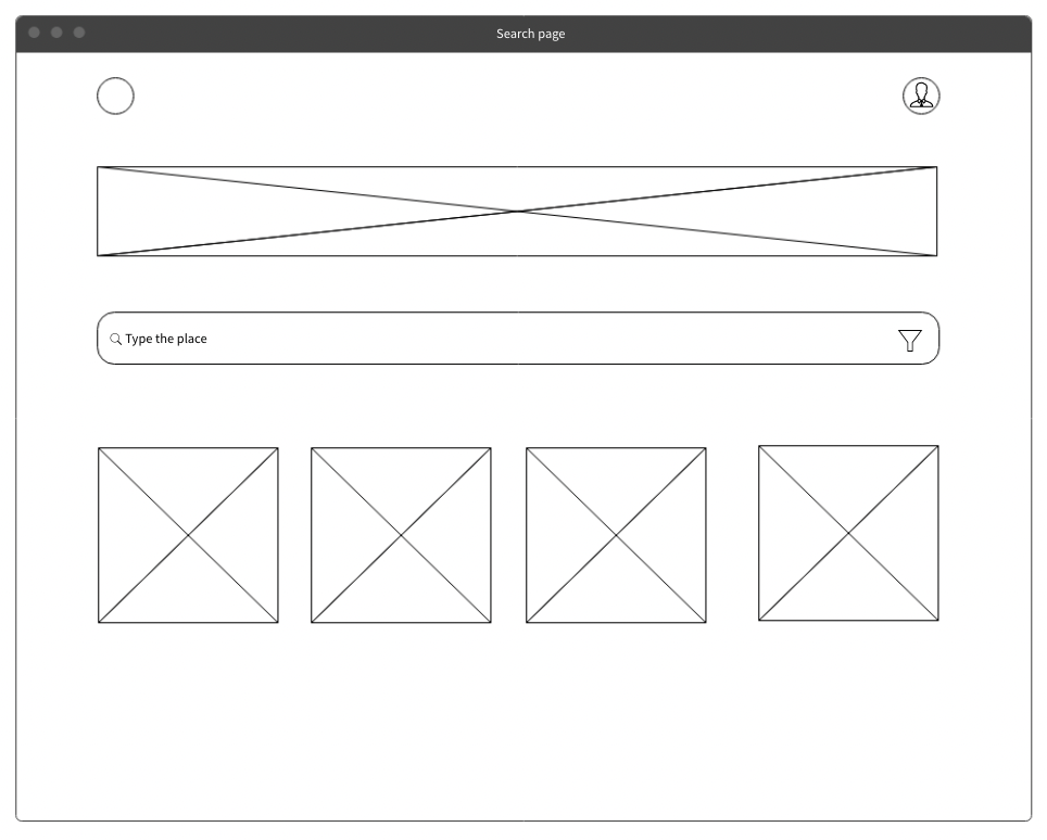
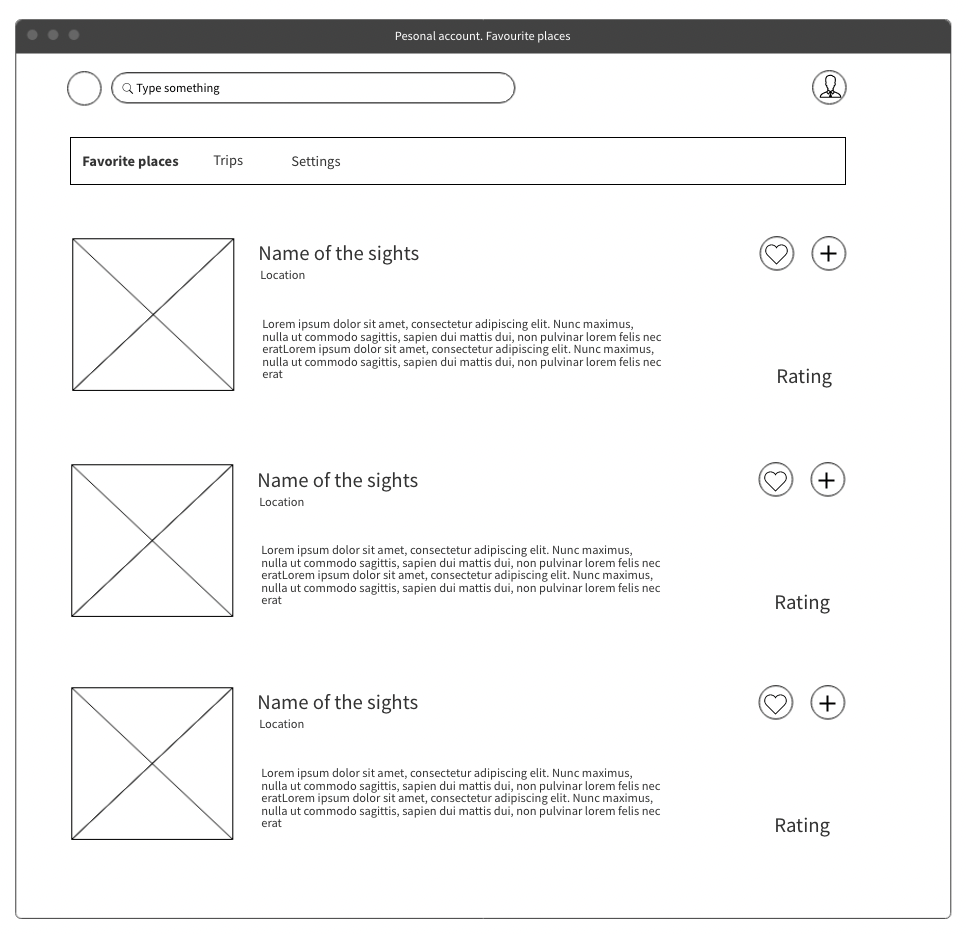
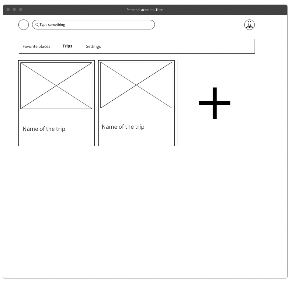
Schematic Drawings: There are schematics drawings of the future functional with short description.
After authorization, the user can search places by name or use filters with AI. The main points of the AI logic at the moment are being discussed and will be provided together with the full design. Next, the user can see the search results, add places to favorites and save the object to the chosen trip.

Tech Stack
We will announce it on the second week of capstone project course
Anticipating Future Problems
- During the development stages, our team may face a lack of experience with the software, as this application requires deep knowledge in backend development and advanced ML skills.
- Limited resources: Also, we can face a lack of time, because there is only seven weeks to develop a project. Next, financial resources may be required for further development.
These problems can be solved with proper planning of tasks and time. Also, our team should have good soft skills to achieve the result. To solve financial problems, there are many Russian contests and grants to support innovative ideas, student projects, and so on
Elaborate Explanations
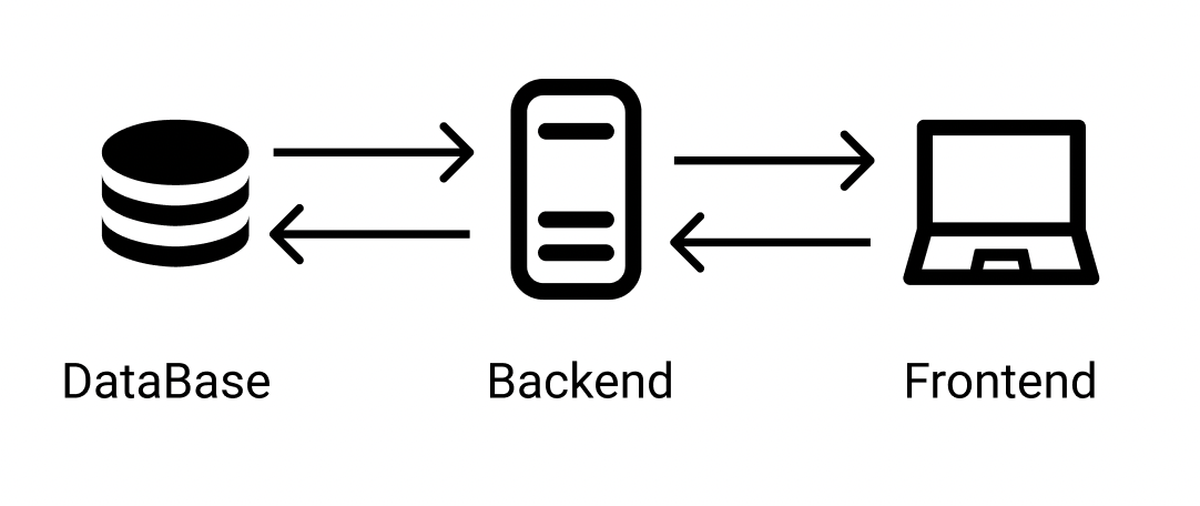
The application is built with a number of important components that work together to provide users with a comprehensive trip planning experience. These include:
- Frontend subsystem: The web application with UI that allows users to see their profiles and recommendations. This subsystem will be connected with the backend part to provide full service functionality.
- Backend subsystem: The application that communicates with the frontend UI and stores all user and application data.
- ML/AI subsystem: The service (part of the backend or independent one) which uses ML to build and recommend comprehensive routes to our users. It will communicate with the Backend subsystem to get users data and give new routes.
Week 02 - report #
Important note: Our team decided to change the name of our web application from “Triptastic” to “Voyagio”. Therefore, we updated the name of the web application in our blog and the name of the branch in Github as well.

Tech stack and team allocation #
Stack
- Backend: Python language with FastAPI. We will also use tools for deployment and containerization.
- Database: PostgreSQL.
- Frontend: NGINX, React Fraemwork, and TypeScript.
- Machine learning: Anaconda, Python language with Tensorflow, Numpy and Pandas libraries.
Team allocation:
- Alexandra Chupkova: Project Manager, UX/UI Design
- Yegor Blinov: Frontend
- Egor Kuziakov: Backend
- Ayaz Sunagatullin: Machine learning
- Vyacheslav Rybalchenko: Frontend
- Dzhovidon Vakhidov: Backend
- Karina Denisova: Machine learning
Architecture Design #
Component Breakdown:
For creating success application we should take the following components:
- UX/UI design
- Onboarding in mobile version component
- Authorization component
- Search component
- Machine Learning recommendation component
- Backend and database design component
- Personal account component
Data Management:
Our team will use PostgreSQL, a reliable and stable relational database, to store authorization data and user information. PostgreSQL is capable of handling large data volumes and concurrent connections that is important for multi users access. Additionally, it provides robust security features to protect stored data.User Interface (UI) Design:
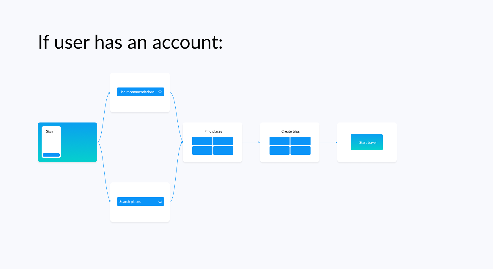
Based on analyzis of potential users, we created a user flows: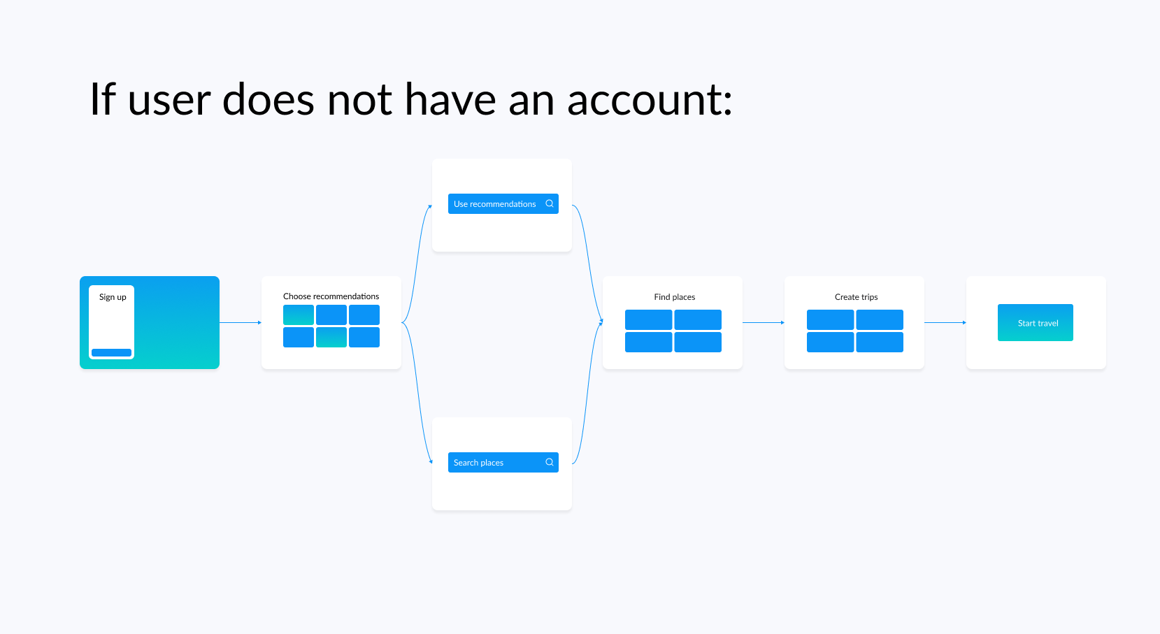
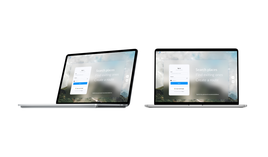
If you are interested in seeing all of the designs in Figma, please contact Alexandra Chupkova (@KMnSO4) via private message.
Integration and APIs:
We do not plan to use external APIs in this project. Instead, we will store data about items in the database. However, to get initial dataset we are planning to use Scraper API.Scalability and Performance:
We lay the load on the database for the ability to add social networking elements for travelers. However, with the successful development of the project and the startup opening, at this point we cannot predict the number of potential users.Security and Privacy:
To store authorization data in the PostgreSQL we will use security tools for this type of the database.Error Handling and Resilience:
To prevent mistakes from we users we will use hadling mistakes on frontend side and add tooltips for users. For check coding mistakes, we will write tests on the frontend/backend.For errors and exceptions, we will have standardized error messages that will be returned from the API. Any error logs will be written to a file on the server, but there will also be monitoring using Prometheus and Grafana, so if there are too many error messages or any component fails, it will alert (for example to Telegram). For deployment, we will use Docker images, which have retry and fallback mechanisms to handle exceptions that may occur.
Deployment and DevOps:
We decided to rent a server to simplify the deployment process and interactions with the database.Week 2 questionnaire #
Tech Stack Resources:
Our team does not use specifical project-based books.Mentorship Support:
In this time we are not planning to find mentor for our project. In our team there are people with experience in commercial projects, therefore, they can take role of the mentors for other teammates.Exploring Alternative Resources:
To filling knowledge gaps we like usual way to find information: to learn something new teammates read articles, use Kaggle or watch guides on youtube.Identify Knowledge Gaps:
Our team has identified two main knowledge gaps that require further exploration:- Algorithm for recommendation systems
- Integration of a trained model with the backend
Engaging with the Tech Community:
Our team regularly participates in online and offline meetups and conferences related to their tech stack. Also we communicate with a professional community regularly visiting some professional resources, for example, Habr and Medium, and communicating with our collegues. Some members of our team is a large hackathones participants.Learning Objectives:
By the end of this week, we plan to accomplish the following tasks:- create and set up github repository
- exploring concepts of machine learning algorithms
- creating main design concepts.
Our team utilize Scrum method with one-week sprints to handle teamwork. To track the progress of the team, we will use a Backlog to assign and split tasks. At the end of each sprint, we will hold meetings to review our results.
Sharing Knowledge with Peer:
We use division and mentorship approach inside a team to achive the optimal results. Each subteam consists of two members with one who has commercial or strong experience in the topic. This provides direct communication and knowledge sharing within the subteam, without involving the Project Manager. Also, we utilize telegram group for team communication, time schedulling and knowledge sharing.AI utilizing:
We use OpenAI's ChatGPT to gain inspiration, save time, and receive hints in unexplored areas. Also, we used special AI for generate the name of the web-application, select infographics and color palettes.Feedback
I like the logo and the name!!
1. Component Breakdown Good
2. Data Management
Good
3. UI Design
Images are too small, Beside I want to see the designs so you should leave a link to them. Not ask us to contact the designer. It doesn’t make sense.
4. Integration and APIs
Good
5. Scalability and Performance
You should write a Scalability plan her regards of your prediction. Imagine you will have a lot of user, how will you scale your business?
6. Security and Privacy
Good
7. Error handling and Resillience
This only one part of handling error, what are your plans to handle crashes when app in production.
Read about crashlytics.
8. Deployment and DevOps
That is not answer. You should do your research and decide. You can use GitHub actions for it.
Answering questioner
- Why no books?
- Mentor point: So you are perfect at the tech. Yo don’t need an advice? And mentor should not be part of the team member the whole idea of the mento to be an outsider in order to see what you couldn’t see
- Good that you are using Scrum
Overall The report is ok. You didn’t really spend much time considring answering a lot of important points. Grade 3/5
Feedback by Moofiy
Week 03 - report #
There are importnant links: Figma and Github
Please, notice that there are several pages in Figma: Authorization, Search, Personal Account and UI.
Last week, our team focused on developing a database architecture for our project. In terms of technical infrastructure, all necessary components required to support our prototype development are ready to use. We have set up a shared development environment, complete with all essential instruments (Vite, netlify, React and ReactRouter for frontend and fast API for beckend) and rented server.
Progress report #
Prototype Features:
To increase our work efficiency, we made significant progress in setting up the necessary environments during the first sprint this week.Backend and DevOps:
- API development: We have successfully created an API that provides a seamless connection to the database.
- Docker configuration: To ensure portability and ease of deployment of our backend system, we configured Docker.
- Server Hosting: We have taken the initiative to rent a dedicated server to host our application. We will provide the link on the next week, due to this task is for the next sprint.
Frontend:
We have begun working on the layout design for the main functionalities of the application, that includes the following pages: Authorization and Search. To simplify the deployment and hosting of our external application, we connected it to Netlify.
Data Management:
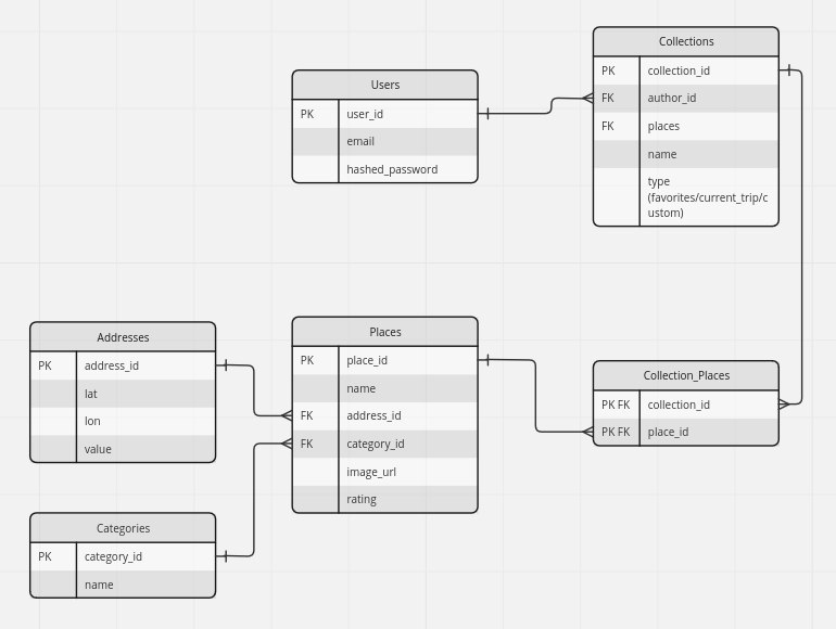
We created the main logic of the database with the following structure:
Prototype Testing:
To ensure the quality and usability of our prototype, we tested it with both team members and outsiders, including our roommates.
During this process, we found and successfully solved several issues:
- Inability to delete items in the trip collection
- Lack of necessary filtering when searching by parameters
- Making it easier to add an item to a specific trip collection
User Interface:
We finished implementing the design and clickable prototype that avaible in Figma:We created the Design basing on the user flow, that includes: authorization (sign in or sign up), add recommendations (this logic in development, due to dependencies with ML model), search places and added to collections of trips.


Challenges and Solutions:
During this sprint, the primary challenge we faced was deploying the backend to the server. Initially, we considered utilizing the capabilities of the university server to save costs. However, in order to simplify the deployment process and enhance performance, particularly when dealing with a large database, we made the decision to rent a dedicated server.
Another challenge for the developers is to ensure that both the backend and frontend agree on the format of the data being sent and received, which requires some standardization of data formats and creating models and schemas for each API endpoint. So team leads for backend, frontend and ML were selected, who interact with each other and assign tasks to team members. When the task is completed, it is checked by the team leader and, if everything is all right, it is closed.
Next Steps:
In the coming weeks, our development team has outlined a clear plan for the project, focusing on specific features and improvements that need to be implemented. Below is a list of priority features that we intend to work on:
- Continue add logic to frontend and connect with backend using API.
- Increase fields and entities in the database, add neccesasary logic in backend for MVP
- Deploy on the server and provide a link for the application
- Write a ML model, learn it and connect with the web application
- Improve the UX design
- Write test
To ensure efficient project management, we have created plans for the second sprint, which will be discussed during the upcoming weekly meeting on Tuesday:
- Continue add logic to Authorization page (connect with API) and finish the layout on other pages
- Add additional functionality to the backend according to the design
- Finish deployment on the server and configuration CI/CD
- Discuss functionality that will be implemented after MVP (we are olaning to add some social components e.g news and logic where users will communicate together)
- Improve the previous weeks report, according to feedback
- Complete market research in topic of the application (travel trends in Russia 2023-2024)
Reflection:
In the end of the sprint we were able to complete all the tasks planned for the sprint. this means that the tasks for the first sprint were distributed competently between the team members. everyone worked hard during the week without downtime and achieved their goal.As a result, we were able to deliver high-quality work within the given time frame, and we are now better prepared for future sprints.Feedback
Prototype Features
What you listed in the feature section in not featuresfeatures refer to the distinct functionalities or capabilities provided by a software application. They are the things that an application can do to fulfill user needs and requirements.
User Interface
Good design. But try to utilize colors into it. Blue is just a burned out color. Try add 2 colors one primary and one secondary that can go together very well. Like indigo and yellowAlso, when clicking on a card you should direct errs to details screen. But I didn’t see that you have one, do you?
Challenges and Solutions
Good!Next Steps
Good. You should relay think of testing with users (Usability testing)Overall
Good reportGrade
4.5/5Feedback by Moofiy
Week 04 - report #
Important links: Web-application
Progress report - External Feedback, Testing, Iteration #
External Feedback
To collect accurate external feedback, we conducted User Acceptance Testing (UAT) using real business cases and groups of people who represent our potential audience.We enlisted the help of friends from Kazan and other cities who might be interested in our application idea.
The UAT testing consisted of the following steps:
- Scenarios in testing:
The user is only interested in search places and is not interested in adding any places to their list of favorites or creating collections.
Success: The user login successfully, and find places
The user wants visit the city in future, therefore, it is interested in creating list of favourites, due to it does not know its plans
Success: The user login succesfully, crate a list of favourites in profile
The user is going to visit Kazan in a short time, that it needs a plan what to visit (create trip collections) and check the location on the map.
Success: The user login successfuly, find places and crete its own collection
- Prorotype of users that might use the web-application after finishing MVP:
- Group 1: Young people in Kazan, who are interesting to find some new places at their leisure time. (2 persons)
- Group 2: People who are planning to visit Kazan in a short time and need to visit all possible sights in one-two days (3 persons) participants to explain the basic functionality and idea of the application, collect feedback and some personal opinion.
Unfortunately, we implement not all pages on the website, therefore, some tests was in Figma prototype.
- Measure of the success:
- Intuitive understanding all functionality and success in all steps.
- 3/5 participants finished their tasks.
- Results:
4/5 participants finished successfully and provide a useful feedback
- Group 1: (2/2)
- Group 2: (2/3)
One participant failed the third scenario due to the absence the signifacnt knowledges in foreign language. 5. Defect table
| Defect | Priority | Feedback |
|---|---|---|
| No Russian language in the interface | low, it is not MVP task | The only english speakers can use this application |
| Hard to understand meaning of “trip collection” in the web application | high, implemented in design | This participant suggest improve UX and add description of the “trip collection” when the user adds the first one |
| Difficult to find a map with places | High, in work | It is not clear that the button means map and its clickable |
The UAT testing proved highly valuable for our team, as the participants’ feedback provided objective insights. We appreciate the constructive feedback received, which will aid us in making further improvements to the application.
Testing and narrowing the scope of the project
Manual testing
Our team conducted manual testing to identify bugs in the implemented pages. Each team member performed manual testing and provided feedback to the other members on the bugs found. We focused on identifying bugs in the login and search pages.
Below is a table listing the bugs, their prioritization, and their execution status at the time of reporting.
| Bag | Priority | Status |
|---|---|---|
| Absence of the перехода на search page | High | In progress |
| Incorrect display of the background picture on the backgroud | Low | Waiting, due to it is not the main functionality |
| No message about the lack of places in the selected city | High | Todo |
| Clicking on the google signup button without logging into your google account | High | Todo |
| Unintuitive place in the design, you need to invert the display of tabs | High | In progress |
All bugs are already marked in the Backlog according to their priority, so that the developers and designer can start fixing them.
Narrowing the scope of the project
We have decided to narrow down certain aspects of our app:
- We will postpone the implementation of registration with a Google account. While this is a great feature that simplifies registration, it only applies to registration and has no effect on further functionality. However, we will leave the button in the design and display a message that the button is currently in development and that users should register using another method.
- We have narrowed down the dataset to places that are located in Kazan, due to technical difficulties in gathering a larger dataset. We have collected enough data on places in Kazan to allow users to plan a trip and use all the features of the application. For commercial use, however, it will be necessary to gather a dataset covering all of Russia.
Iteration and refinement
Our team demonstrated efficiency and cohesion in our work. We evaluated multiple topics based on feedback from potential users and turned significant comments about the application into tasks on our backlog.
We improved our communication between team members by immediately reporting and recording (via Telegram, photos, or videos) potential bugs and flaws.This method will enhance our productivity in the coming weeks.
Also, during this week, our team has completed several significant steps towards the MVP:
- We have finished deployment, which is now available at the following link: https://voyagio.dropteam.ru/login
- We have implemented the API logic for authorization, added functionality for other entities, and resolved all authorization issues on the backend side.
- We have completed the frontend for the search and authorization pages, and we are almost finished with the frontend for the personal account page, including its functionality.
- We have finalized the dataset for machine learning and database, selected the model, and begun implementation.
- We have collected information about travel trends and are currently conducting market research.
- We have also fixed some errors in the design.
Feedback
External Feedback
Wow!!! That is really good approach to collect feedback and take action according to it.Testing
Very very Good.Iteration
Perfect!!Overall
Best Report ever!!!!!!! Keep up the good work like this and you will get an A.Grade: 5/5
Feedback by Moofiy
Week 05 - report #
Meetings with relevant stakeholder for receiving broader feedback #
During this week, we conducted two types of meetings:
- We held a meeting with people who provided us with relevant feedback from the previous week and showed them the results of our improvements. They also provided comments about the next items that we developed, which helped us receive more comprehensive feedback. (Group 1)
- We met with new people who might be interested in our application idea and opened up a new and big category of potential clients. Colleagues from teammate’s company have a job trip to Innopolis every 3-6 months, and they often visit Kazan in one day. We conducted several online meetings with them to receive feedback about functionality and usability. (Group 2)
Group 1: Used an automated feedback form and provided us with both written and oral feedback.
Group 2: Filled out an automated feedback form and then participated in online meetings.
In this way, we increased the number of potential customers, as well as received and strutted feedback. We analyzed user interests, feedback on usability and functionality, and asked users to rate their interest in implementing the feature after the MVP.
The results of the surveys and analysis of the feedback will be summarized in the report below.
Feedback collection plan #
For automated feedback collection, we used Google Forms to break the survey into several sections:
Personal information collection: age, travel format, types of travel, and use of AI for daily life recommendations.
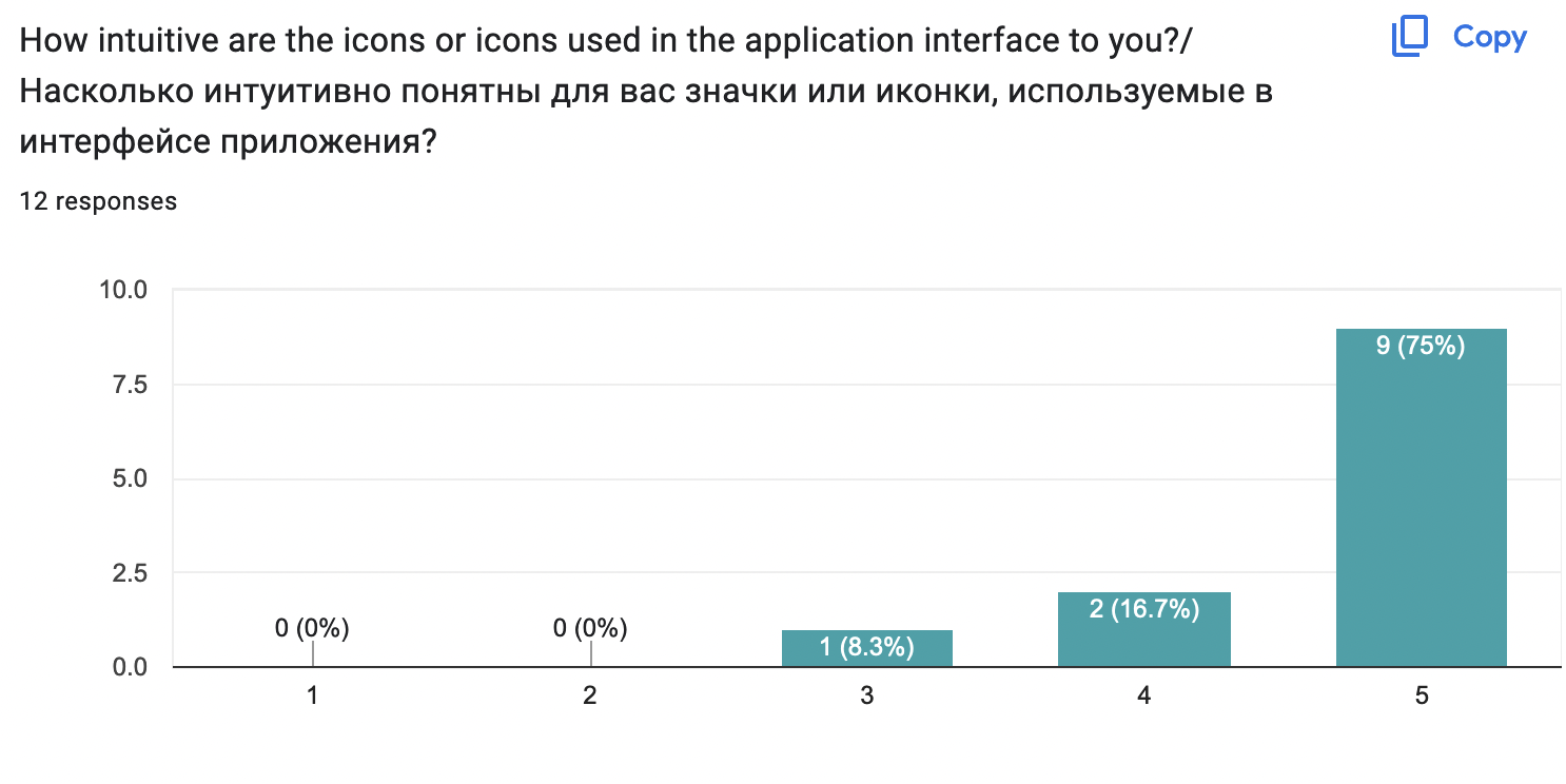
Interface and Navigation: Users were provided with a link to a web application and asked to perform one of the possible application scenarios on their own, without prompting. We received evaluations regarding the usability of the application, intuitiveness of the functionality, and answers to open-ended questions about what the user liked or did not understand in the application.
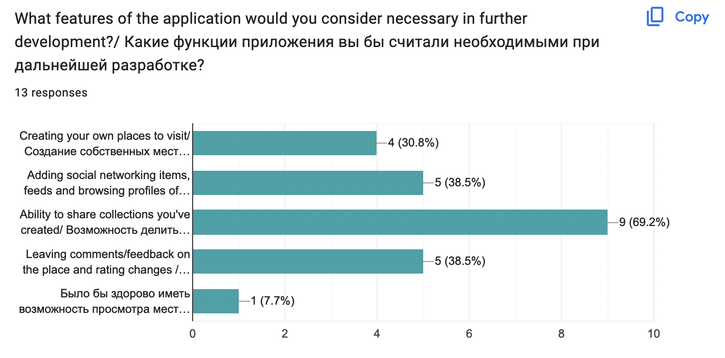
Functionality and vision of the future: This section includes questions about the implemented functions of the application that interested the user. Additionally, it suggests options for improving functionality after the end of the MVP, such as adding personal objects, social networking elements, the ability to share collections of places, and adding comments/feedback to places or their own variant.
Survey results on usability, functionality and overall satisfaction #
We used the built-in capabilities of google forms to analyze the responses to these critical aspects:
Аpplication convenience
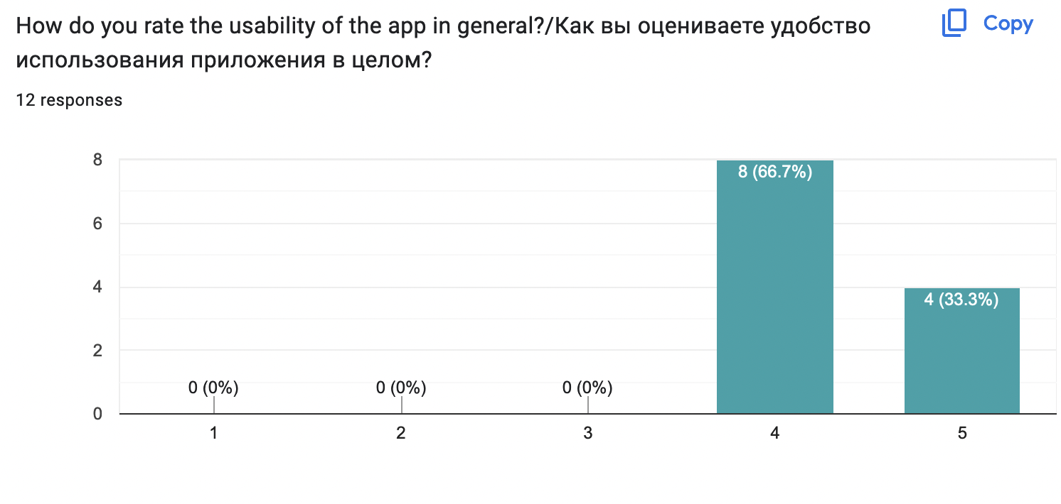 Usability
 Functionality
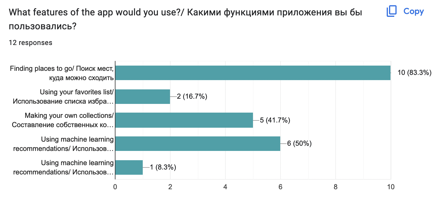
Based on verbal feedback from online meetings, we have learned that users are generally satisfied with the interface and find it intuitive. This is very important for our team. Additionally, users appreciate the features that the app provides.
As part of the surveys, we collected additional information that is important for further development of the app and additional analysis of the target audience.
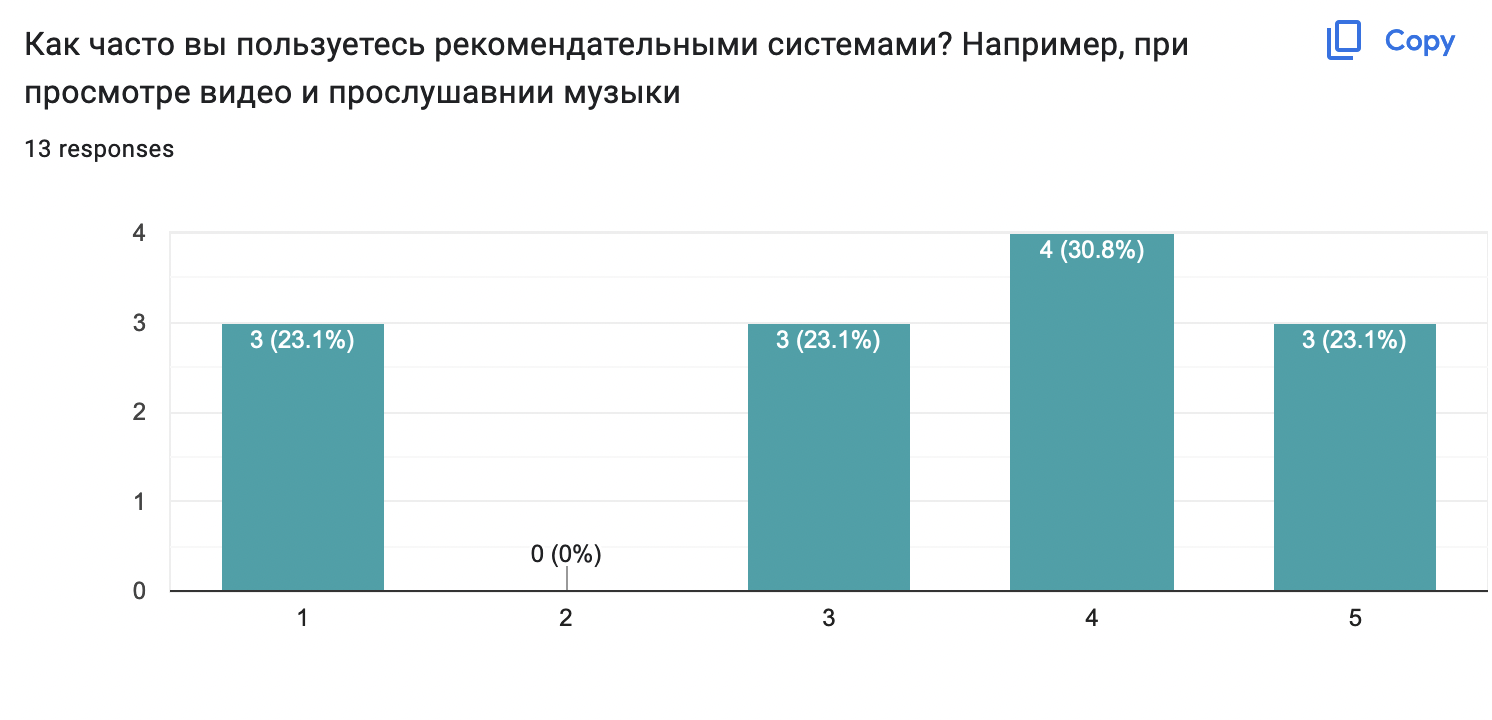
We conclude that most users of AI-based recommender systems in real life
Collected feedback for improved functionality, which will be useful in the development and prioritization of further functionality
Feedback documentation #
Finally, we conduct 20 interviews with potential users and recieve 14 results for the survey. This information and answers from open questions helped us to analyze the application. We defined ares that need further enhancement:
- User Experinece in many-steps user stories
- Increase the dataset
- User Interface
Feedback analyzing #
After analyzing the feedback we received, we found the following patterns:
- Overall satisfaction with the app idea
- Overall satisfaction with user experience and color scheme
- Flaws in user interface design (Some fonts are not enough readable on the big screens and several buttons do not have a background)
- Uncomfortable logic in searching and results view (In this time there is an opprtunity for finding place by its location, but users intersted in finding a place by its name)
- Dissatisfaction with filtering system (We need to add more filters)
- Lack of support for other languages
Prioritization of feedback and feasibility of implementation: #
We put comments on improving the app in a separate table, where we additionally indicated their priority and feedback from the team
| Pattern | Overall feedback | Priority | Comments from team |
|---|---|---|---|
| Flaws in user interface design | In some places headings are unreadable, e.g. user geolocation | High | In progress |
| Uncomfortable logic in results view | No pagination when viewing results | Normal | Include in ToDo list in Backlog |
| Dissatisfaction with filtering system | Users need more filters | Low | This remark has a place, but within the framework of a small dataset is an additional task for MVP |
| Uncomfortable logic in searching | I am not unterested in finding place by its location, because I need to find concrete place with unique name | Normal | Include in ToDo list in Backlog |
We will definitely take all comments into account for further development of the application.
Roadmap and future plans #
Our team is currently unsure whether we will monetize this project. However, we have put together a simple roadmap for a few months to gain useful experience, which will eventually lead to a full-fledged commercial product.
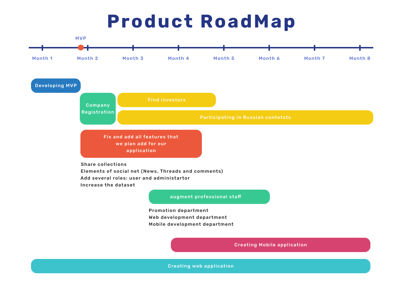
Necessary changes and progress: #
We carefully reviewed the feedback that users left us this week, prioritized the implementation of comments during week 5 and 6 of the project.
In addition, we fixed the necessary points that were given as feedback last week and fixed the bugs that occurred during their implementation.
Also, weekly progress in steps:
- Upload the dataset to the website
- Add significant endpoints to backend (for ML reccomendations and personal account)
- Improve color scheme by using default illustrations with bright background.
- Create layout personal account and connect it with backend (Will be done to the Thurday, due to it is the end of the sprint)
- Create layout for ML recommendations in result page
- Create Machine learning model and defines parameters that models need from backend side
- Improve searching results (Standartaized size of the card (fix bug))
- Add predprocessing filters to exclude places without images
- Add all points to the design from the previous week feedback (Unintuitive place in the design, you need to invert the display of tabs,No message about the lack of places in the selected city, add description for “trip collection” terminology, improve visibility of the buttons)
- Fix simple bug (some typos and wrong redirection)
We had an incredibly productive week, successfully completing many significant tasks. One of these tasks involved developing a cutting-edge machine learning model. Additionally, we gathered essential feedback that will contribute greatly to the success of our project. This combination of achievements made the week highly valuable and rewarding. However, there are always areas where we can strive for improvement to maximize our future productivity and outcomes.
Thefore, we define final steps for the future week:
- Connect the learning model with backend and frontend
- Add layout to ML recommendations
- Add all functionality to personal account
- Fix all tasks from user’s feedback
- Find and fix all possible bugs
- Create a final presentation
Plans for the sixth week we will define during the meeting on Tuesday.
Feedback
Collecting and documenting feedback
Very good!Feedback analysis
Very good!Roadmap and enhancement
Very good!Grade: 5/5
Feedback by Moofiy