Week #5 #
Feedbacks #
- Feedback collection plan
We have developed two comprehensive feedback collection plans to gather valuable insights and suggestions.
Google Forms: We distributed Google Forms to our friends and relatives to collect their feedback. This method allows us to reach a broad audience quickly and efficiently. The form includes questions aimed at understanding their experience in photography and feedback for our UI-prototype. Form is here Here
User Interviews: We conducted three detailed user interviews with potential clients to gain deeper insights into their needs and expectations.
- Conducted user surveys or feedback sessions
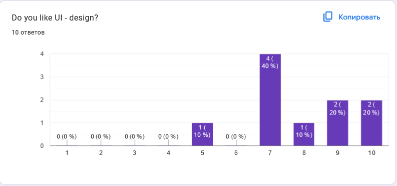
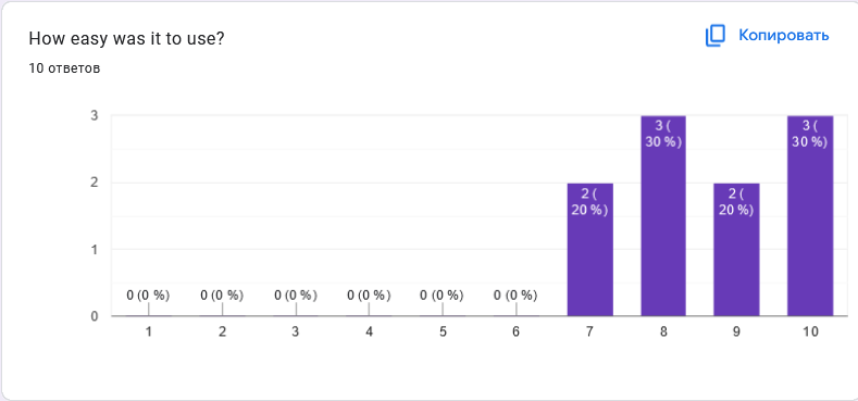
Google Forms: Here you can see the Google Forms feedback results:
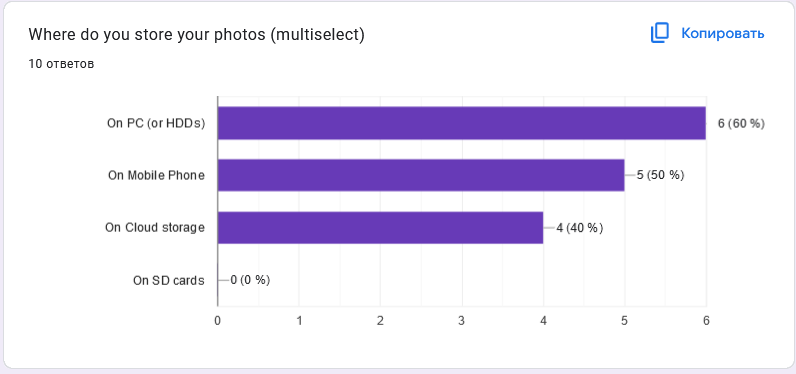
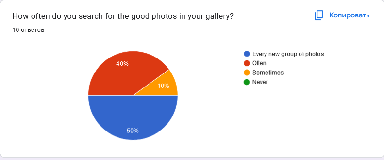
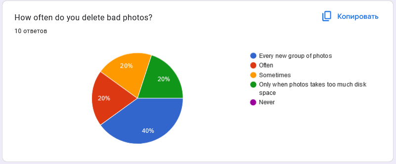
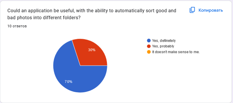
User Interviews: Here you can see the interview script: Script
Here you can see the interviews: - Interview-1 - Interview-2 - Interview-3
- Analyzing feedback, identifying and prioritizing issues
In general, the feedback turned out to be positive. According to statistics, a group of users often determines the best photos. Only a small group of 20% removes bad photos only and also removes bad/blurred photos. We also found out the fact that users liked our idea of sorting into bad and good photos, and 70% of respondents believe that our application is certainly useful for solving problems with self-selection of photos. Also, 50% of the respondents rated 8-10 in the field with a question about design evaluation and 80% of users found the design easy to use (score 8-10)
Interview 1 Summary: The interviewee is a beginner in photography who takes photos rarely, mostly using their phone. User finds sorting and deleting blurry or dark photos time-consuming. User generally like the user interface prototype, describing it as simple and clear, but rated it 8 out of 10 due to missing features like tutorials and settings options. In the working version of the application, the interviewee found the lack of a full-screen mode challenging but appreciated the convenience of the photo sorting feature.
Interview 2 Summary: The interviewee has been involved in photography for two to three years, taking photos frequently during trips. User manually sort and delete poor-quality photos. User found the user interface prototype to be clear but noted a lack of storage for already viewed photos, requesting this feature. In the working version, user successfully uploaded pictures and found the sorting feature to significantly speed up their process. User suggested cloud storage integration, which was declined by the interviewer.
Interview 3 Summary: The interviewee is photographer who uses both a smartphone and camera. The interviewee finds manually deleting blurry photos by himself inconvenient. They found the prototype interface generally okay but mentioned color issues and non-functional buttons, and initially did not understand the slider function. In the working version, the interviewee successfully uploaded photos, found the features easy to use, and appreciated the blurry photo identification feature for its time-saving benefits. Overall, the feedback was positive, and the interviewee is willing to continue using and providing feedback on the application.
Identified issues:
Change the color palette of the application.
Consider the usage of dark theme for the application.
Full screen view implementation.
Creating settings, options and tutorial pages for the application.
Roadmap: #
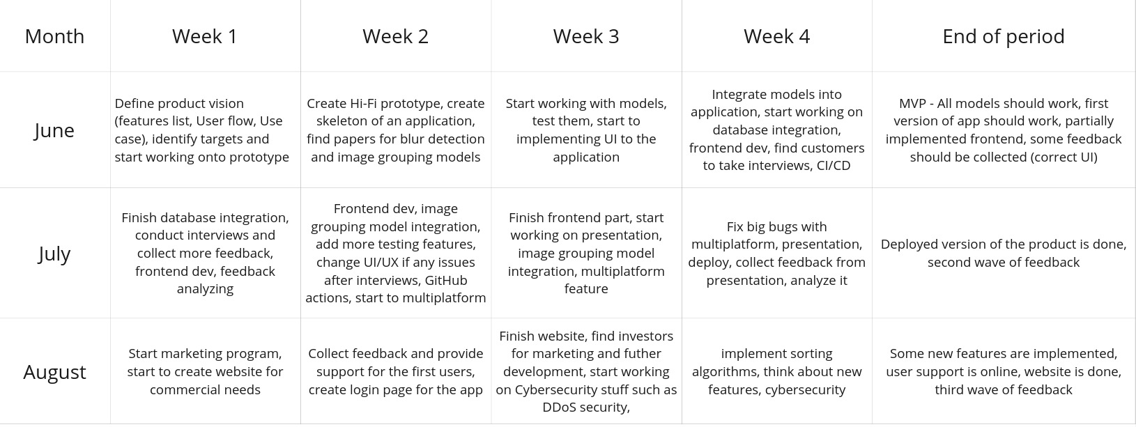
Here you can see our roadmap:
Weekly Progress Report: #
Database #
This week we finally connect Room database with our application. It will help to prevent redundant imports and to refresh the interface when users add new photos.
Furthermore, the database facilitates secure and efficient data communication, streamlining tasks and enabling the quick and convenient addition of features such as sorting, grouping, and more.
Feature to like and dislike photos #
From interview conclusions we understand that potential customers would like to see ability to Like or Dislike photos in our application, to identify best photos by user self. We already include Like/Dislike buttons in our application and for next steps we should implement sorting ability for Liked and Disliked photos
Frontend development #
We continue to develop UX/UI interface into our application. For now, application contains all main UX features, except slider for quickly navigation in the group of photos, and User Interface in progress. The main locations of objects in the application are already in place, it remains to adjust the fonts and the design of the buttons
Challenges & Solutions #
Challenge 1: Room database integration
Problem: Unfortunately, Room database integrated directly into our application did not allow us to build and debug the
application, it gave an error
Solution: We used the Kotlin Multiplatform Wizard. This is the library that provides architecture components of
Model-View-ViewModel for UI applications. It helped us to rewrite architecture of our project and successfully integrate
Room database
Conclusions & Next Steps #
Colour palette
As a key result we obtained from our interviews, is that customers do not like the colors of the User Interface, so we need to brainstorm this and change the colour palette. Also, this problem might be solved by developing dark style of the product
Frontend development
We should continue frontend development and solve main issues which we got from interviews - options, settings bars, button to switch to the dark style. Also we need to add User interface to the buttons. Also we need to implement full screen photo viewer.
Image-grouping model integration
Model is already done, we should integrate in our application. Main steps:
- Determine the level of coincidence in a model to group photos by similarity.
- Add User Interface for beautiful view