Week #5 #
Meetings with stakeholders #
As our team doesn’t have any concrete stakeholders, we aimed to contact our fellow students and ask them to try our application via conducting meetings with them. This brought us a lot of useful and sincere feedback. We have also undertaken an online survey to rate our current UI\UX implementation and provide any additional feedback.
Feedback collection procedure #
As stated previously, we conducted a one-to-one sessions with potential stakeholders and provided them with the functional prototype. One of the team members presents a main task for the client to accomplish. User interacts with our prototype and tries to achieve the prototype goal, while our team observes and documents any difficulties and notes appeared during his journey.
In parallel, we discussed the possible questions and areas to focus on for the user surveys. After that, our team created the Google Form hosted online and shared among the focus group.
To get the detailed feedback, we splitted the survey on the web application sections:
- auth and registration
- link creation
- page redirection
- overall satisfaction
- usability and functionality questions
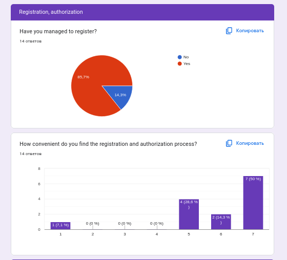
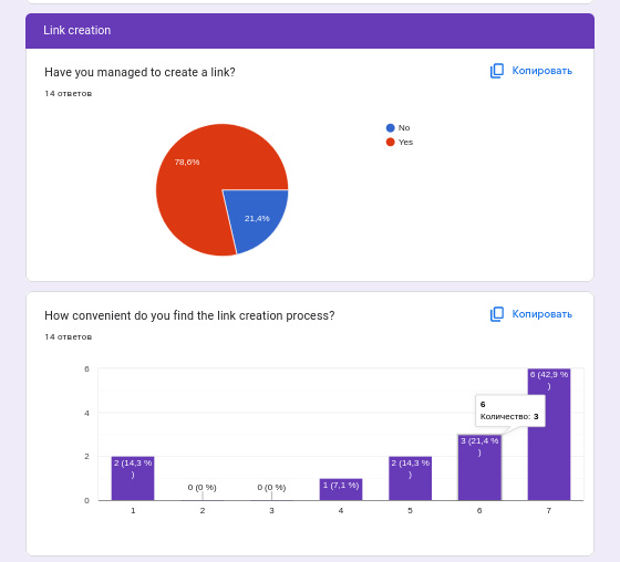
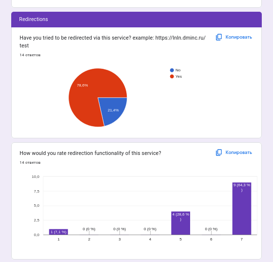
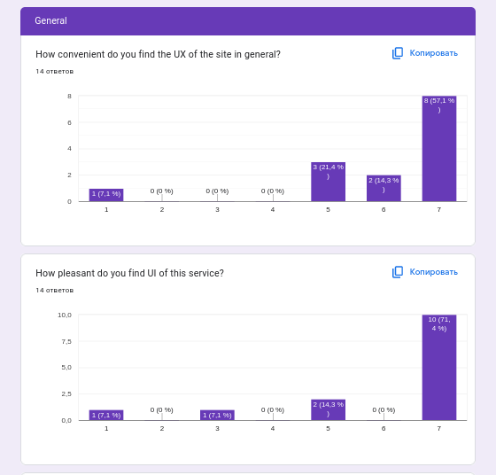
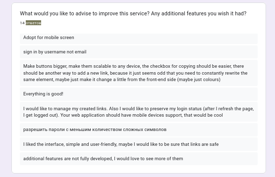
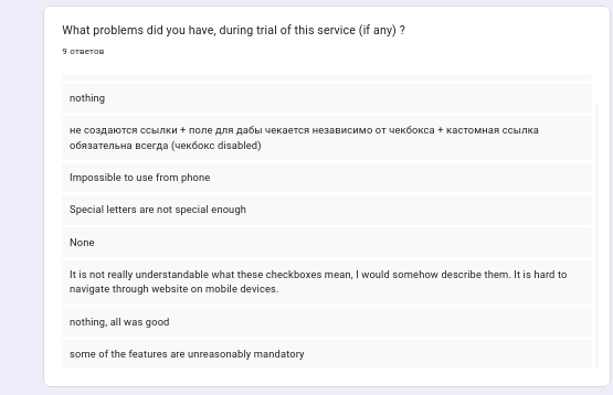
We have received and documented the following feedback from our online survey:
Feedback analysis #
Registration and Authorization #
The majority of users have successfully accomplished the task without external assistance. Moreover, most of the users created the account without a specific task requirement and they believe that it is convenient for them. However, since users have discovered medium usability bugs, it affected scores and satisfaction with the authorization process.
Link creation #
The main page of our frontend application has high conversion — the majority of users managed to create a link and did not found any usability or convenience issues. Nevertheless, the opinion has diverged into various number of points, since the users stated their desire to access more secondary features.
Redirection #
Most of our respondents didn’t have any complains about the UX\UI side of the redirection, as this feature is very simple and understandable, available even for unauthorized users.
Overall Satisfaction #
As provided data shows, in general, our respondents liked the provided UI\UX of the service. Additionally, some users suggested improvements for our service.
Task priorities #
First of all, our team prioritizes the functionality and usability of prototype over its design. Therefore, we decided to primarily fix all discovered severe bugs that prevented user from accomplishing target actions, such as registration or link creation. After that, we plan to implement and refine the secondary features according to the following priorities:
- Link management UI and backend support
- Redirections with a password (refinement)
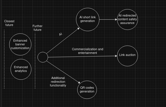
Future roadmap #
This is an addition plan for the future.
- QR codes for the short links
- Auction of link slugs
- Enhanced customization of banners
- Link safety analyzation using AI
- Link AI generation
- Improved redirects statistics
Improvements, based on the feedback, which were done instantly: #
We implemented the fixes for the frontend application bugs that were discovered during the meetings, and described by the survey feedback. In particular, we fixed the form validation bugs and improved the UX of link creation checkboxes, so it became more intuitive and non-confusing.