Jurnalik #
Do you like real newspaper?
Jurnalik is a mobile application, an electronic “newspaper” that collects and provides the user with the latest news, posts and photos from their social networks and news channels in one application.
Week 1. The Beginning #
Team Formation and Project Proposal #
Team Members #
| Team Member | Telegram ID | Email Address |
|---|---|---|
| Nikita Semeritskiy | @FatM1nd | n.semeritskiy@innopolis.university |
| Nikita Fedorovich | @Fedorovich_Nikita | n.fedorovich@innopolis.university |
| Yana Pavlova | @pavlova_yana_1 | y.pavlova@innopolis.university |
| Valeriia Kharina | @exemplerie | v.kharina@innopolis.university |
| Dilyara Farkhutdinova | @d_farkhutdinova | d.farkhutdinova@innopolis.university |
| Oksana Konovalova | @ksko02 | o.konovalova@innopolis.university |
| Adelina Kildeeva | @yumiue | a.kildeeva@innopolis.university |
Value proposition #
Problem
In today’s world, people live in a state of information overload. Social networks are accompanied by an endless feed and recommendation systems, forcing users to spend hours of their time scrolling through thousands of news and posts. In addition, many users read the news in multiple apps, switching from one to another. What if we could offer a convenient solution to these problems?
Solution
Jurnalik is a mobile application, an electronic “newspaper” that each day collects and provides the user with the daily news, posts and photos from their social networks, news channels and subscriptions. The app contains a limited amount of content from a few selected sources and divides all news into categories, allowing the user to read posts based on their interests.
Benefits to Users
- Reduce time spent on social media by consuming a limited amount of content. Focus on the latest news without the distraction of recommendation systems and corporate retention algorithms.
- Read news from several social networks at once. Our app allows users to get information in a single feed so they don’t have to switch between apps.
- News filters based on post source and category. The user can customize the feed by selecting news by specific categories or sources.
- Removal of identical news and advertisements. The algorithms of our application will remove repetitive news and advertising posts from the feed that take up time and attention of users.
Social networks available in the app: Telegram, VKontakte, Instagram. News categories: accident, business, entertainment, politics, sport, technology.
Differentiation:
Jurnalik provides a single news feed collected from multiple social networks with post categorization features. No app with an identical idea has been found on the market so far.
Most apps with similar functionality are designed to manage multiple social networks (publishing posts, accessing private messages, scheduling a user’s personal content). Thus, Sprout Social and Scruddle don’t have category news separation, and Hootsuite and Bynd don’t have a unified feed at all. Feedly and NewsBlur provide great functionality and a unified feed but are designed for news apps (BBC, Time etc.) and articles. Also the above applications do not have a limit on the amount of content.
User Impact:
Users will be able to manage their time more efficiently by avoiding endless scrolling and information overload on social media. They will only receive information that is relevant and interesting to them. This contributes to increased productivity and focus in users’ daily lives.
User Testimonials or Use Cases:
- People who want to spend less time on social media. Using Jurnalik, they will read a limited amount of news from the selected groups and channels, without sticking to the recommendations from the social media apps.
- A person experiencing panic and nervousness from the news happening in the world can remove the politics category and read only news that does not contain political content.
Feedback
- Have you done any Market research, what product you searched?
- What other social networks you mean exactly, all of them?
Feedback by Moofiy
Lean Startup Questionnaire #
What problem or need does your software project address?Our mobile app solves the problem of information overload and inefficient use of users’ time on social media. It provides a resource in the form of an electronic ’newspaper’ that aggregates all news, updates, and photos from various sources such as social media, news feeds, and subscriptions. Users now don’t have to switch between different platforms to get up-to-date information.
Who are your target users or customers?Our target users are people who want to reduce information overload and spend less time on social media.
Feedback
The term “people” is too generic! It’s better to specify these individuals into specific personas:
- Students who are following university news
- Unemployed individuals following job advertisements
- Coders keeping up with new trends in programming .. etc
When knowing your uses, you can target their needs better.
How will you validate and test your assumptions about the project?Firstly, we will use analytics metrics and conduct MVP testing to consider overall feedback. Then, we will conduct user surveys and use A/B testing to validate and test our assumptions abput the app.
Feedback
Again, this is too generic plan. What will your survey cover? what will you ask the users? what are the analysis that you are going to conduct? how will you examine the overload?
- You didn’t provide any concrete answer here.
Your first assumption that you need to validate: Will users use the? to answer it, you need to create an MVP and use metrics/ analytics to see if users actually using it. Than you can conduct interviews/ survey to learn more
Feedback by Moofiy
What metrics will you use to measure the success of your project?We can use the following metrics to measure the success of our project:
- Number of app downloads and active users.
- Time spent by users in the app.
- User feedback and feedback on the app.
- Net Promoter Score (NPS)
- Retention Rate
Feedback
Good, but you should take into account other metrics like:
- Net Promoter Score (NPS): This measures customer loyalty and satisfaction by asking users how likely they are to recommend the app to others.
- Retention Rate: This measures the number of users who return to the app after their first visit. High retention rates are often seen as an indicator of an app’s value to its users
- Churn Rate: This is the flip side of the retention rate, measuring the number of users who stop using the app over a given period.
Feedback by Moofiy
How do you plan to iterate and pivot if necessary based on user feedback?Firstly, we will reqularly gather feedback from user surveys and interviews. Secondly, analyze feedback to find pain points and areas for improvement. Thirdly, prioritize feedback based on frequency and significance. Finally, release updates or new features and evaluate their impact on user satisfaction.
Feedback
too generic plan !!consider defining how to prioritize feedback, as you might get conflicting opinions. How will you exactly analysis those feedback? Beside you didn’t really specify how will you iterate? how will you handle bug reports? how will handle feature request?
Feedback by Moofiy
Grade reduction on this section
-1
Leveraging AI, Open-Source, and Experts #
- AI: Our team plans to develop and train NLP model to classify news, identify the advertisements and find near-duplicate content.
- Open-Source: We will use open-source libraries to interact with social media APIs.
- Experts: We plan to seek advice and input from experts in the field through University.
Feedback
We will use open standards and web libraries to ensure our projects are accessible and affordable
- What libraries?
- What open standards
- how are you going to use classification? what Algorithms will you use exactly?
Feedback by Moofiy
Inviting other students #
We are open to invite other students to join our project. We believe in the power of collaboration and are keen to expand our team in the future.
Feedback
😒 say no, don’t fill in fluff words!
Feedback by Moofiy
Vision for Your Project #
Project overview #
Jurnalik is a mobile application, an electronic “newspaper” that each day collects and provides the user with the daily news, posts and photos from their social networks, news channels and subscriptions. The app contains a limited amount of content from a few selected sources and divides all news into categories, allowing the user to read posts based on their interests.
Schematic Drawing #
Tech Stack #
- Frontend
- Figma
- Flutter
- Backend
- Python
- Flask
- RestAPI
- PostgreSQL
- ML
- Python
- numpy
- pandas
- sklearn
- SQL
- DevOps
- GitHub Actions
- Docker
- Kubernetes
- gRPC
Feedback
First, it helps users reduce the time they spend on social media by limiting the information they post and consume
How? do you have control over posting in other social media?
Secondly, the app provides protection from corporate retention algorithms by offering a more independent and objective source of information.
but, you also want them to return to your app, right ;). I mean it’s ok to make people return to the app. but you need to give them good reason and benefits
Feedback by Moofiy
Anticipating Future Problems #
Now we’ve already found some possible problems that we should overcome during development.
- Services integration Purpose of app is to pull news from different sources. API or other integration tools would provide pulling. But some services (like Instagram) have strict rules for registring new apps which would use service info (posts in Instagram).
- Comparing posts for near-duplicate content User can read news from different resources, but sometimes aggregators could post equal news but in the different presentation of the text. Purpose of app to reduce time-spending in smartphone, so we should implement method for identifing duplicates.
- Rethinking the Newspaper The goal of designers to rethink old “newspaper” to new modern mobile app.
- An obstacle to the expansion of mind horizons By limiting the user, we really allow him to save time, but at the same time the user loses the opportunity to learn about a new source of information. Thus, the problem is to find a balance between limiting and expanding horizons
Elaborate Explanations #
We divided responsibilities between teammates. There are similar divisions in our team: frontend, backend, ML and devops. There are 1-2 people in each unit. Also we will use agile practices and Notion for developing and communicating.
Feedback
I would give this report 3/5. it’s good but most of the answers are too generic, and seems like you write it to finish. not to accomplish. please give more time to reflect on the questions on the reports. they are here to help you build better products
Feedback by Moofiy
Week 2. Architecture and Analysis #
This week is still in progress, but our team have intermediate results. So, let’s talk about this week.
Tech Stack Resources #
We’ve divided our team into 4 departments: Copyright (ML), Backend, Frontend and DevOps and defined our tech stack. DevOps department has not so much experience, thus book will be used. Also we are planning to find a mentor that would help us. Frontend Department uses The design thinking playbook. The book helps to understand the needs of the consumer, to build personas, to understand the subtleties of UX.
Books could help to expand knowledge in the field with which we work. It is possible to find new approaches to solve different problems.
Alternative Resources #
Copyright Department #
ML Department has been researching text comparison and text categorising problems for this week. Now we’re still in progress, but for now the following articles were found:
- For Categorisation:
- For Comparison:
- Case studies how to detect near-duplicate content
DevOps Department #
We’ve found course interesting. This resource could help us to define CI/CD for our project.
Frontend Department #
Except book, stack of Frontend is conclude Flutter, so, department will use some additional resources like:
Backend Department #
Backend department has been researching APIs of VK, Telegram and Instagram*. So, now we’re researching:
- VK
- Telegram API and telethon
- Instagram* Graph API (need VPN in Russia)
Mentorship Support #
We’re finding mentors for most departments. We believe that mentors would direct our workflow in right direction and would help us during the development. Frontend department found Flutter mentor Gleg Osotov who has been developing Flutter mobile apps for 4 years. Also, we’re planning to find DevOps mentor, but unfortunately we are still in progress of finding.
It seems to us that having a mentor in our project will significantly improve the quality of the final product, since we will involve people with development experience, perhaps even those who have entered a large market, for example, TalkNow. Such supervision will help us improve or touch on those technical and business aspects that are unfamiliar or difficult for us.
Since our product is a social network (a resource that aggregates information from the user’s social networks), it is important for us to have a mentor experienced in the development of social networks. Therefore, we plan to contact the TalkNow developers for mentorship, advice, and an experienced outsider’s perspective.
Identifying Knowledge Gaps #
Whole week we were discussing solutions and possible problems of our app development. We’ve understood that our current knowledge could not cover all the requirements for a complete application development. But also we’ve enough knowledge to define directions that we need to learn. That’s not problem, that another task (auf).
Copyright Department needs to find a way to train model for classification and comparison. Developers know classification and comparison, but NLP is new sphere for them. On this week we’ve already found solutions. Now department is testing them.
DevOps Department is at the beginning of learning DevOps practices. We hope that this project could help learning k8s, docker and monitor tools deeply.
Frontend Department already knew much, and now continues learning deeper.
Backend Department have mush knowledge about Backend practises. But we would actively practise gRPC for container communication, so we need to research some info for that.
Engaging with the Tech Community #
Now we’re finding new experts, sharing our idea with community and collecting feedback. Unfortunately, we’ve not engaged experts into critical tech stack problems. But we’re planning to do so.
Learning Objectives #
All objectives for each Department are written in the section before previous one. We’re all open to get new experience in the development of such app. We would use books, articles, courses and mentors for achieving our goals.
Sharing Knowledge with Peers #
We have two meeting per week (Wednesday and Sunday). All departments meet together in a friendly atmosphere discussing problems, solutions and offers. In spite of different spheres of departments, we’re offering ideas and solutions for possible problems for all departments. Also, we can share and ask question to developer from another group. Also we’ve Telegram Chat with topics for each Department.
Leveraging AI during Development #
On this step, all departments do not have need to use AI for boosting our knowledge. But we could use some AI tools for constructing learning plan or generating some textures for design.
Tech Stack and Team Allocation #
Most departments conclude two developers except DevOps.
Copyright Department #
| Team Member | Telegram ID | Email Address |
|---|---|---|
| Oksana Konovalova | @ksko02 | o.konovalova@innopolis.university |
| Adelina Kildeeva | @yumiue | a.kildeeva@innopolis.university |
In Copyright Department are two developers: Adelina and Oksana. Department has a separate meetings where developers discuss tasks and distribute them. Project has two main ML problems: categorisation and comparsion. So, Adelina takes Comparison part and do most researched. Oksana takes Categorization problem and test found solutions.
Frontend Department #
| Team Member | Telegram ID | Email Address |
|---|---|---|
| Yana Pavlova | @pavlova_yana_1 | y.pavlova@innopolis.university |
| Dilyara Farkhutdinova | @d_farkhutdinova | d.farkhutdinova@innopolis.university |
This department consits of two people. Yana is in charge of mobile app front-end part development and it’s functionality. Dilyara is in charge of Design and identity of the app. But they’re actively help each other, exchange experience and opinions, so tasks is common.
Backend Department #
| Team Member | Telegram ID | Email Address |
|---|---|---|
| Nikita Fedorovich | @Fedorovich_Nikita | n.fedorovich@innopolis.university |
| Valeriia Kharina | @exemplerie | v.kharina@innopolis.university |
Department conclude two developers. Now is week of research, but responsibilities are already outlined. Nikita is researching about VK API and Valeria is researching about TG API. After success research, anyone would research Instagram* Graph API. Also, department has task to implement database architecture.
DevOps Department #
| Team Member | Telegram ID | Email Address |
|---|---|---|
| Nikita Semeritskiy | @FatM1nd | n.semeritskiy@innopolis.university |
DevOps conclude one developer. Department does not have task except researching existing DevOps practices. So, after defining architecture of project, department should make up CI/CD for other developers.
Weekly Progress Report #
This week is week of research. We’ve defined most features and started testing their implementations. The progress is below:
Front-end Department: Figma prototype (with created UI and UX logic, navigation and interactive elements) is developed, model (outlines of the main variant) of the Front-end part is also created.
Back-end Department: Studied the VK and telegram documentation and how to interact with their API. Wrote a sandbox for VK, telegram for collecting, aggregating audio + text. Also came up with the architecture for the project.
Copyright Department: Studied existing sources on the topic of categorization and comparison of texts, collected data on which training and evaluation of models will be carried out, and preprocessed the data.
DevOps Department: Together with the back-end department, the architecture was thought out, in the process a deep study of the aspects necessary for implementation and described above is underway.
Feedback
Improvement section Good, for the money you need to talk to the university how will you handle transactions.
1. Component Breakdown
Missing
2. Data Management
Missing
**3. UI Design **
Missing
4. Integration and APIs
Missing
5. Scalability and Performance Missing
6. Security and Privacy Missing
7. Error handling and Resillience Missing
8. Deployment and DevOps You found a course, this is what you did all week?
Overall The report is extremely week. It Dorset reflect any of the requested items. And doesn’t show that you did much development or progress. Finding a course is not a progress. Or even taking one. It might be good for your knowledge but we expect form you to show progress. Which mean learn and apply.
Grade 1/5
Feedback by Moofiy
Week 3. The First Prototype and Priority list #
The main goal of the third week was to develop and test the first prototype. Our team finalized the architecture of the application, implemented some of the functionality, and made a list of priorities for future work.
Technical Infrastructure #
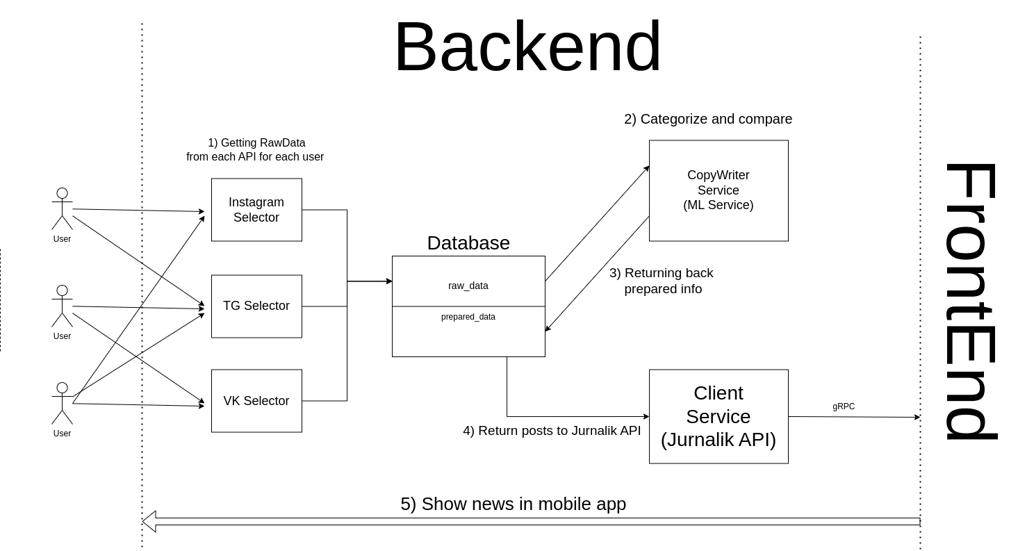
We have defined the final version of our application infrastructure (picture below). It represents a GitHub repository with further CI/CD. The server side will include Docker-Compose and deployment on a server (our own rented virtual server).
Data Management #
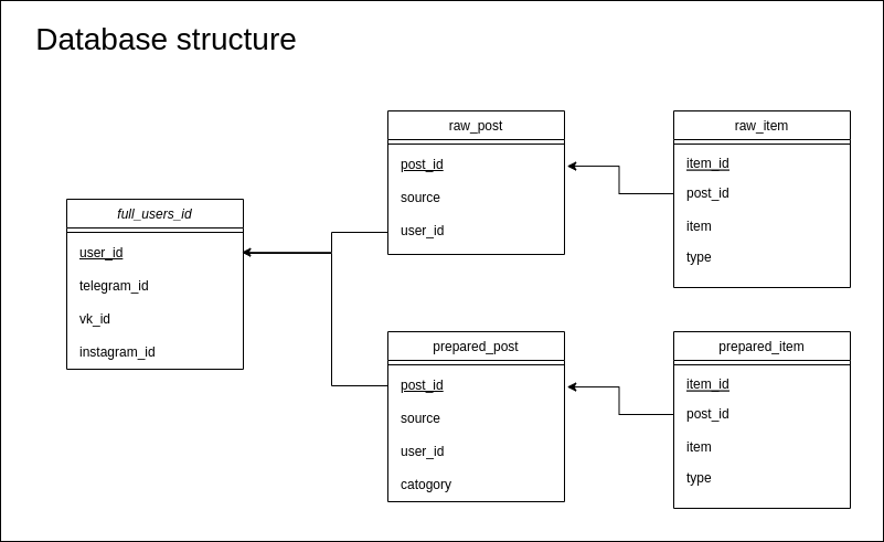
We defined the architecture of the database. full_user_id contains the ids of users and their identifiers in authorized social networks. Post tables store user posts, and items contain post items (text, photo, video, or audio). raw_post contains the user’s extracted posts using the social network API and prepared_post contains the processed posts where categories are defined and duplicates are removed.
Implemented functionality #
Backend Development #
Backend department developed selectors for news extraction:
- Telegram bot, where the user can send all the channels they are interested in
- Retrival of the groups that the user is subscribed to using OAuth VK
ML department developed a module for news processing:
- ML model that determines the category of the news based on the text (the accuracy of the model is 0.8, it will be increased with the expansion of the dataset)
- Method for identifying duplicate news using TfidfVectorizer
Frontend Development #
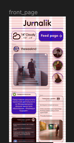
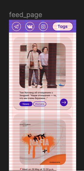
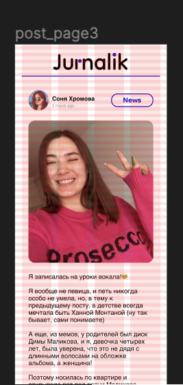
Frontend department have developed a prototype in Figma, the link to which will be below. The beginning of work, as expected, consisted of building wireframes, agreed with the entire team. After, following all the logistical rules (UX) and design solutions (UI), a convenient and beautiful prototype was developed. All interactions and likely user steps were tested on an interactive prototype with built-in connections. Our interface is intuitive, does not include many steps, so the user immediately gets to the desired content. Ultimately, at the MVP stage, it is planned to have 4 pages, as presented in the prototype: authorization page, front page (title page), feed page (collection of all the news of the day) and post page (full post page). The functionality of each of them is also intuitive:
- Authorization and selection of desired sources for posts
- A small representative assembly of the day, meeting a bright page
- A page with all the news for the day, with the ability to sort by topic or social network
- Page presenting the selected post in its entirety
Prototype #
Link of Prototype #
Prototype Testing #
After developing the prototype, our team had a meeting where we discussed the available features and evaluated the convenience of using the app and also made a few changes:
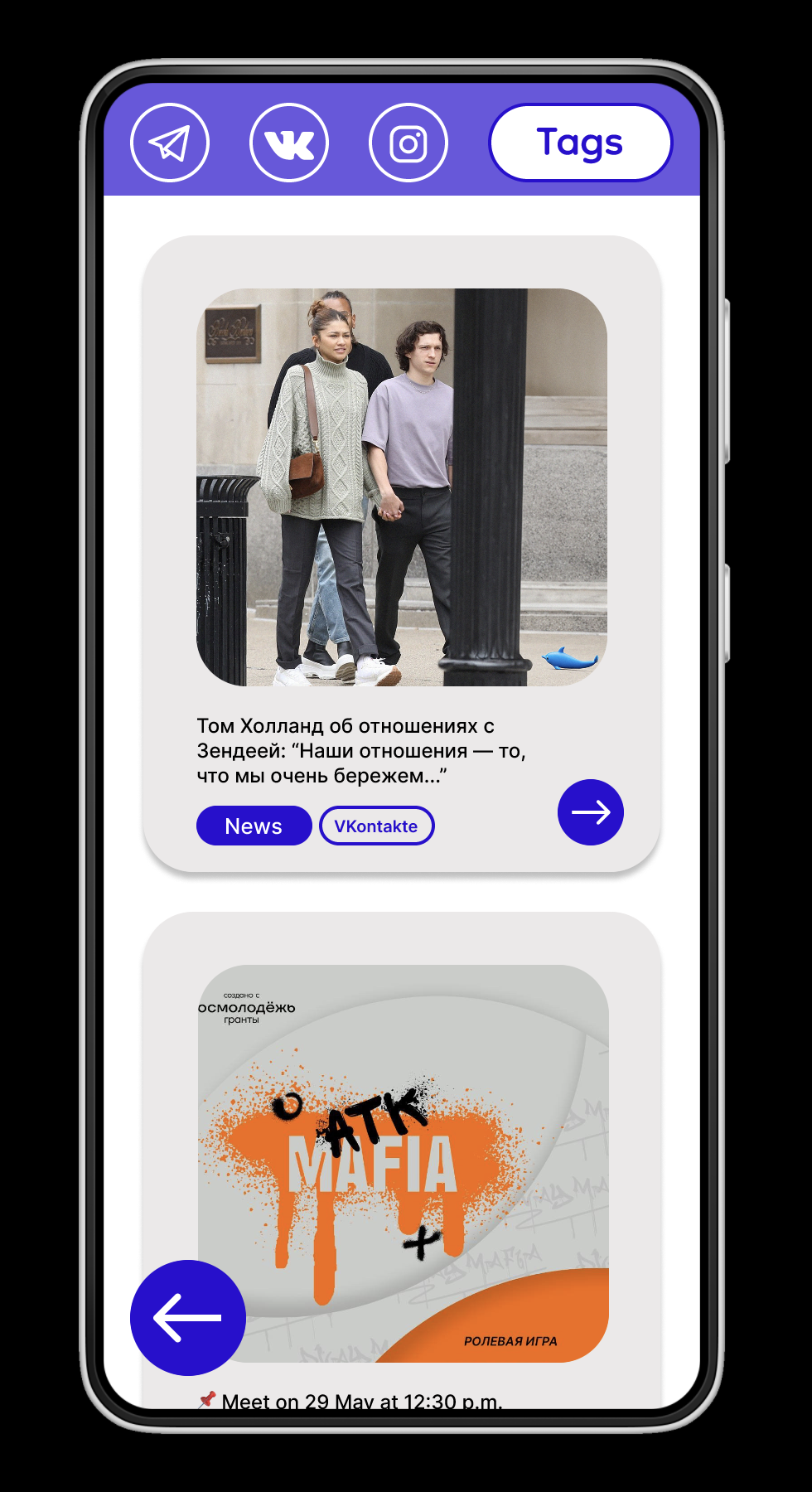
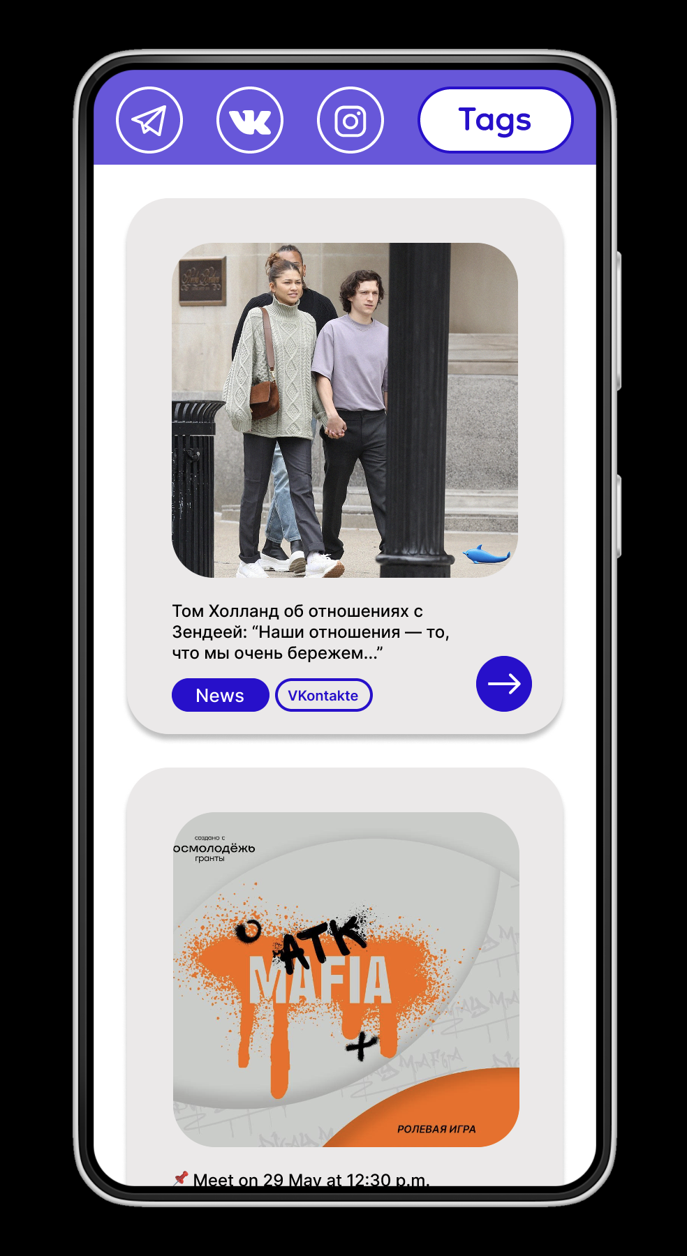
- Back Button
We were minding about saving “Back Button” in the left down corner. But after getting feedback we realized that it interferes with the review of posts and is unnecessary.
| With button | Without button |
|---|---|
 |  |
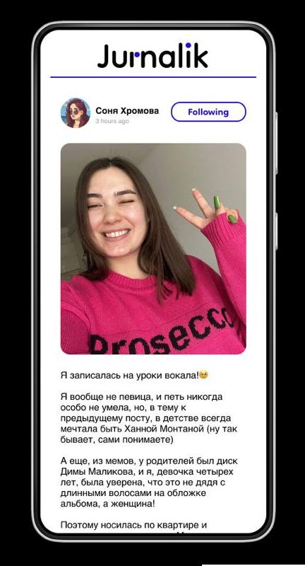
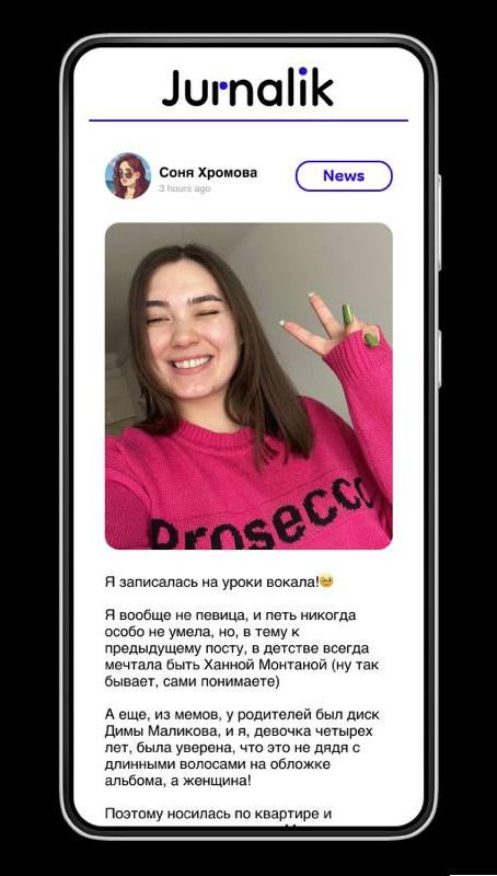
- “Following” is changed by some post category because our app give posts from following sources.
| “Following” text | Specific tag |
|---|---|
 |  |
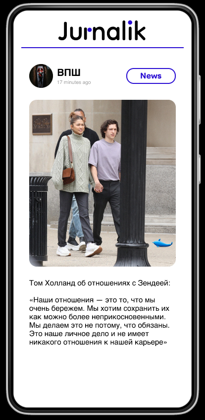
- “Jurnalik” heading. We’ve minding about saving or removing this on ‘post page’. After feedback we decide to save it.
Prototype Features #
You can view our prototype via the link right in Figma, see the work with frames, component sets and connections, as well as switch to view mode and click through all the pages yourself. Below is a GIF that shows the interaction with the prototype.
Functionality: the user, entering our application, will follow the following journey map:
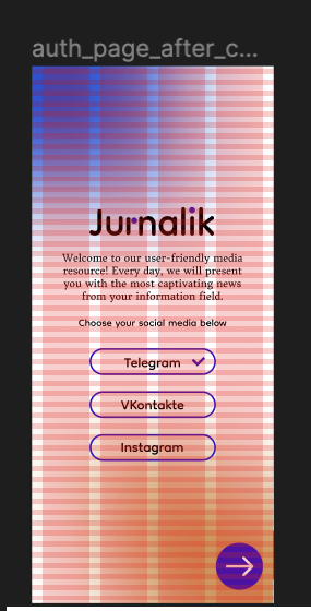
- auth page: Authorization page giving the opportunity to log in the desired social networks for further receiving news posts from them. After authorization, the user clicks on the arrow at the bottom of the page and goes to the front page
- front page: The page is a digital analogue of a newspaper title page. There, the user sees a small number of posts, the weather (because in theory the user will access our application in the morning, this is a useful feature) and the ability to go to the feed page.
- feed page: A page where all aggregated posts are collected, in the fixed menu bar at the top of the page, you can sort news by tag and / or social network (tags and social networks are also indicated next to the posts)
- post page: The page that expands when the user clicks on a post from the feed page. It contains full text, pictures and potentially will contain audio content.
| Auth Page | Front Page | Feed Page | Post Page |
|---|---|---|---|
 |  |  |  |
User Journey Map, in general, is presented above and in the YouTube, all interactions are also registered and visible in the YouTube link.
User Interface #
Link to the Figma Prototype is above as well as the User Journey Map and interactions description
Challenges and Solutions #
Major challenges in prototype development:
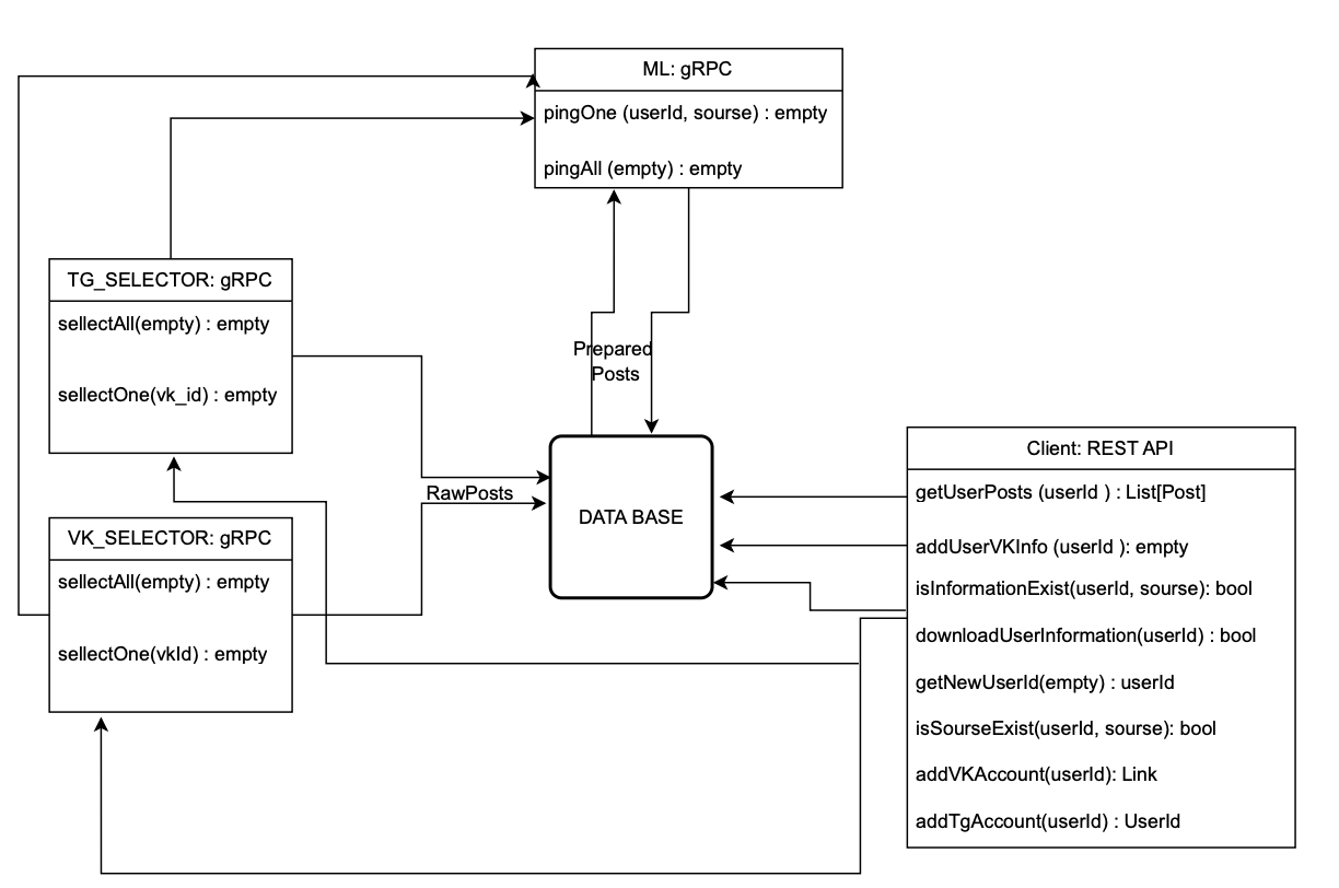
- Services communication. Initially we planned to implement the services communication through grpc. In this case the application would crash if there was a problem with any of the services. So we added a database to the application architecture for the reliability of the product.
- Telegram API modules. Telethon is convenient for extracting user channels, but it is not safe for the users (we literally get access to all of the user’s data and actions). So we decided to write a bot on telebot, where the user can send his channels.
- The Vkontakte API has a limit on the number of requests per second. In the future this may affect the running time of the application.
- Model for photo categorization. Some posts have no text. They can have just pictures or information in the form of images. For this case we need to implement a model capable of reading the information from the photo and categorize it.
Next Steps #
Priority list:
- Implement database for posts storage
- Connect the services of the project
- Parsing news from retrieved user groups and channels
- Continue the development of the frontend
- Develop Jurnalik API with Swagger documentation
- Implement categorization model for images
- Improve the accuracy of the model by expanding the dataset
Feedback
Prototype Features
Very good!!User Interface
Good progress. Unfortunately the deign doesn’t look very good. You created everything form scratch. and it seems you didn’t follow any standards like Material design for example This led to a design that look strange on Mobile.But I thing you have done good effort doing it.
Challenges and Solutions
Good!Next Steps
Good. have you considered testing the app with real users, listen to them?Overall
Good report, great progress form last week. Good job!!!Grade
5/5Feedback by Moofiy
Week 4 #
External feedback on our project #
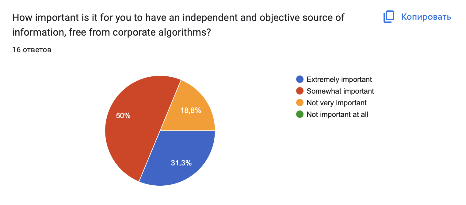
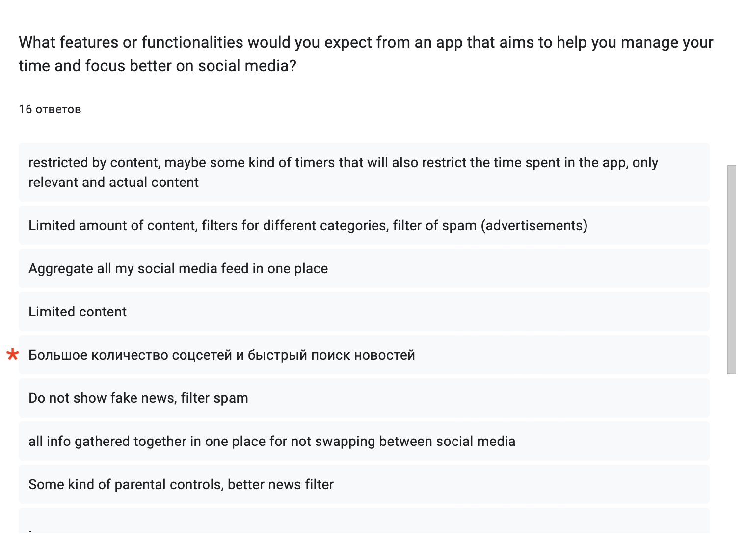
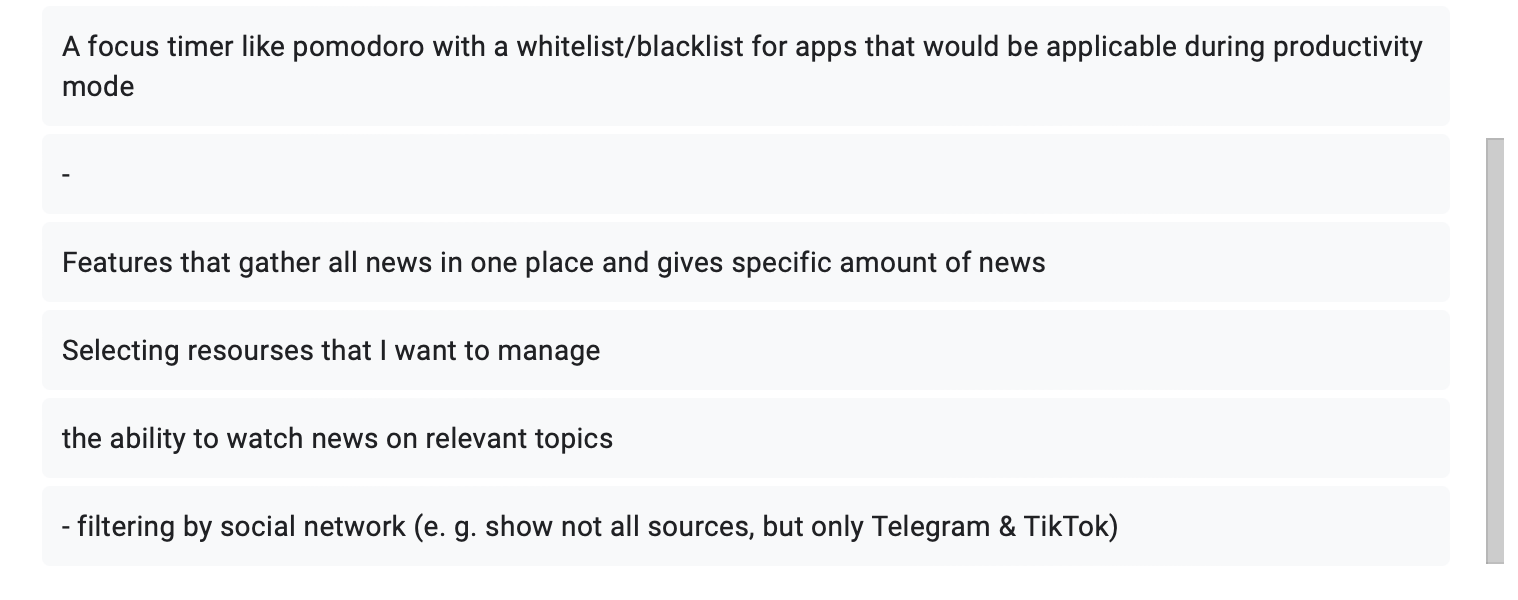
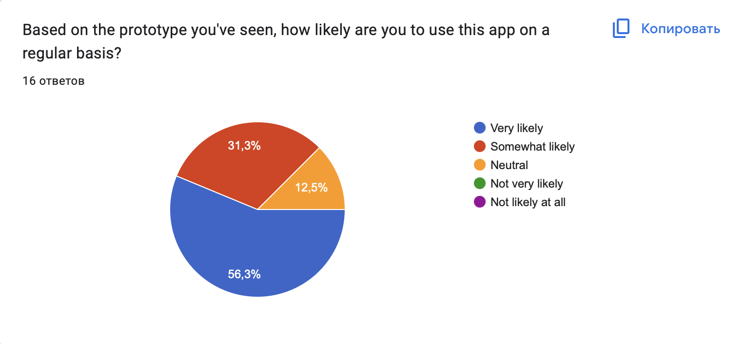
To assess the needs of the target audience and in-depth analysis of their experience, we conducted a survey that evaluated the daily routine of potential users (in relation to social networks, respectively) and their attitude towards our prototype.
The questions were aimed at studying the frequency of visiting social networks, the regulation of consumed content, the presence or absence of information overload, and interest in our product. In addition to general questions aimed at the experience of potential consumers, there were also questions about the evaluation of our prototype and its functionality. The collected feedback helps us understand the strengths of the implemented prototype and the desire of the target audience to improve the product for further development.
We provided an interactive prototype and a GIF showing how our app works to users, along with a survey for the most honest and realistic feedback possible.
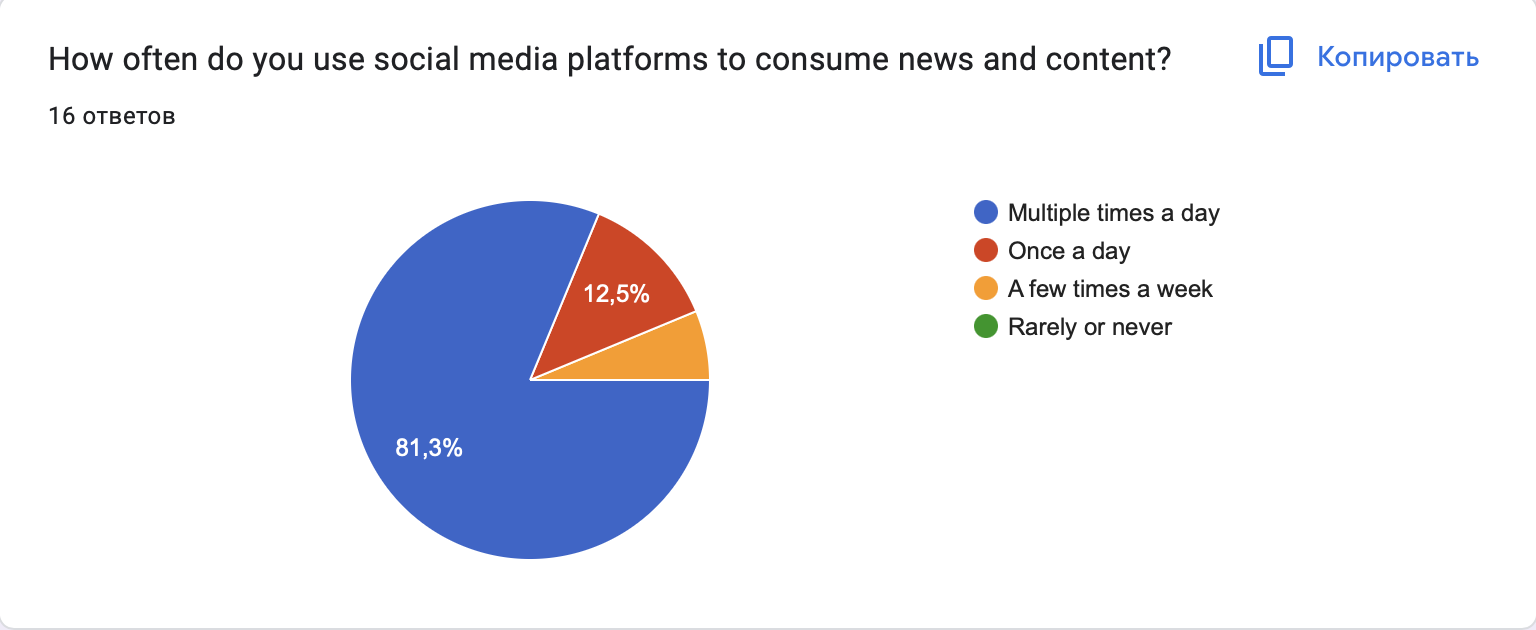
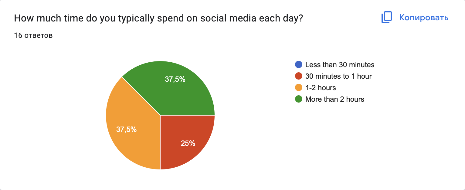
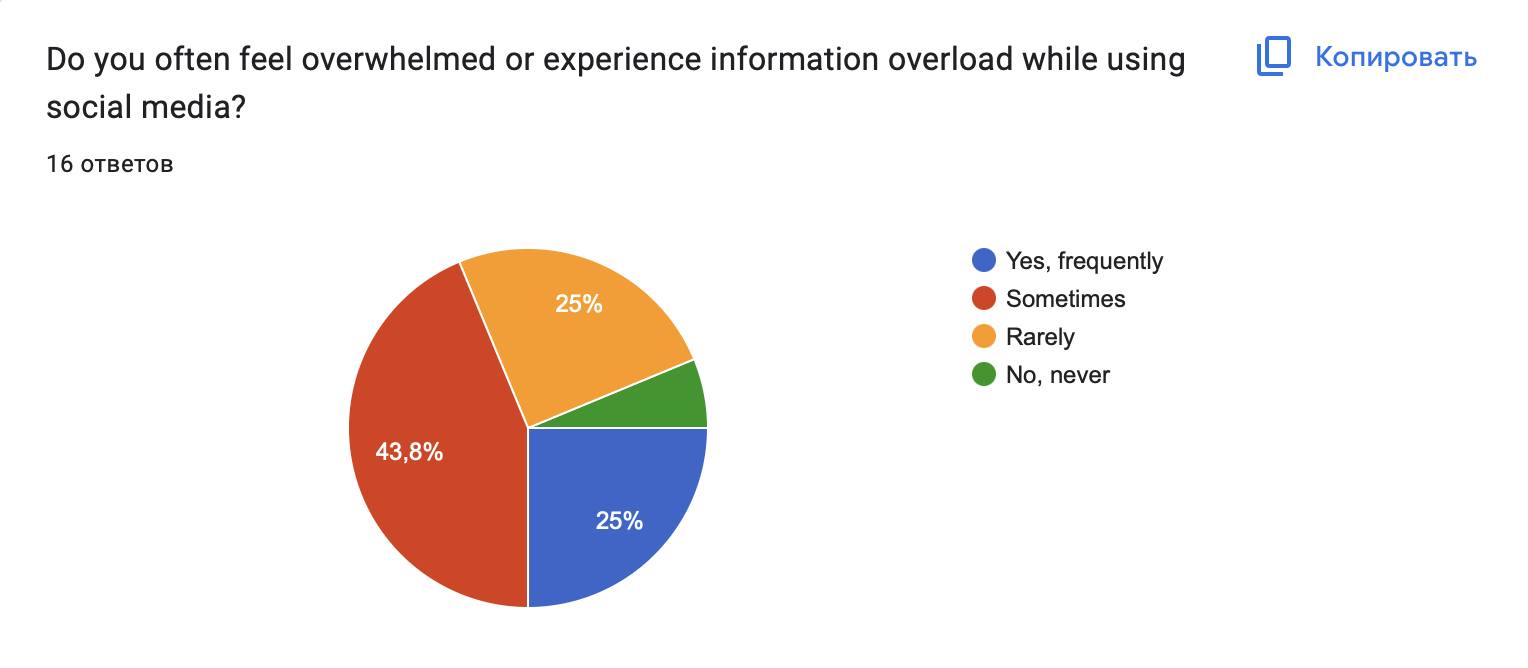
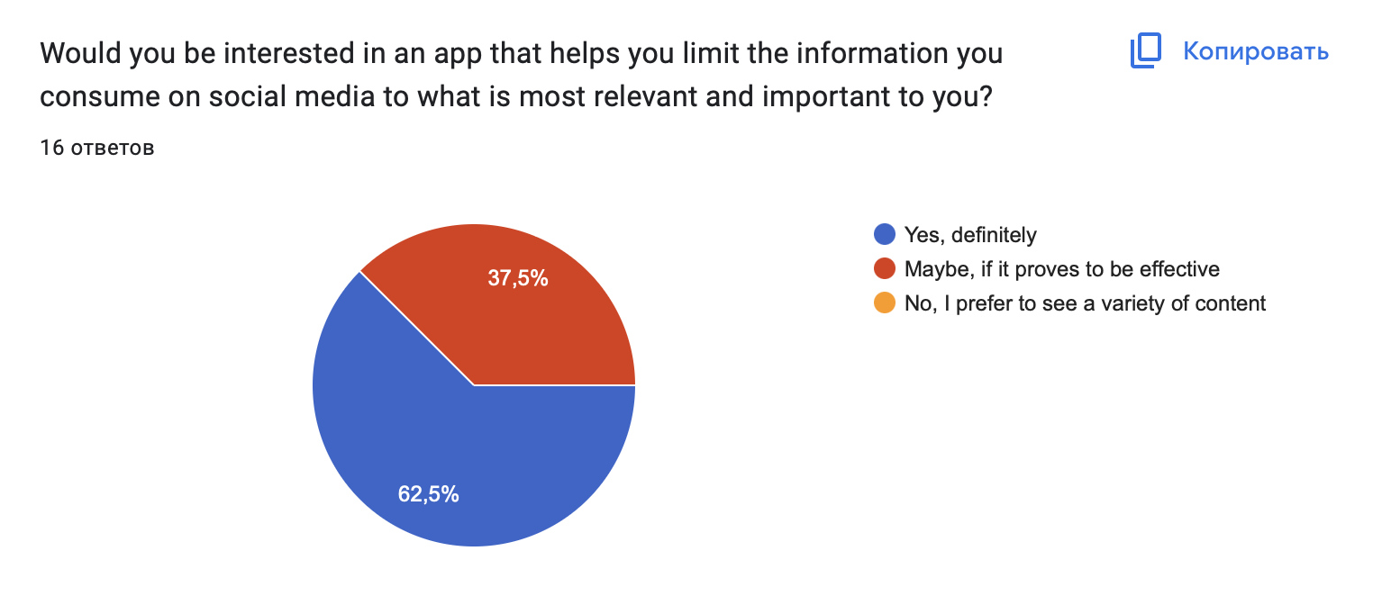
Below are statistics from our representative sample of consumers:
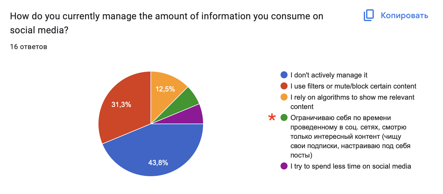
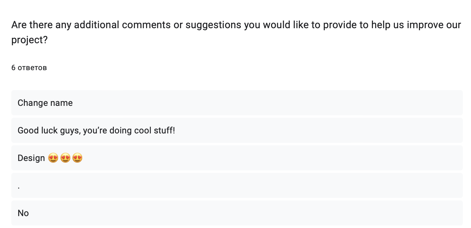
*’Restrict myself in time spent in social media, scroll only content I’m interested in (clean up my subscriptions, set up posts)’
*’Big amount of social media and fast search’
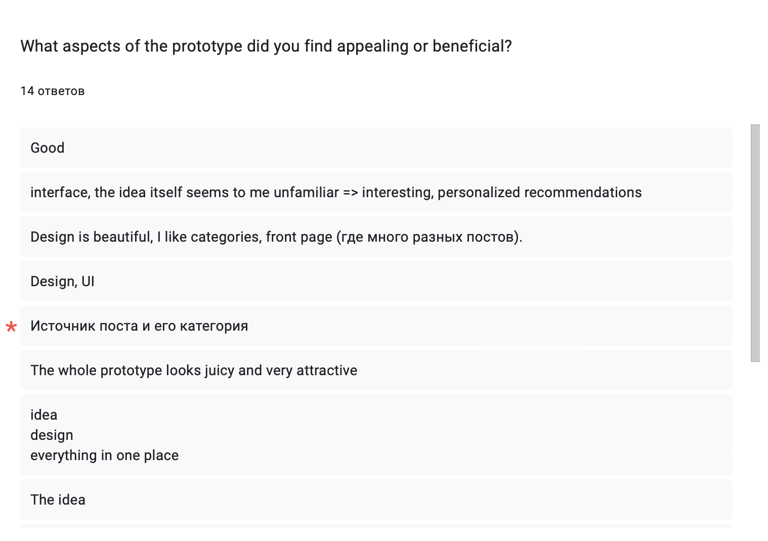

*’Post source and its category’
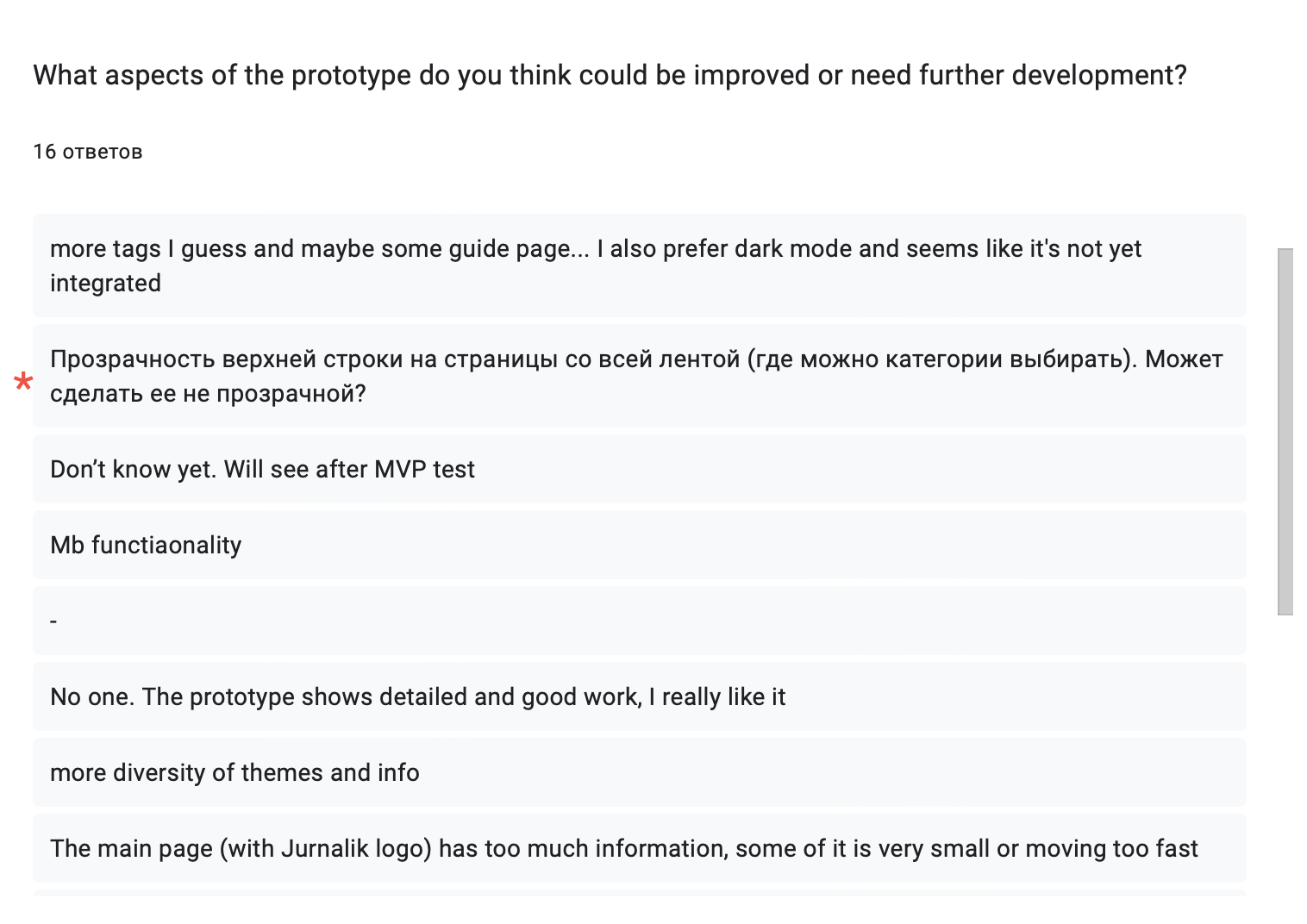
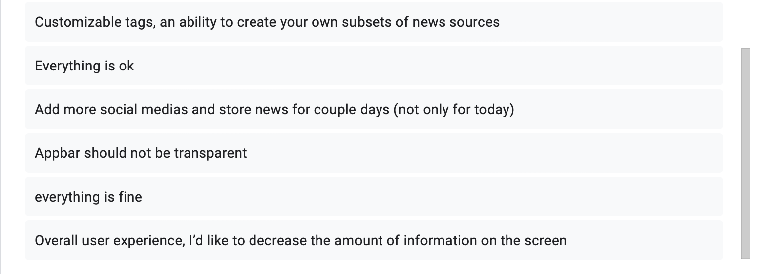
*’The transparency of the upper line on the feed page (where the categories could be chosen). Maybe make it not transparent?’
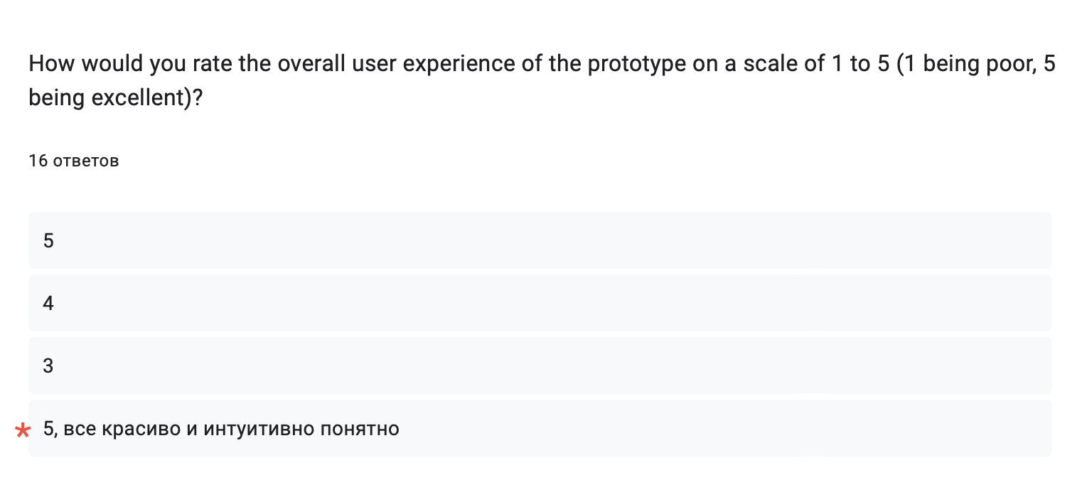
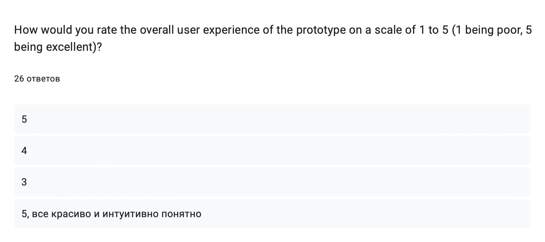
*’5, everything is attractive and intuitively understandable’
After analyzing the results, we found out the subtleties of the needs of our target audience, we realized that most of them check the news several times a day, spend a total of 1> hours consuming such content and often experience an oversaturation of information, which is a statistical confirmation of relevance for us our project. People from different fields of activity and different age categories were interviewed, so the sample is diverse and representative. The people surveyed confirmed the lack of algorithms regulating content consumption, none of the respondents expressed disinterest in our project, and 62.5% even answered that they would definitely use such an application. Many noted the design and idea as interesting and attractive to them, the respondents liked the news collected together with the ability to filter. People told what functionality in such an application could be of interest to them, and also gave criticism to our project. All comments were taken into account and sorted into tasks. We have already corrected some of them after a joint discussion, the relevance of some is still being considered, as well as the timing of their implementation.
Testing #
Due to the constant testing of our project and the constant exchange of information between team members, the following adjustments to existing solutions were identified:
Back Botton #
The back button on the feed page with a full scroll down the page obscured part of the last post, which interfered with the quality perception of the content. As a solution, we could expand the frame / page, but for aesthetic reasons, we decided to remove the button altogether and rebuild the logistics: phone users use either the button back at the bottom of the built-in panel, or swipe.
Following Tag #
The “Following” button on the post page was a good ethical but bad logistical decision. Since it had no practical value, but was only a subscription flag, we decided to replace it with a thematic tag.
Telegram Client #
At first, teleton was chosen as a client for telegram, but it turned out to be a very insecure solution, since all user data would be available to us, as developers, which is already a violation of our user’s security, moreover, this data could be lost or “leaked” . Therefore, as the best alternative, we chose to create a telegram bot.
Comparison Method #
On the part of the ML, the choice of the comparison method used was changed. We changed the comparison method from MinHash to TfidfVectorizer, since the comparison accuracy was low - different news were given out as the same, and the same ones were recognized as completely different from each other.
gRPc → REST API #
From the backend side, initially we’ve decided to do the interaction between the front and the back through gRPc, but in the end we came with new solution - implement it through the REST API, because there is more information about the latter + more popular choice.
Architecture #
Initially, it was planned to make one monolithic service for all backend part, but we decided to do it through micro-services, due to the advantages of micro-services.
Temporary Data Transfer #
Instead of the initial choice of storing data in RAM, a decision was made to store data in the database due to higher reliability and simplicity (if one service crashes, the whole system won’t work properly while choosing RAM, what will not happen using a database).
Iteration #
We consistently discuss our decisions in the implementation of different parts of the project, consult and test, therefore, in addition to the changes described above (initial decision -> alternative + reason), there are also aspects in which, due to a general conversation and advice, nothing has changed.
After 4 weeks of constant development, testing and reflection, we were able to improve our project by changing several approaches (see in the Testing section), this upgraded:
- security of our product (client created via telebot -> telegram bot)
- perception of the interface (became even more intuitive due to tag replacements and the removal of interstitial navigation buttons)
- accuracy of news selection (comparison models have been replaced)
- architecture (monolith → microservices, gRPc → REST API, returned pings instead of RabbitMQ, RAM storage → database)
- reliability of the system (RAM → DB)
Progress Report #
All tasks from the sprint for this week have been completed, here are the changes, thus
What’s done #
- Implemented reading and writing to our database
- Comparison model added to the module
- Written get and push for the module
- Made authorization bot
- Made the layout of the authorization page
- Research on photo/video categorization was done
What’s planned #
- Customize PostgeSQL
- Customize Swagger
- Make communication with the service
- Write the necessary functionality for the Frontend
- Add categorization by photo to the module
- Expand the dataset to 500 items
- Make a selector for Telegram
- Set up infrastructure
Instagram Remark #
*Признаны экстремистскими организациями и запрещены на территории РФ
*Recognized as extremist organizations and banned on the territory of the Russian Federation
Feedback
External Feedback
Very Good!! But you should really make your feedback collecting consistent. For example, have one consistent categorical data I agree, disagree, strongly disagree … etc.This way you can assign numbers to this categorical data and gain some insights form choses data.
Testing
Very Good You should explain more about the testing you did. How did you mange bug reporting / fixing / documenting? Do you have a process for that?Iteration
Good but keep in mind:An iteration plan is essentially the plan for an upcoming iteration. It would typically outline:
- The goals and objectives for the iteration: what the team aims to achieve.
- The features to be developed.
- The tasks needed to develop these features. This might include coding, testing, design tasks, etc.
- Any assumptions or dependencies.
- A timeline for the iteration.
Overall
Report is very Good!. Now focus more on development side and finished the product.Grade: 5/5
Feedback by Moofiy
Week 5 #
Continued collection of feedback #
This week we continued to work on the project, gathering more feedback and comments about our prototype, and building a plan to improve our project in parallel with the tasks from the sprint.
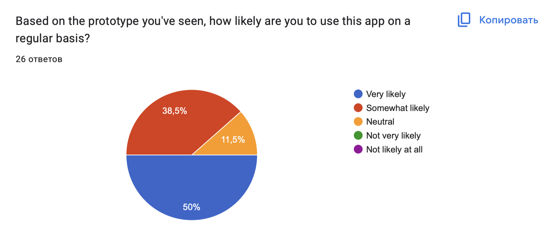
10 people were added to the existing 16 respondents, as a result of which the statistics changed slightly. The overall result is the following:
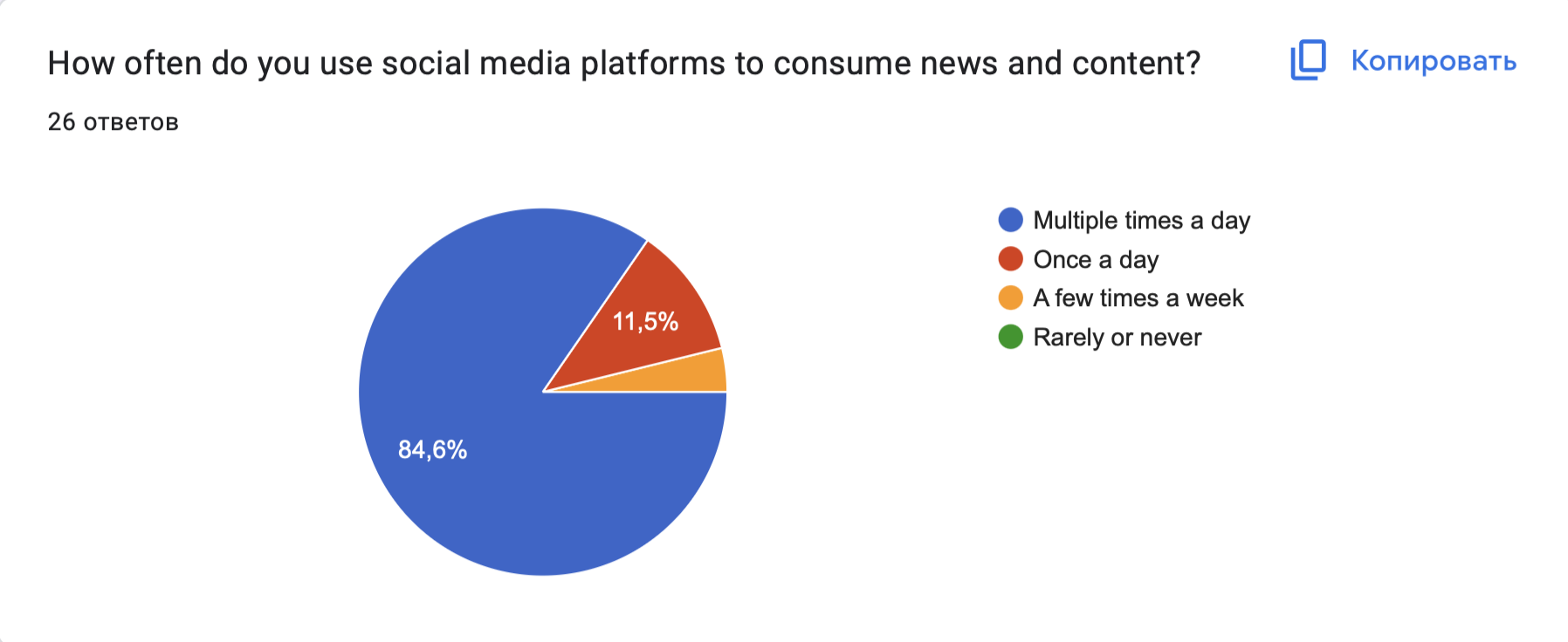
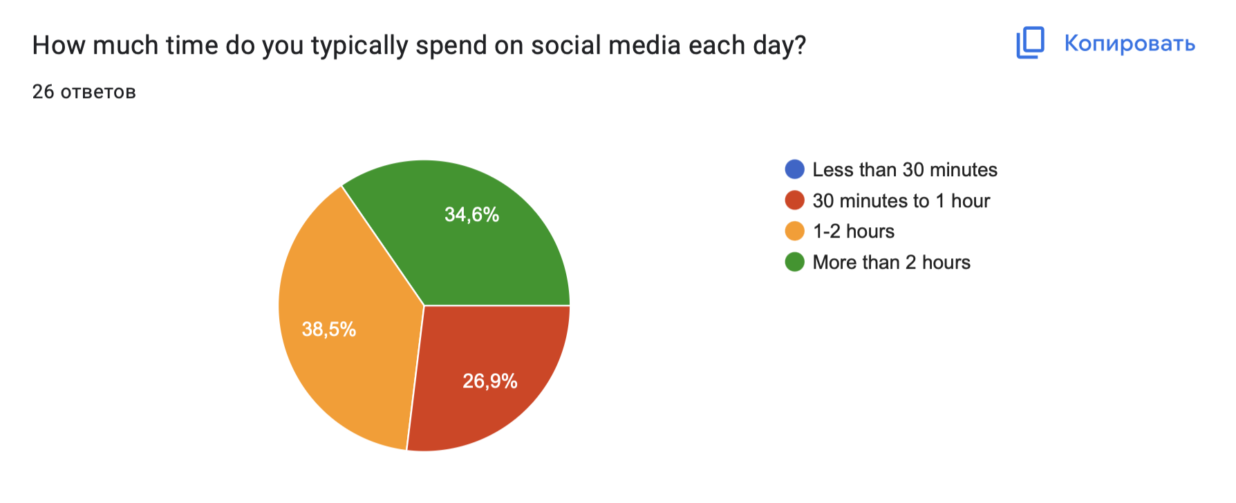
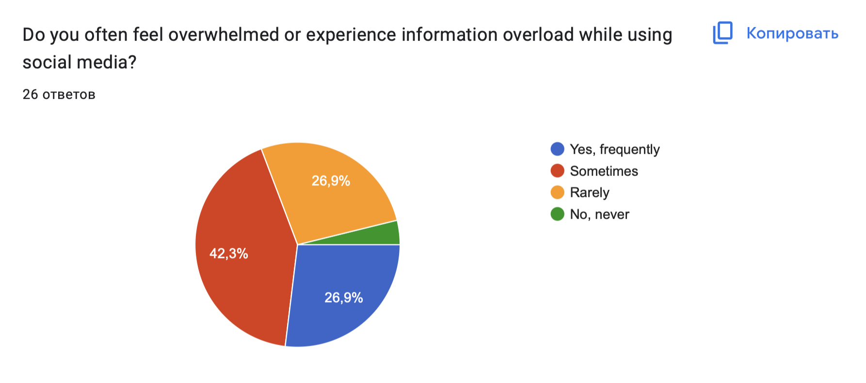
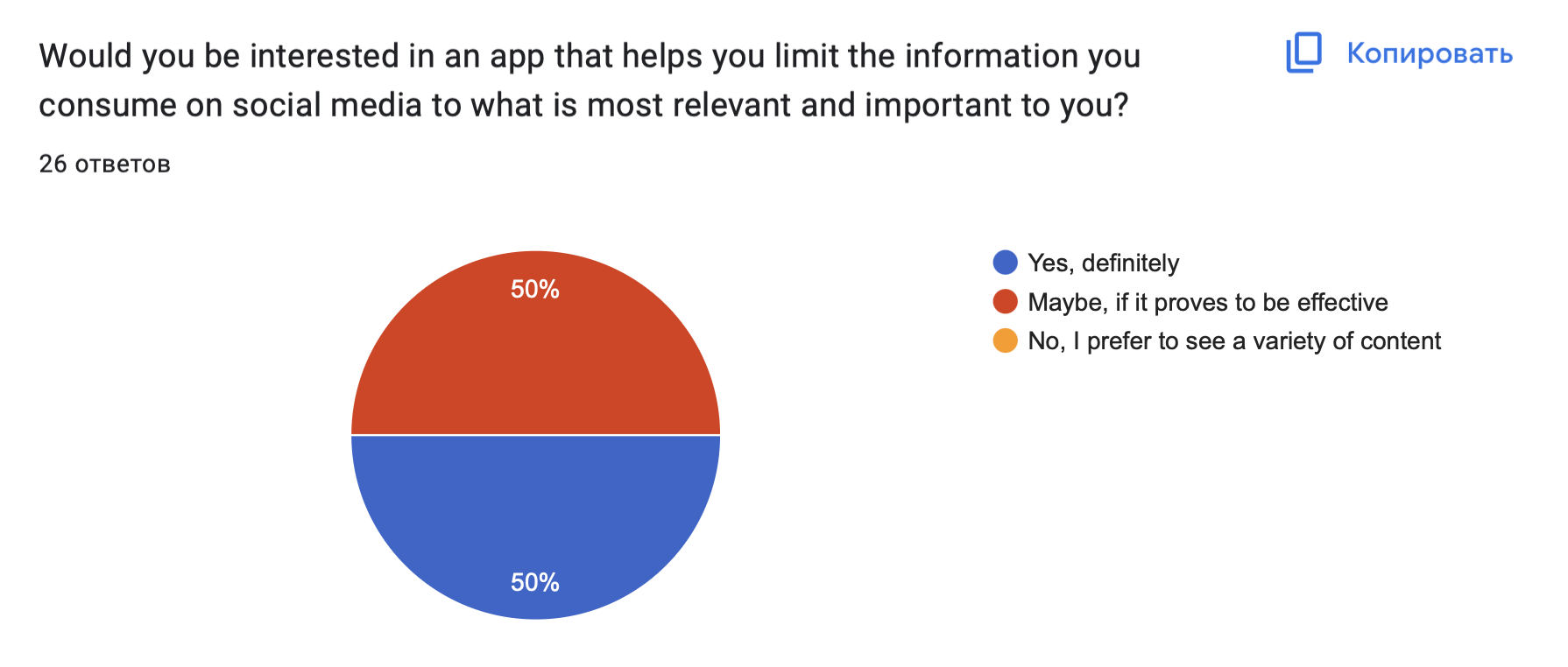
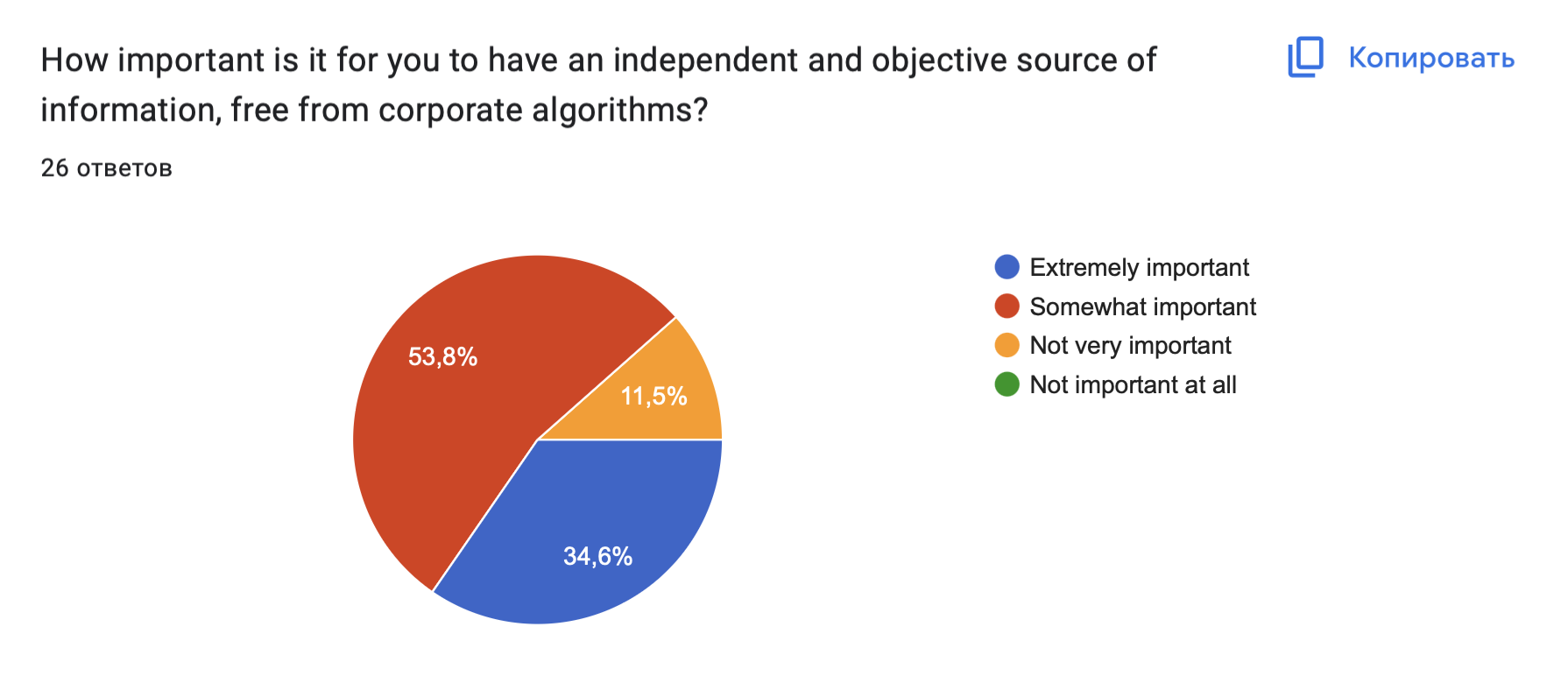
84.6% of respondents check their social networks for content consumption several times a day, 73.1% of them spend 1 hour or more, almost half experience information overload after and do not organize the content they consume. None of the respondents expressed disinterest in our project, on the contrary, 50% of the respondents expressed active interest. Most people would like to have an independent platform with our concept and have expressed their desire to try our product. The respondents gave their recommendations, which we took into account and described the most frequent ones below.
This further convinced us of the relevance of our project. We see how many people are interested in the proposed algorithms and our idea, and our motivation is also strengthened by the diversity of the respondents - different fields of activity, gender, age and experience.
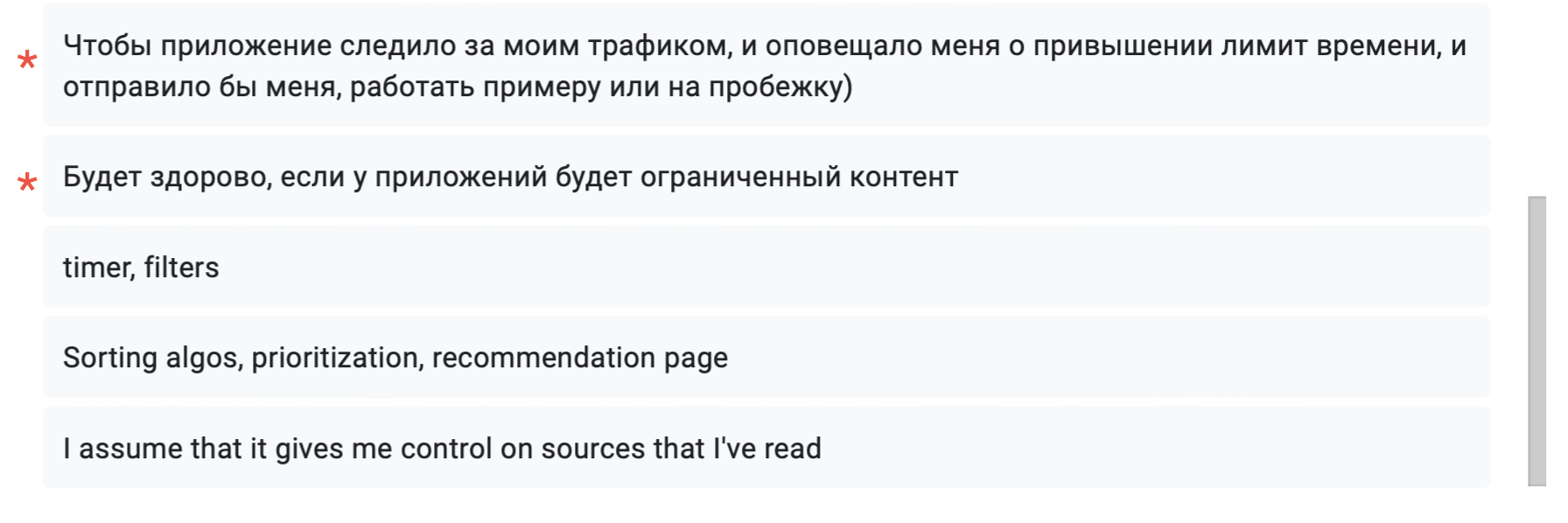
Below are updated diagrams, we will insert old comments together with the new ones from open questions.
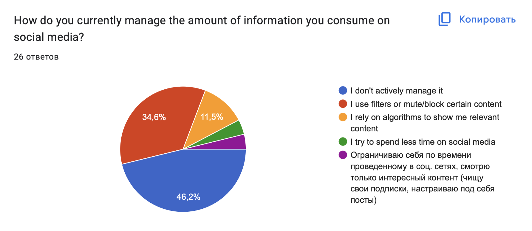

- big amount of social media and fast search of news
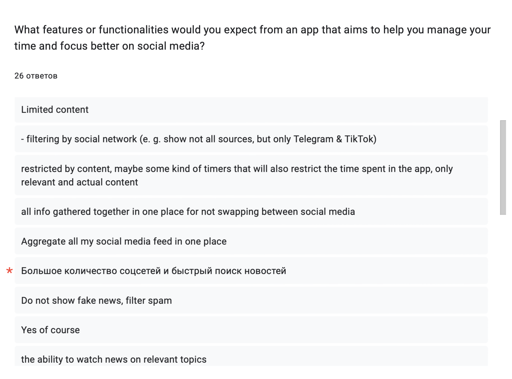
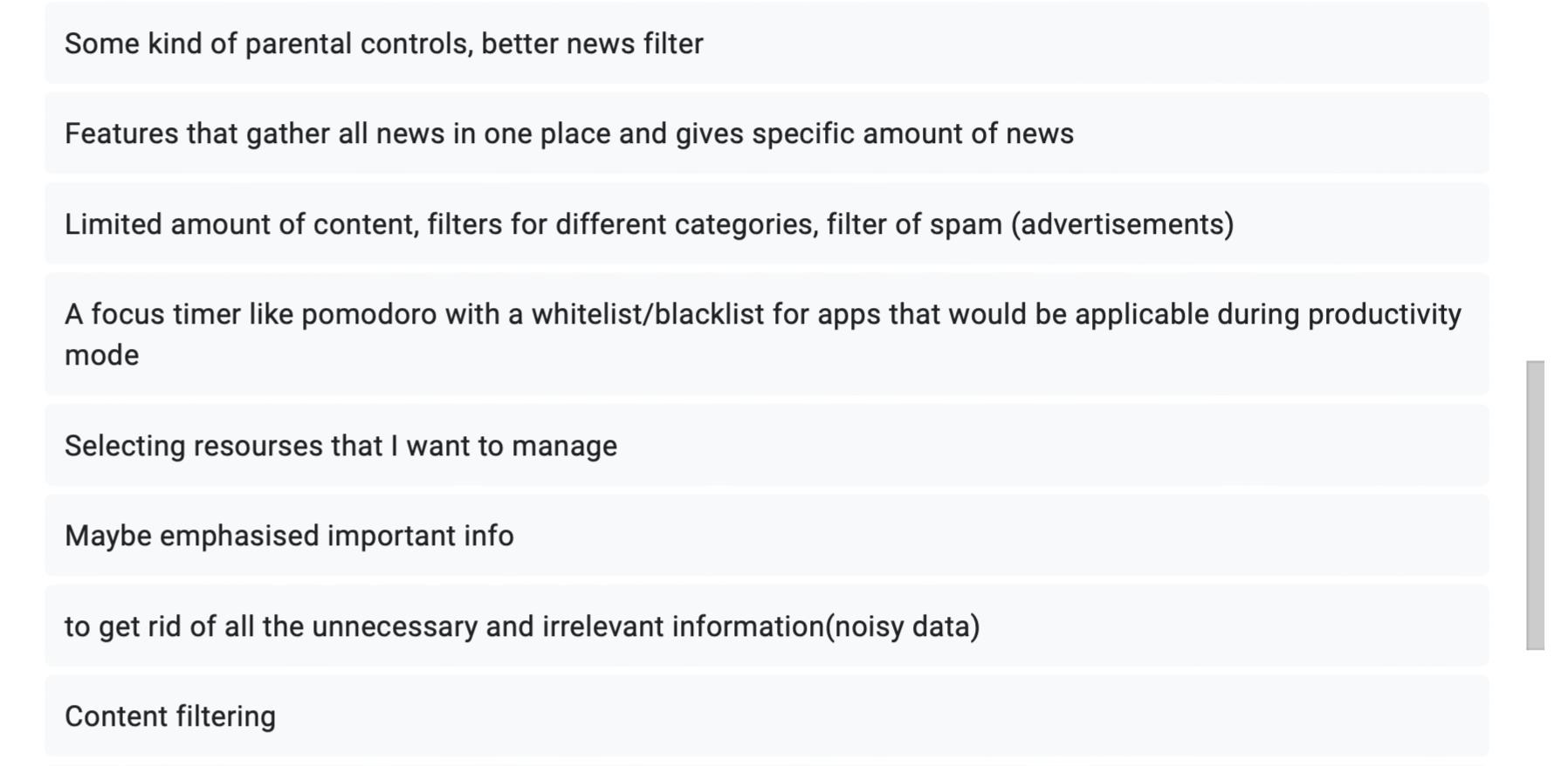
- make the app tracking my traffic, notify me about limit is over and sending me working or sporting for instance
- it would be great to have a limited content in such app
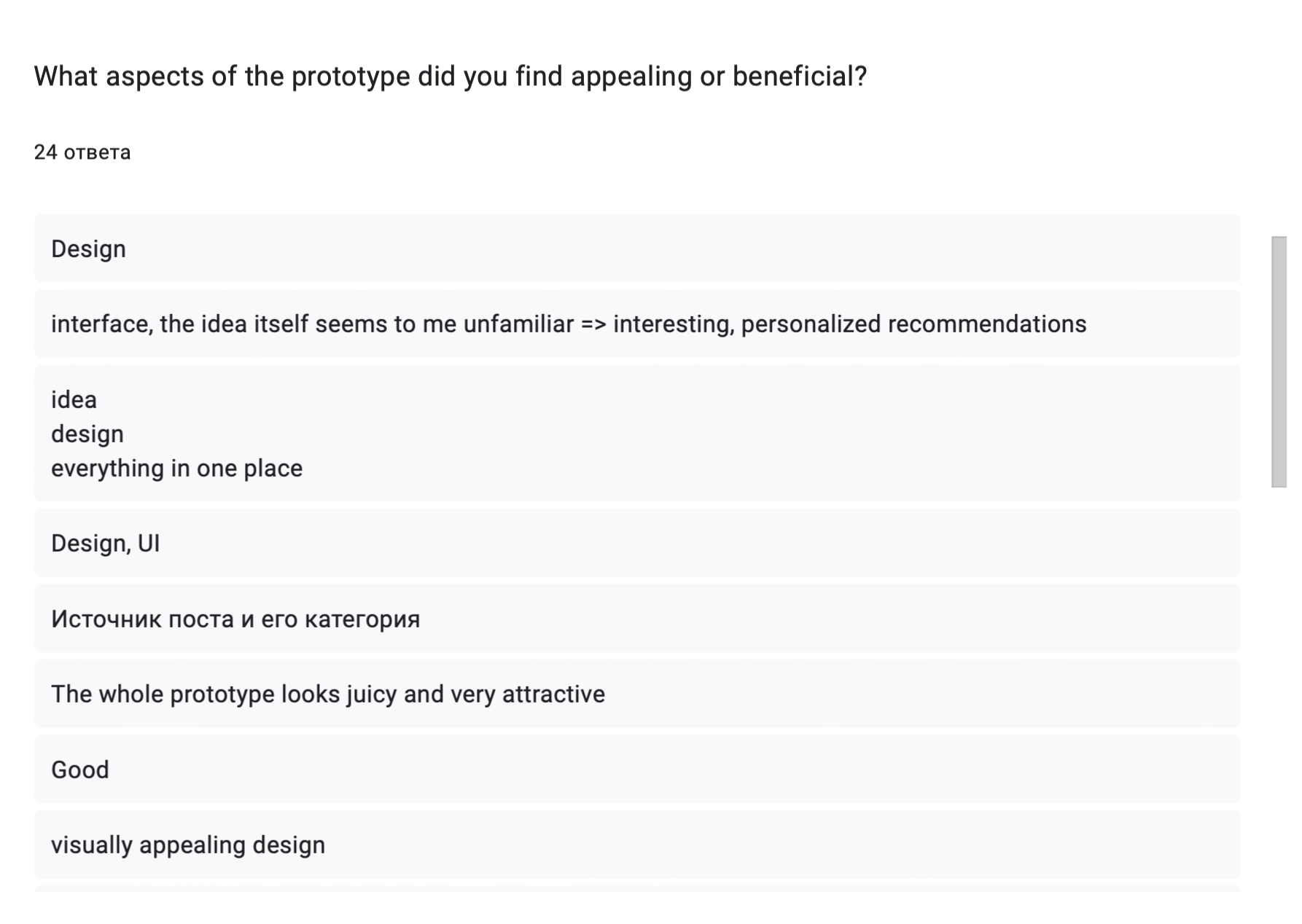
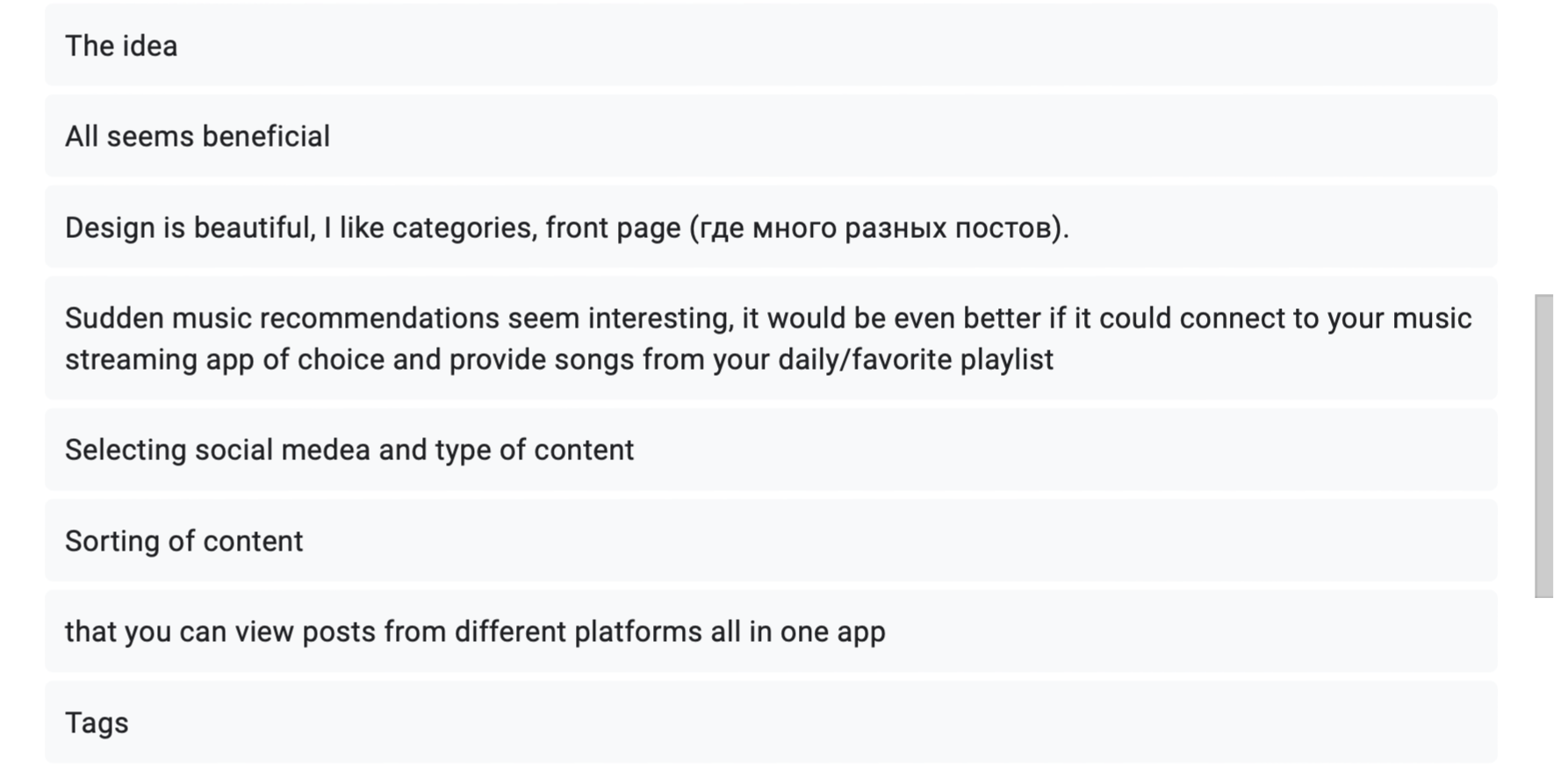

- transparency of the menu bar - maybe it should not be transparent?
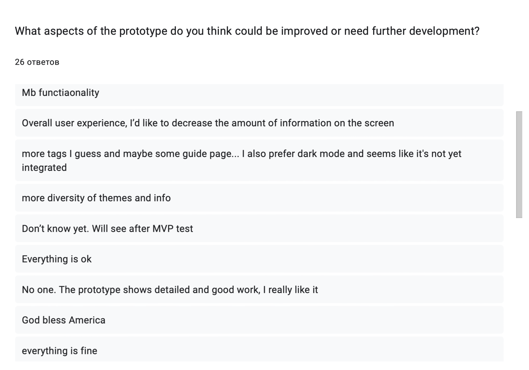
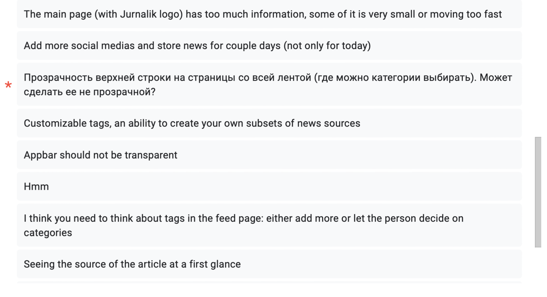


The collected feedback also made us think about making some changes. We have come to the following conclusions:
Transparency of the top panel #
Despite several suggestions to remove the transparency of the menu bar on the feed page, we consulted after the UI/UX designer’s comments and decided that the advantage of our choice was the lack of complete content overlap when scrolling, convenience and constant access to the panel (fixed on the screen and moving when scrolling ) and a slight contrast that creates volume and a more pleasing interface. Due to these arguments, we left the original version.
Amount of info on front page #
We will listen to this recommendation, there have been several similar reviews, it is likely that such a grid is too overloaded for the phone screen, and it will be difficult for some users to perceive the information. We will keep the concept of block news on the page, but increase their size, as user experience is more important than a fancy interface.
Guide page #
We have received a request to create a guide page, probably in the future with the introduction of more functionality, pages, tags and social networks, we will create something similar to a guide for orientation in our application, however now we do not have many pages and wide functionality, so everything is intuitive for the user. We would like to continue making the interface intuitive so that the user does not even have questions when using.
More tags/social networks/functionality #
Of course, we would like to immediately provide an extensive service, but we are still at the development stage and the final product for the course will be an MVP. In the future, it is planned to upgrade everything requested by those who have passed the survey, but for now we are focusing on developing a high-quality MVP with a small, but well-thought-out and working functionality.
News feed update period #
The proposal to extend the period of keeping news in the feed seems interesting to us. Most likely, we will provide the user with the opportunity to choose the period for updating the feed from the proposed period options. In the MVP phase, we will introduce a resource with a daily update.
Progress Report #
Almost all the tasks from the sprint for this week have been completed, here are the changes
What’s done: #
Make up CD
Set up PostgreSQL
Make up instructions for working with CI/CD
Add video to a carousel
Set up infrastructure
What’s planned: #
- Rewrite cateorization for specific user
- Add photo categorization to the ML module
- Make up the REST API for Frontend-Backend communication
- Expand the dataset to 500 elements
Feedback
Very good way of collecting feedback and documenting. I like howe you translated the Russian one. but I feel now you have a lot of feedback. how will you reflect to all of them?
Grade 5/5
Feedback by Moofiy