Week #4 #
External Feedback #
We have met with one of the UX/UI designers at Innopolis, Haytham, the teacher of UX/UI course for the summer trimester. We gained valuable feedback on our website and how to make it more user-friendly. Here is the summary of what he suggested:
- Try to see similar projects online and gather inspiration from them, his idea was that we are not designers and those projects are probably studied in the manner of the design based on the interaction of their users.
- Try to use templates from material design.
- Try to see what colors are related to our domain
- Add different pages
- Add more explanation to help in navigation
Testing #
This week, our focus was on enhancing the UI design and frontend of our application. To ensure the reliability and effectiveness of these improvements, we employed a comprehensive manual testing approach.
Initially, we tested the prototype internally by inviting students to use the app in a natural, everyday manner, carefully observing how the UI changes responded and checking for any issues or inconsistencies. We extended this testing to include other team members, encouraging them to use the UI and deliberately attempt actions that might break it. This helped us identify potential vulnerabilities and areas for improvement.
Furthermore, to gain an objective perspective, we invited individuals not involved in the development process to use the application. Their feedback provided valuable insights into how an outsider might interact with the UI and helped us uncover any issues that we, as developers, might have overlooked. This thorough testing process allowed us to refine our UI and ensure a smoother user experience. We gained info that there is an issue of understanding what to do when first seeing the website, so for that we have made modifications on our homepage to have a navigation bar.
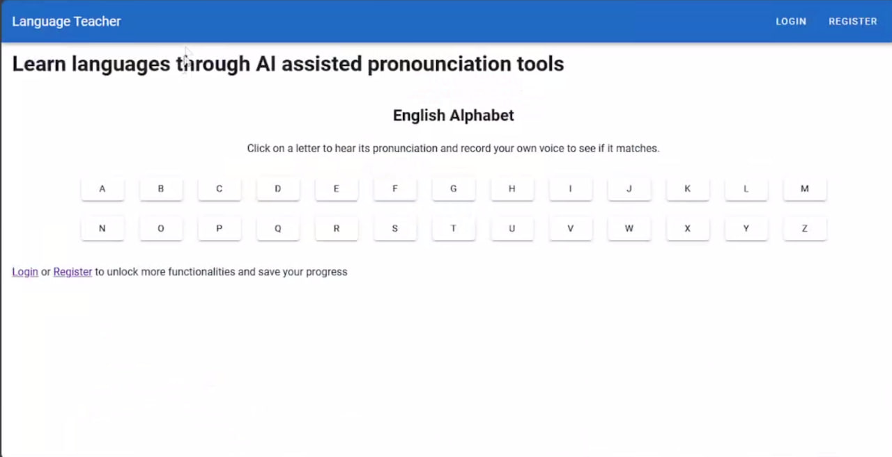
Here is our old homepage:

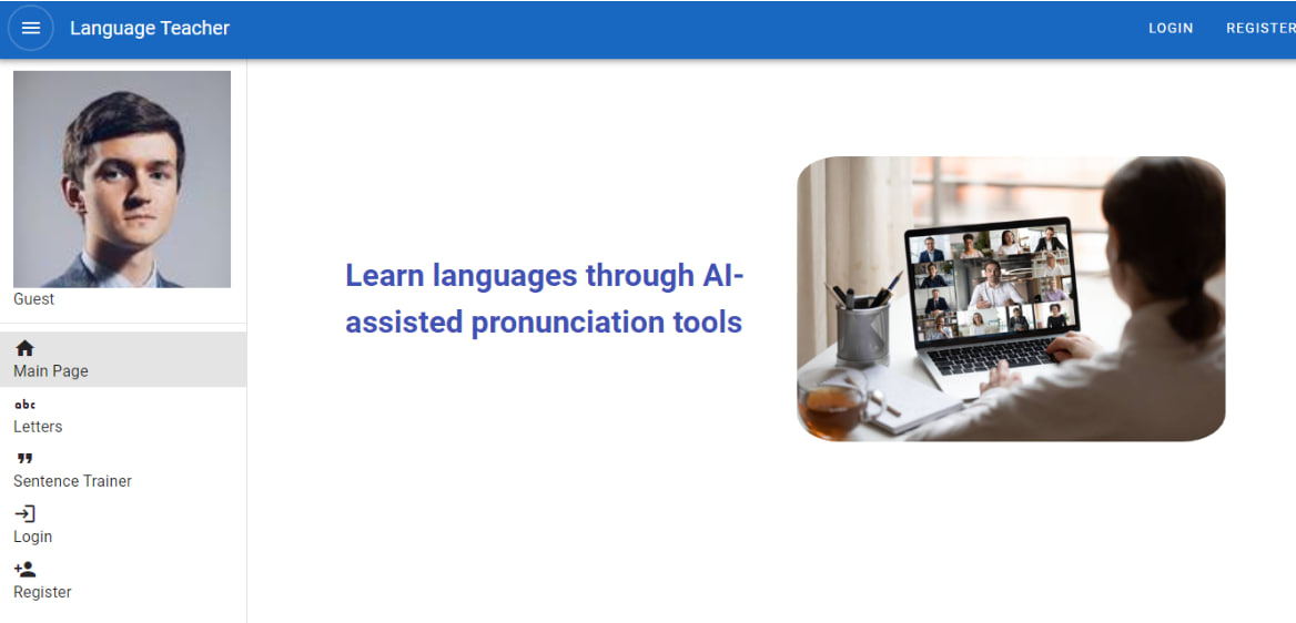
After modification, the new home page can be seen in the iteration section.
Iteration #
Based on feedback from random user tests, we have decided to implement a new design and modify certain functionalities that were not user-friendly. Additionally, we will enhance navigation, improve loading times, and integrate new features to better meet user needs. Our goal this week is to create a more intuitive and efficient user experience.
To summarize the iteration in the web development part:
We introduced a new navigation drawer.
Split the functionality into multiple pages.
Enhanced the design of the main landing page.
And here is the result:

Progress reports #
For this week we have achieved improvements in multiple domains:
In the phonemes recognition (audio to phonemes) part, we have found a model trained with 29 classes of phonemes for English and the performance is excellent.
We updated the website.
To improve our phonetic comparison, we initially used a simple sequential string comparison. However, this approach had significant limitations. When a user missed a part of a word, it incorrectly marked all subsequent words as mispronounced. To address this issue, we implemented the Longest Common Subsequence (LCS) algorithm using a top-down dynamic programming approach. This method enhances the accuracy of our phonetic comparison by maximizing the similarity score, thereby providing a more robust evaluation of pronunciation.
We evaluated the similarity between alphabetic character pronunciations using the context vectors generated by the transformer encoder in the wav2vec2 model. By taking the transformer encoder, applying softmax, and using cross entropy loss between the ground truth pronunciation encoded vector and the encoder’s output, we obtained a statistical evaluation of the speech quality.
We also found a model (onnx format) for phonemes recognition for English and tested it. This model has PER = 13% (Phoneme Error Rate) which is not bad.
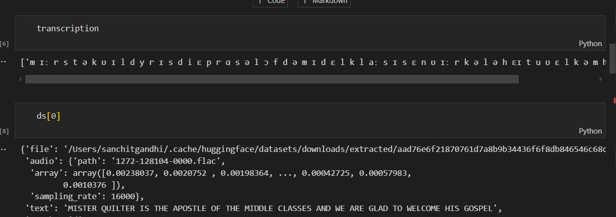
Some examples of progress with models:

This is the output of the phoneme model from the pronunciation of hello where:
Here is the phonemes model output (Dutch phonemes alphabet):
