Week #5 #
Feedback #
Sessions #
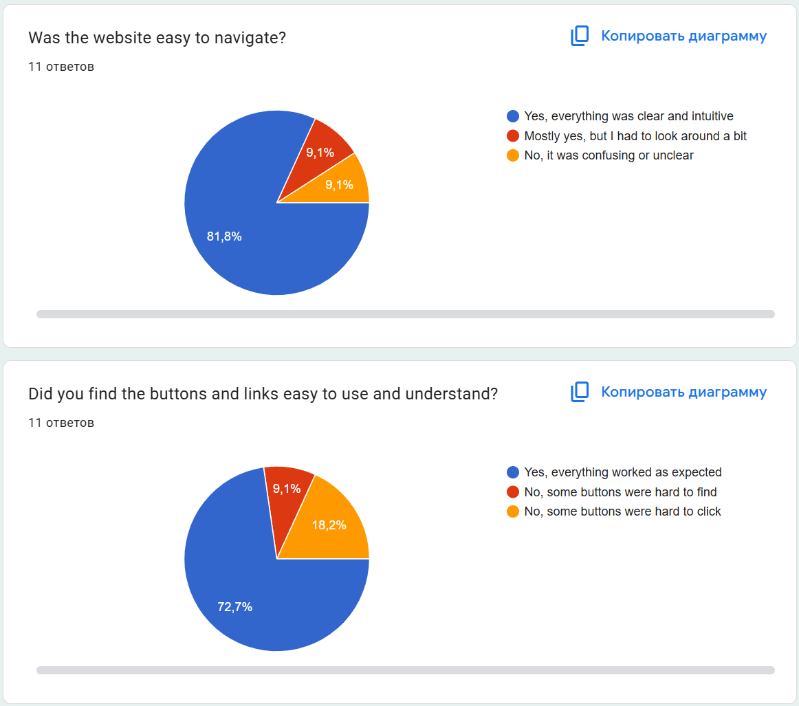
To simplify the usability testing process, we created a Google Form and distributed it among users of various age groups (ranging from 17 to 45 years old). To avoid bias and gather more objective insights, we intentionally did not ask whether participants were interested in books or reading beforehand.
In total, we received 11 responses.
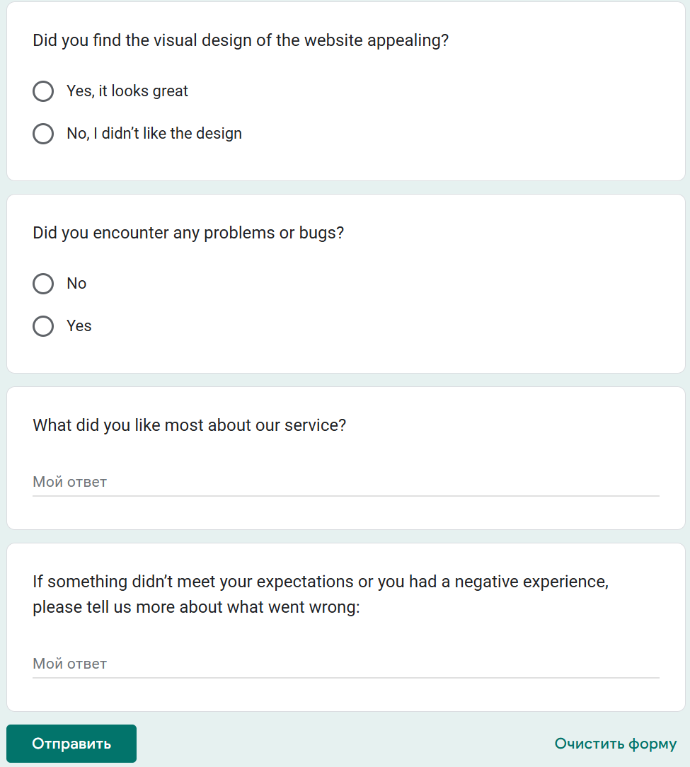
The structure of the form:
Collected Results: #
In addition, open-ended responses were compiled into a separate table for clarity and better visuability:
| What did you like most about our service? | If something didn’t meet your expectations or you had a negative experience, please tell us more about what went wrong: |
|---|---|
| I liked the idea of making a fairly minimalistic design with additional entartainment such as interaction with a 3D model: this attracts to the service and makes interested in staying on web page | In the mobile version everything looked a little worse than on the computer. The 3D model looks better on the computer and I don’t know how necessary a 3D model to be on a mobile phone |
| an unusual approach to implementing such a service | The button on the title page turned out to be not very convenient. On the first attempt I clicked not in the center and it did not work |
| Fast and works well. Great experience overall. | — |
| I really liked the idea of the platform | The design felt too dark. When browsing for books (especially fiction or children’s literature) I’d prefer something more light or pastel tones. The current theme feels a bit heavy |
| A website made “wow-effect” with its title page. It is not static and definitely different from ordinary and simple websites. | Everything was good. I will definetelly want to use final product |
| Looks good and quite intuitive | It looks like not all pages have enough animated gradient to make the picture look completed. But overall, it’s good |
| Dark colors and purple highlights | All good |
| I like the idea with tops and recommendations! It really solves the problem when you don’t know what to read) | I liked everything, I have no complaints about the service at all |
| The presence of a 3D model was quite unexpected | Maybe it’s just me as I’m not a fan of reading in general, but this service clearly won’t make me read in such quantity that this recommendation system would be needed at all. I can pick up the next book myself |
| Intuitive and minimalistic. All parts are in their place: books are recommended quickly, status and rating of the book are easy to set | all good |
| I like lists on the personal page, it helps not to lose any of the planned books and to structure everything in one place (and motivates not to stop reading what you have already started :3) | Everything meets my expectations (even more) |
Feedback Analysis #
Based on the feedback received, we identified several key insights that helped us prioritize improvements:
Identified Issues #
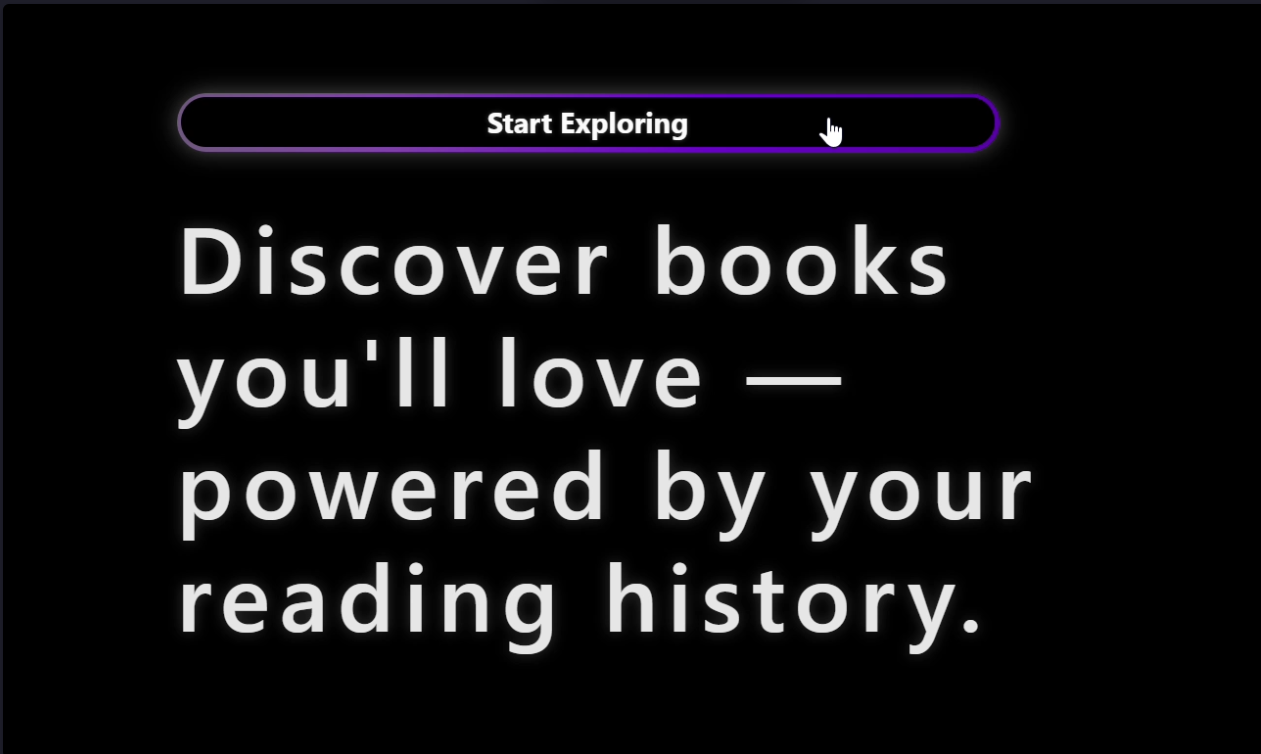
Homepage button usability
One participant reported that the main button on the title page was unresponsive when not clicked directly in the center. This suggests a need to adjust the clickable area. Since this issue concerns the title page (the first thing a user sees and the basis for their first impression and decision to stay) we have assigned it the highest priority.Mobile version quality
While the desktop experience was consistently rated highly, the mobile version was perceived as slightly inferior. One user noted that the 3D model looked significantly better on desktop. We decided to remove the model from the mobile version, but we did not put this task as the first priority, since it is still an additional feature and not the main functionality of the serviceColor scheme feedback
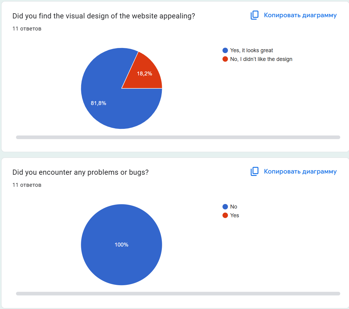
The dark theme with black as a dominant color and purple accents drew mixed reactions. Although a few participants found it too heavy, a majority of users responded positively, describing the design as modern and stylish. As a result, we decided to keep the current color scheme.
Positive Highlights #
3D model and interaction
The interactive 3D model stood out as a unique and memorable feature. Users appreciated this added layer of engagement and felt it enhanced the overall appeal of the servise.Gradient animation
The animated gradient effects on some elements were specifically mentioned as visually pleasing. However, one user pointed out that not all pages used this effect, suggesting the possibility of expanding gradient use to additional components to create a more cohesive visual experience.Personalization and structure
Many users valued features like personalized reading lists, book statuses, and recommendations. These tools were seen as helpful for motivation and organizing reading habits effectively.
Outlier Feedback #
- The most critical feedback came from a user who openly stated they were not interested in reading in general. This participant found the design unappealing and questioned the need for recommendation features.
However, since this user is outside our target audience, we consider their input non-representative and chose not to revise the design based on this response.
Backend and Stability #
- Importantly, no respondents reported any bugs or technical issues. This indicates that the backend systems and database operations are functioning reliably, providing a stable foundation.
Iteration & Refinement #
Implemented features based on feedback #
- Homepage button usability problem was fixed: Link to PR
Regarding expanding gradient use to additional components, we reworked the status selection menu and made it more prominent by replacing the plain white dropdown menu with an accented purple segmented control. Link to PR
3D model on mobile: we are aware of the issue but decided to address it next week, as it is primarily an additional entertainment feature and not core functionality.
Performance & Stability #
To evaluate the performance of our application, we measured the execution time of the Airflow DAGs. On small datasets, the DAGs complete execution within 4–5 seconds.
The performance remains stable even with a moderate increase in data volume. Additionally, based on user feedback collected through a survey, users are totally satisfied with the system’s speed.
Therefore, we concluded that this part of the project does not require further optimization at this stage.
Documentation #
Documentation
Our project includes the following type of documentation:
README.md
The main entry point for anyone accessing the project. It provides an overview of the system and includes a dedicated Deployment Guide section.The Deployment Guide explains how to deploy the application using Docker or Kubernetes. It covers the setup of authentication services (Keycloak and LDAP), environment configuration, and orchestration commands. This ensures that the system can be reliably deployed in various environments.
Bonus #
VDS Server #
We deployed our service (Recommendation System) to a VDS, accessible at: https://capstone2.cybertoad.ru
A custom domain was set up and HTTPS enabled.
Weekly commitments #
Individual contribution of each participant #
Denis Troegubov:
- Fixed materialised views and add filtering. Link to PR
- Completed user page. Link to PR
- Get data about books from db. Link to PR
- Write all classes for accessing databases and make book_to_origin_dag idempotent Link to PR
Timur Garifullin:
- Implemented pagination, logout functionality, and card-based rendering in the profile section. Made frontend adjustments. Link to PR, Link to PR
- Implemented rating setting, returned notifications on status/rating save, reordered rating stars, and cleaned up typing in stats DB scripts. Link to PR
Grigorii Belyaev:
- Improved input field readability and style on login and registration page Link to PR
Peter Zavadskii:
- Fix in switching from search to book page. Link to PR
- Implemented damerau levenshtein length algorithm for book searching. Link to PR, Link to PR
- Added request to db and added new endpoint for searching. Link to PR
Adelina Karavaeva:
- Report
- Optimized the clickable area of the main button for better usability. Link to PR
- Hid the “Recommendations” filter from users who are not logged in. Link to PR
- Added a search results page. Link to PR
- Added visual display of the search input field. Link to PR
- Created and integrated a custom 404 error page. Link to PR
- Designed elements (numbers) for the 404 page animation. Link to Figma
Plan for Next Week #
Next week, we plan to finalize the project, prepare all deliverables, and create a compelling presentation.
We will also have the task of optimizing the 3D model and adding avatars for users.
Confirmation of the code’s operability #
We confirm that the code in the main branch:
- In working condition.