Report 5. Feedback, Iteration & Polishing #
UrTraining #
Authors: Ildar Rakiev, Makar Dyachenko, Salavat Faizullin, Egor Chernobrovkin, Alexandra Starikova, Ilona Dziurava, Anisya Kochetkova
The application can be viewed here: UrTraining
Date: July 2025
Team Members #
| Team Member | Telegram | Email Address | Role |
|---|---|---|---|
| Ildar Rakiev (Lead) | @mescudiway | i.rakiev@innopolis.university | Backend / Frontend |
| Makar Dyachenko | @index099 | m.dyachenko@innopolis.university | Frontend / Design |
| Salavat Faizullin | @FSA_2005 | s.faizullin@innopolis.university | Backend |
| Egor Chernobrovkin | @lolyhop | e.chernobrovkin@innopolis.university | ML |
| Alexandra Starikova | @lexandrinnn_t | a.nasibullina@innopolis.university | ML |
| Ilona Dziurava | @a_b_r_i_c_o_s | il.dziurava@innopolis.university | PM |
| Anisya Kochetkova | @anis1305 | a.kochetkova@innopolis.university | Testing |
Feedback #
To collect feedback, we needed people from both the trainer and trainee sides. We explained the main purpose and features of our application to them and asked them to go through a specific user flow without any help, while saying their thoughts out loud.
At the same time, we carefully watched for signs of frustration or confusion — such as pauses, hesitation, or visible irritation — and wrote down those moments. After they finished, we asked follow-up questions about those specific points to understand what caused the problem.
We also asked Claude to go through the user flow and share feedback. This helped us gather even more insights and compare different perspectives.
User 1 feedback (trainee case) #
Ruslan, 22 years old, works as frontend developer, train every day at home and is interested in personalized trainings
First, there are serious problems with the responsive layout. On smaller screens, content overlaps or doesn’t scale properly. Scrolling either doesn’t work or works incorrectly (for example, in the workout card). This is especially noticeable in the questionnaire, where buttons are cut off and some text is unreadable. Оn Mac, the interface often breaks.
The user flow is also confusing. The client pointed out that on the main page, it’s unclear what happens if you click “Register” without choosing a role (“I’m a trainer” / “I’m a client”). After registering, there are more issues: the system doesn’t guide the user forward, and logging in again is required. This feels annoying and unnecessary. The registration and login flow seems disjointed — the user ends up on a screen with some buttons and a greeting like “hello, example,” but it’s unclear what to do next or why the name is “example” even though registration appeared successful.
Also, it’s not possible to view the password during registration, which is inconvenient. The “I agree with terms” checkbox doesn’t work as a requirement — registration goes through even without checking it. After logging in, there’s no way to log out — the logout feature is missing.
Right now, the login session expires every 30 minutes, which is not user-friendly. The client suggests adding a refresh token that lasts for 30 days, and making the access token expire sooner (a tip from a frontend developer).
It was also noted that there’s no data validation in the questionnaire, either on the frontend or backend.
Summary: #
The main issues are missing validation, a confusing user flow, and poor responsive design.
User 2 feedback (trainer case) #
Alexandr, kickboxing trainer
The website looks nice, and all the labels on the landing page are good too. But before registration, it’s not clear what the platform actually offers — there are no visual examples of workouts or features. Everything else in the user flow is generally fine (the updated version was shown).
There are some issues with creating a workout. Specifically, the fields related to workout details are hard to fill out manually. It would be better if there were preset options to choose from (like in the profile form), otherwise it takes a long time to complete (we spent about 20 minutes thinking and filling it out).
A slider is needed for the list of days — it was impossible to scroll without a mouse. Also, when looking at the trainer info inside a program, it would be helpful to click and see all workouts by that trainer to get a full picture of their work.
He liked the workout format — trainers really like tables because they’re clear and easy to understand, showing what to do and how much. When I mentioned we plan to add a database of exercises with detailed info, he liked the idea and said it would be great if trainers could create and share their own exercise libraries.
Summary: #
Overall, he liked the idea, but warned that without proper mobile support, it won’t work well. We should definitely focus on that too.
User 3 feedback (trainer case) #
Anton V., Trainer, Former PE Teacher
Mobile adaptation is very important because not everyone has a laptop with them, but almost everyone has a phone — especially at the gym.
He said it’s obvious we need a Russian version if we want to turn this from a project concept into a real system that people can use.
About creating workouts: he suggested adding the ability to upload photos or videos for each exercise, so users can see what the exercise looks like when they click on it. I also shared the idea of building a separate database with detailed information about each exercise — he liked it too. We’ll work on that later (not for the final presentation).
Adapting to different screen sizes is important — on his laptop, some things didn’t display properly, especially the options in the profile form and metadata fields. This needs fixing.
He also mentioned it would be useful to allow editing workouts and seeing rough statistics about how often workouts are viewed. He recommended making the workout plan format more visual and less plain.
Summary: #
Overall, he liked the project idea but said there should be strict moderation of uploaded content to make sure nothing harmful makes it into the database.
Claude feedback (trainee case) #
Hi, I’m Maxim. I’m 26, work in an office, and I’ve been wanting to get into fitness for a while now. I’m pretty much a beginner when it comes to working out, so I was looking for some online fitness courses I could do at home. Egor told me about this URTRAINING platform that supposedly uses AI to personalize workouts, so I thought I’d give it a try on July 7th, 2025.
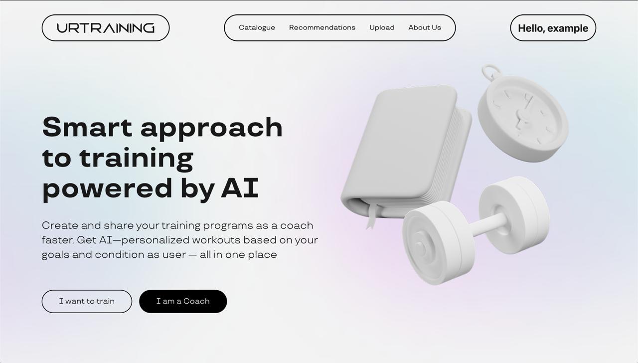
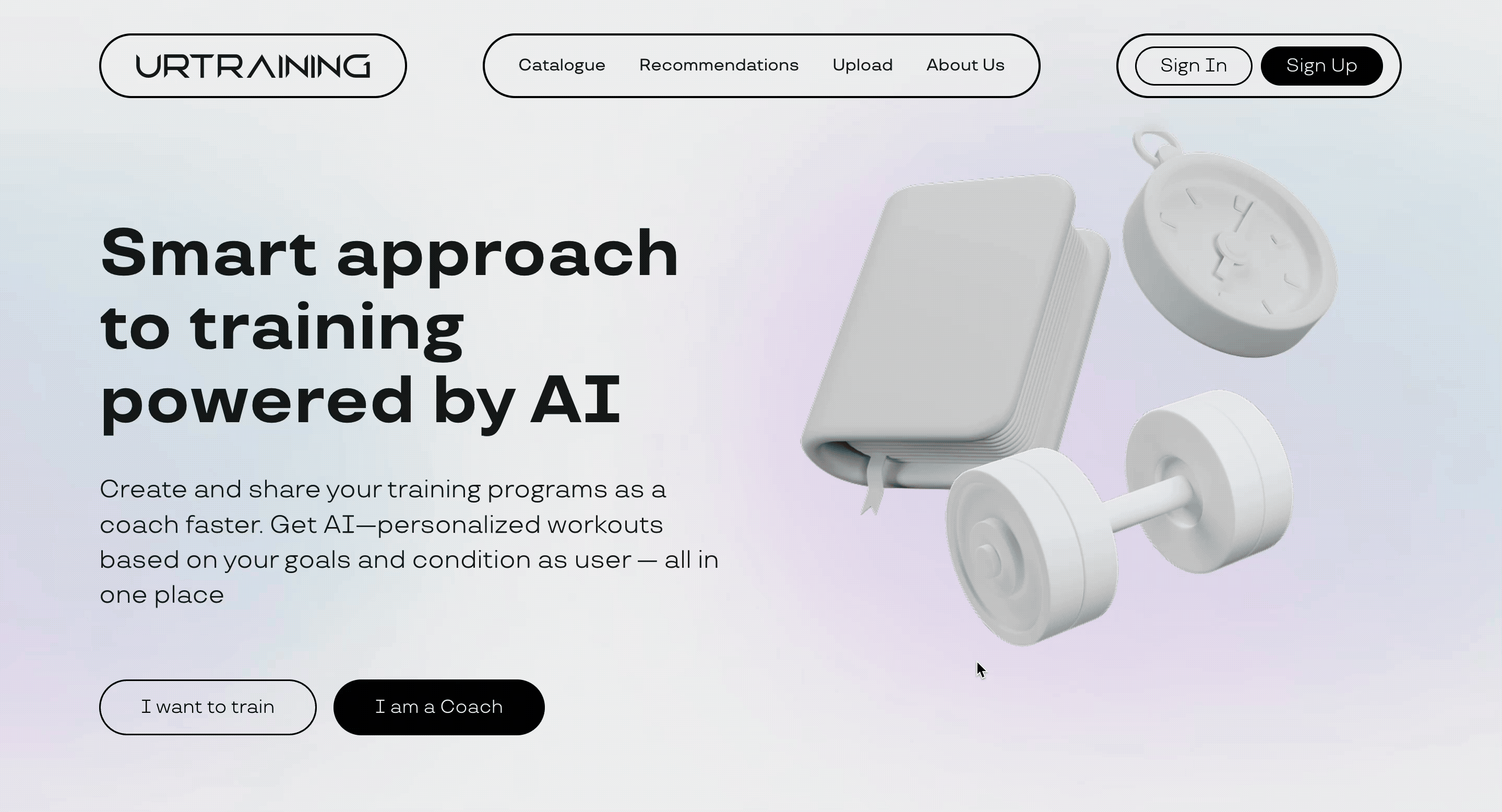
Landing Page #
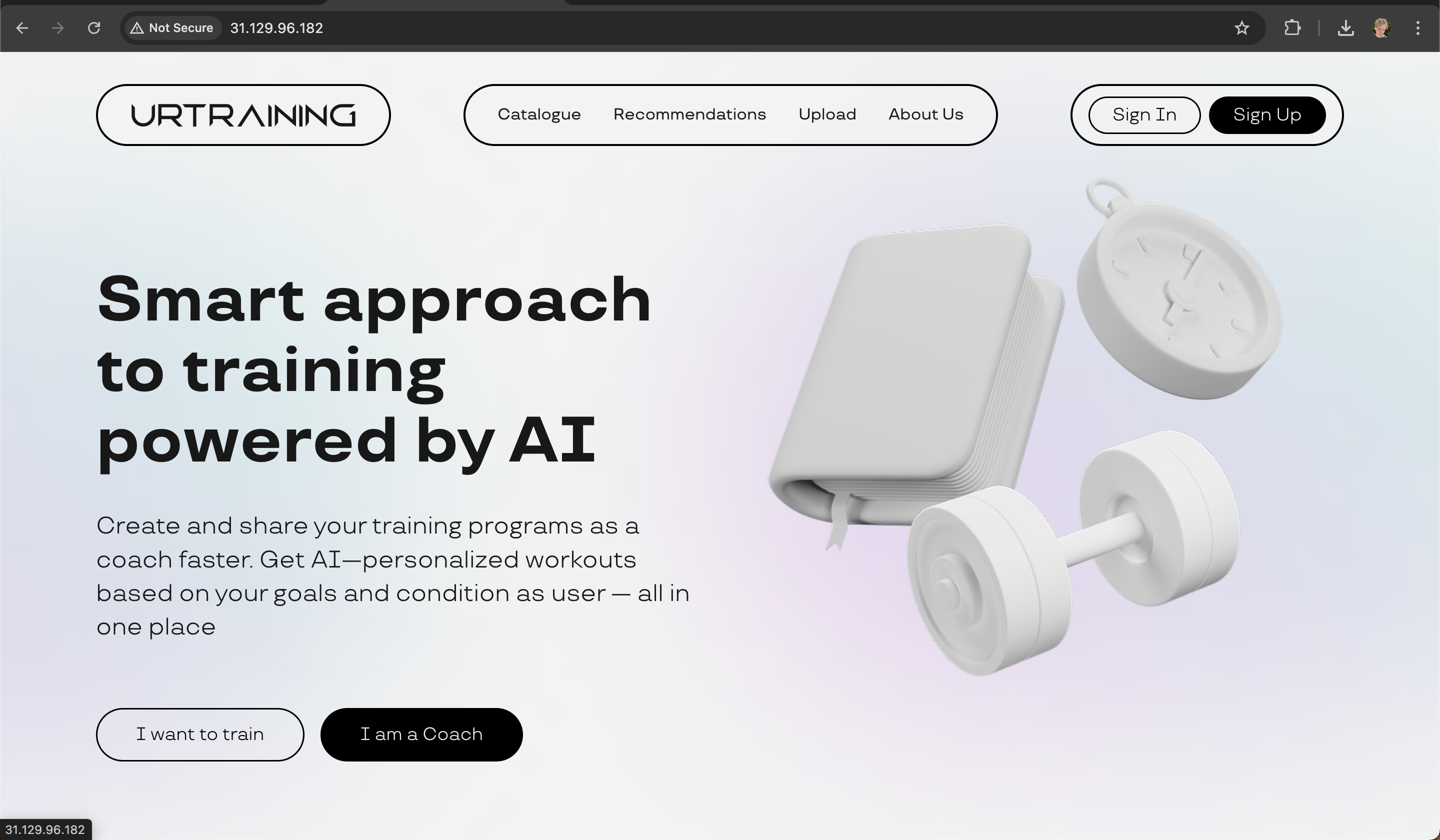
When I first landed on the site, I have to admit, it looked pretty good! The design was clean with these cool 3D elements, and I immediately understood that this was about AI-powered, personalized fitness. The choice between “I want to train” and “I am a Coach” was obvious - I clicked on “I want to train” right away.
But here’s the thing - I couldn’t see any actual courses or examples of what I’d be getting. There was no pricing information either, which made me a bit hesitant. I mean, is this free? Do I need to pay? And there were no reviews, so I had no idea if other people actually liked using this platform. Still, the personalization promise sounded good, so I kept going.
Pre-Registration Page #
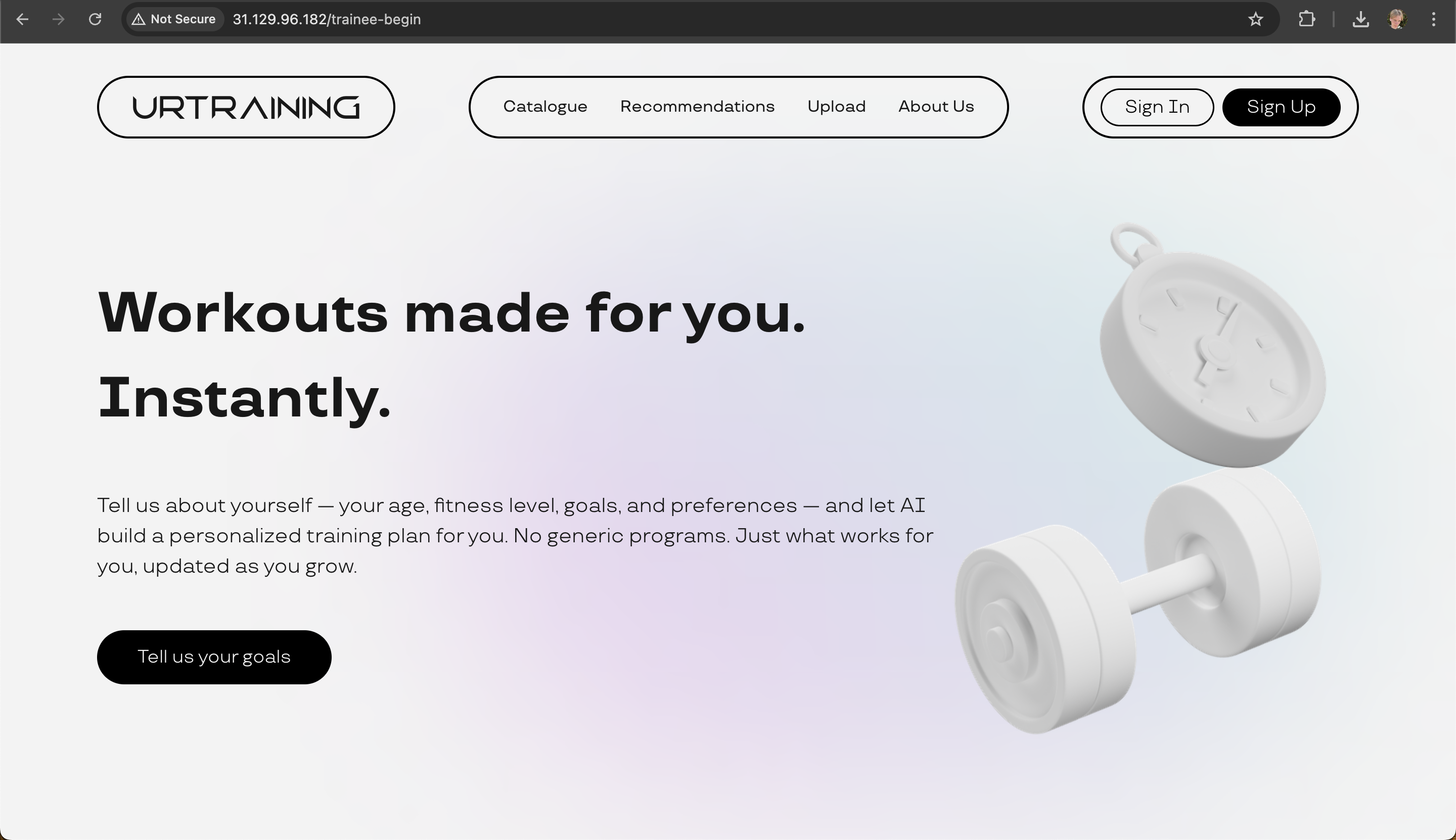
After clicking through, I got to this page that explained how they’d personalize everything for me. The “No generic programs” promise really caught my attention - that’s exactly what I was looking for! They explained that I’d fill out some questionnaire about my goals and get a customized plan.
What bothered me though was that I still couldn’t peek at any courses without signing up. I’m the type of person who likes to browse before committing to anything, you know? Also, they didn’t mention how long this questionnaire would take - 5 minutes? 30 minutes? I had no idea what I was signing up for.
Registration Page #
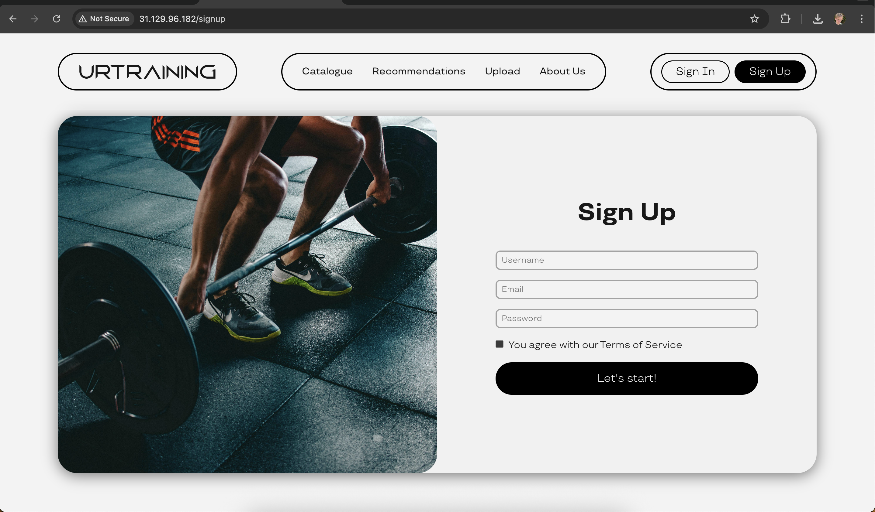
So here’s where things got frustrating. I was expecting to fill out that questionnaire about my fitness goals, but instead, I got hit with a registration form! That wasn’t what they promised on the previous page.
But the worst part? There was no way to close this modal and go back. No X button, no “close” option, nothing. I felt completely trapped. I either had to register or leave the site entirely. That’s not a great feeling when you’re just trying to explore a platform.
Explore other pages #
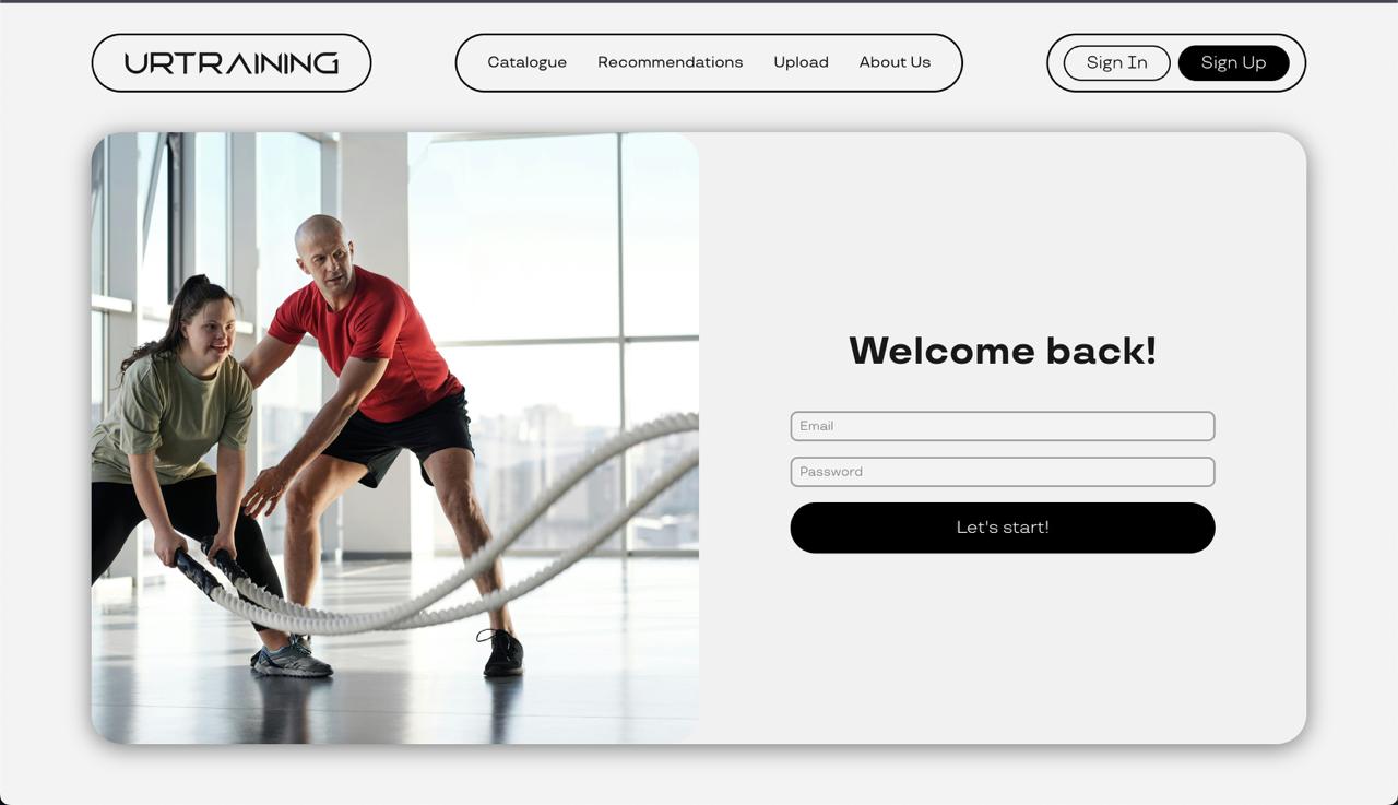
At some point, I tried to check out their course catalog without registering first. Bad idea! A modal popped up saying “Welcome back!” (which was weird since I’d never been there before) asking me to log in. And guess what? No close button on that one either!
I was starting to get really annoyed. Why can’t I just browse some courses to see if this platform is worth my time?
After Registration #
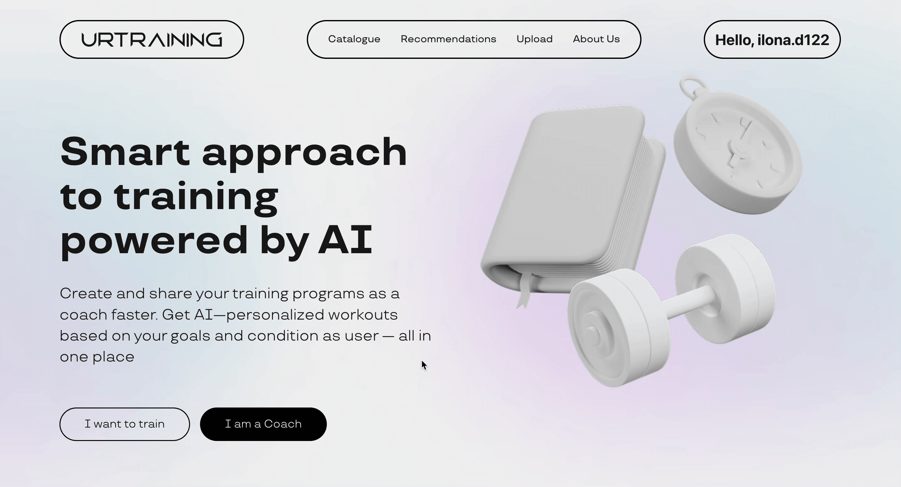
Eventually, I gave in and registered. I was hoping for some kind of onboarding flow or that promised questionnaire, but nope - I just got dumped back on the main page with “Hello, example” in the top right corner.
I was completely lost. What am I supposed to do now? Where’s that personalization questionnaire? How do I get my custom workout plan? The platform just left me hanging.
Courses Page #
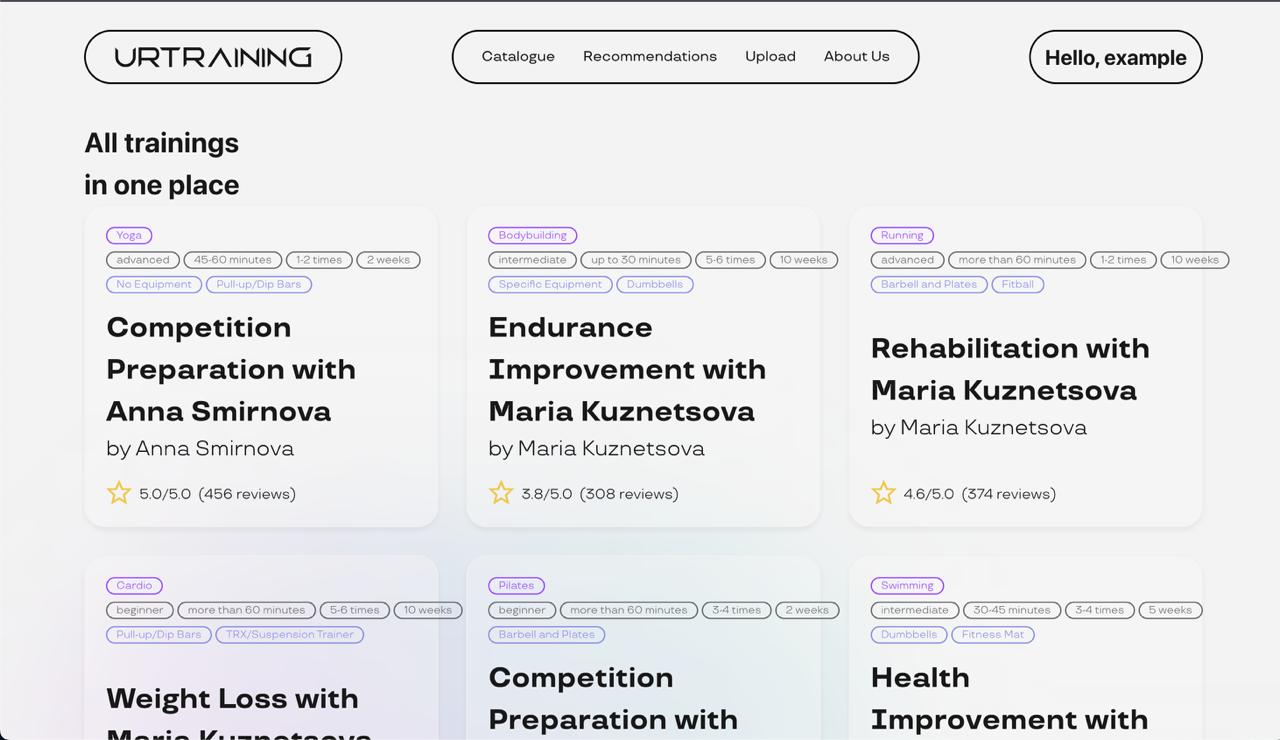
I managed to find the course catalog, and I have to say, the variety looked pretty good. There was yoga, bodybuilding, running, cardio - lots of options. I could see ratings and review counts, which was helpful, and the tags showing difficulty levels and equipment needs were useful.
But I noticed that some tags were broken - like the “10 weeks” tag that didn’t fit properly on the page. It made the interface look messy and unprofessional.
Also, I still couldn’t find any pricing information. Are these courses free? Do I need to pay per course? A monthly subscription? I had no clue.
Checking Out a Specific Course #
I clicked on this “Weight Loss with Maria Kuznetsova” course to see what I’d actually get. The detail page was quite impressive! It showed the full structure with all the exercises, reps, sets, and duration. The exercise descriptions were detailed and helpful.
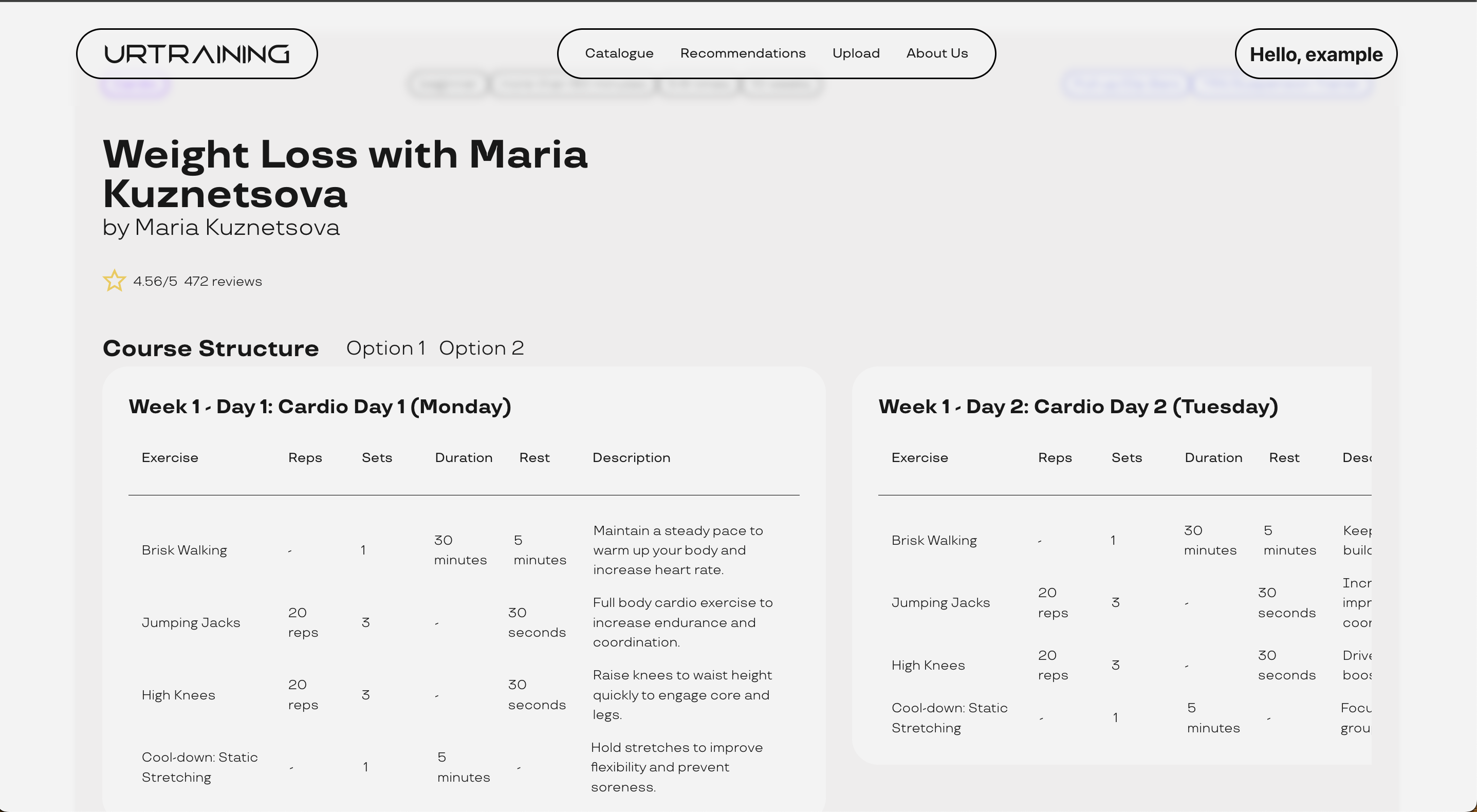
But here’s the kicker - there was no way to actually start the course! No “Start Course” button, no “Buy Now” button, no “Enroll” button - nothing. It was like looking at a menu at a restaurant but not being able to order anything. What’s the point of showing me all these great courses if I can’t actually do them?
There were also some visual issues - the right column with Day 2 information was cut off, which made me think the site wasn’t properly designed for my screen size.
One more thing that really bothered me - the scrolling through course days was absolutely terrible on my MacBook. The interface felt clunky and unresponsive when trying to navigate between different workout days. It made browsing the course content a frustrating experience.
Recommendations Page #
Remember how they promised AI-powered personalization? Well, I was curious to see what the platform would recommend for me, so I clicked on the “Recommendations” section.
The page went completely white. Nothing loaded. I waited, refreshed, tried again - nothing. It turns out there’s a 500 server error happening. The main feature they advertised - personalized recommendations - is completely broken!
P.S. Egor pointed out that we actually skipped the questionnaire form entirely, which explains why the recommendations page isn’t working - the AI system has no data to generate personalized suggestions from. This is really bad.
Summary #
Look, I really wanted to like this platform. The concept sounds great - AI-powered, personalized fitness programs for beginners like me. But the execution is just… not there yet.
Getting Trapped: Those modal windows without close buttons are a nightmare. I felt forced into registration and couldn’t explore freely.
Can’t Actually Use the Courses: What’s the point of showing me all these great courses if there’s no way to start them? It’s like window shopping at a store where nothing is for sale.
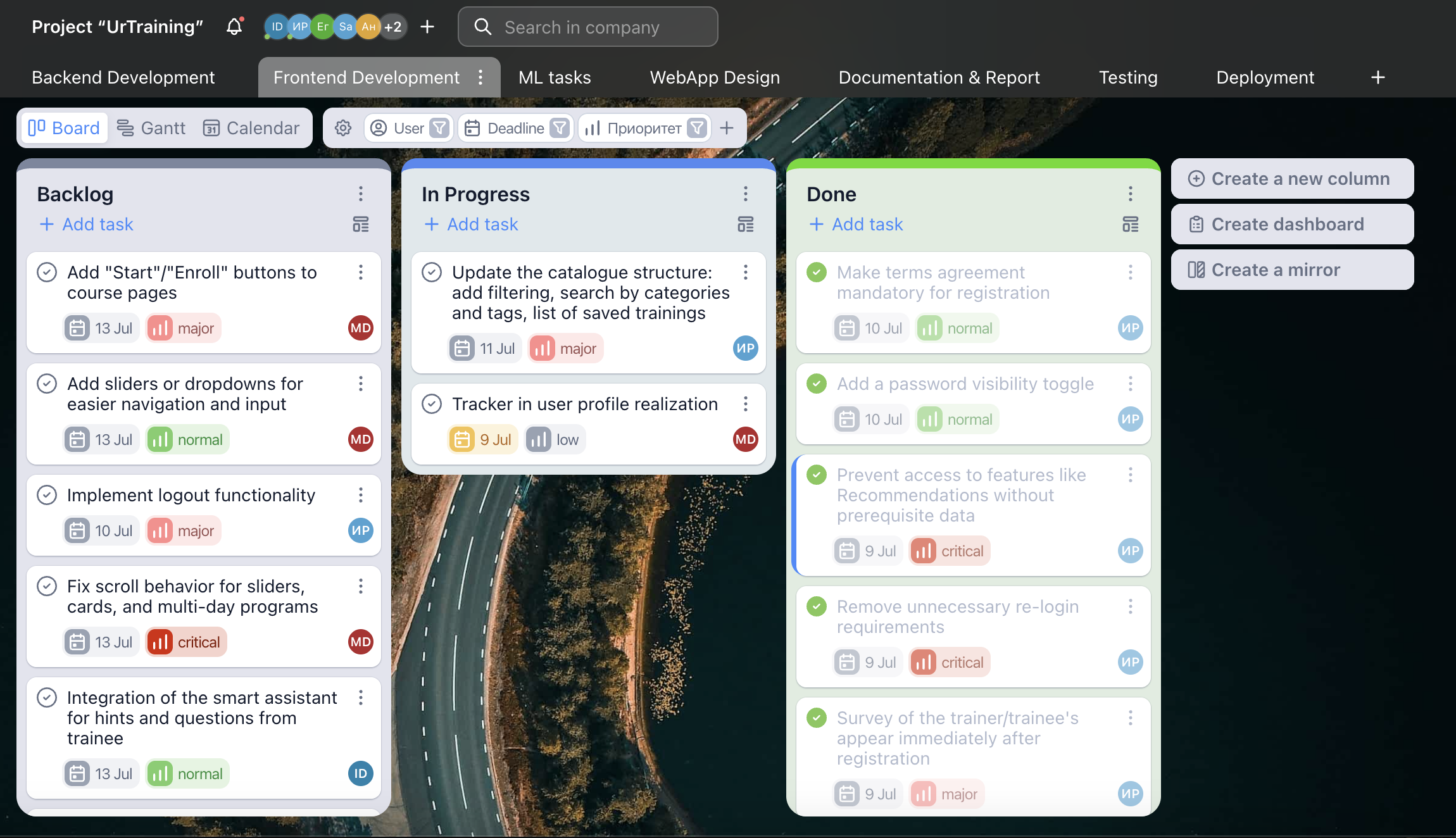
Analysis #
1. Poor Mobile and Responsive Design #
- Problems:
- Layout breaks on small screens and Mac devices.
- Scroll does not work in components like workout cards.
- Forms and fields are cut off or unreadable.
- Tasks:
- Ensure full responsive layout support across all devices.
- Fix scroll behavior for sliders, cards, and multi-day programs.
- Make sure all fields are fully visible and functional on different screen sizes.
2. Confusing User Flow & Modals #
- Problems:
- No “close” button.
- After registration, users are redirected without onboarding or explanation.
- Registration and login flows are disjointed.
- Tasks:
- Add close buttons to all modals.
- Introduce a clear onboarding experience after registration.
- Remove unnecessary re-login requirements.
3. Broken or Missing Authentication Features #
- Problems:
- No “show password” toggle.
- Terms and conditions checkbox is not enforced.
- No logout option.
- Tasks:
- Add a password visibility toggle.
- Make terms agreement mandatory for registration.
- Implement logout functionality.
4. Missing Validation and Error Handling #
- Problems:
- Questionnaire lacks validation on frontend and backend.
- Recommendations page shows a server error if no data is available.
- Tasks:
- Implement form validation both on frontend and backend.
- Prevent access to features like Recommendations without prerequisite data.
- Add user-friendly error handling and fallback messages.
5. Unclear Offering Before Registration #
- Problems:
- No preview of course content or features before signing up.
- No visible pricing information or user reviews.
- Tasks:
- Allow users to browse courses and features before registering.
- Add sample content, testimonials, and pricing models.
- Indicate questionnaire time estimate (e.g., “Takes 3–5 mins”).
6. Workout Creation UX Issues #
- Problems:
- Manual entry of workout details is time-consuming.
- No input assistance (dropdowns, presets).
- Navigation without a mouse is difficult.
- Tasks:
- Provide preset tags and templates for workout creation.
- Add sliders or dropdowns for easier navigation and input.
7. Missing Engagement and Moderation Features #
- Problems:
- Users cannot enroll/start courses.
- No usage statistics or insights for trainers.
- No moderation for uploaded content.
- Tasks:
- Add “Start”/“Enroll” buttons to course pages.
- Show view counts and performance data for workouts.
Backlog for improvements #
Implemented features #
1. Remove unnecessary re-login requirements #
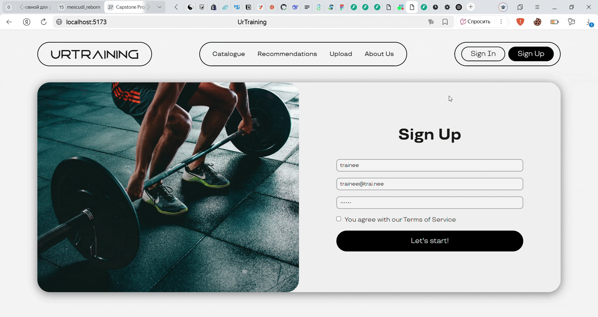
We’ve eliminated redundant login requirements to enhance user convenience. Now, after signing in once, you can access the application without repeated authentication.
Additionally, the interface now displays a personalized greeting (“Hello, [Your Username]”) at the bottom of the screen, not “Hello, example” as before.
2. Improve user flow by removing unnecessary welcome page before survey #
We got rid of that extra welcome page users used to see before the survey - it was just slowing people down. Now you’ll go straight to the survey explanation page where all the important info lives.
3. Prevent access to features like Recommendations without prerequisite data in user-friendly way #
If you attempt to access Recommendations without completing the required survey, you’ll now see a helpful error page explaining the missing prerequisites. From this page, you can easily navigate directly to the survey to complete the necessary steps.
Replaced the technical 500 Error with a user-friendly interface, ensuring a smoother experience.
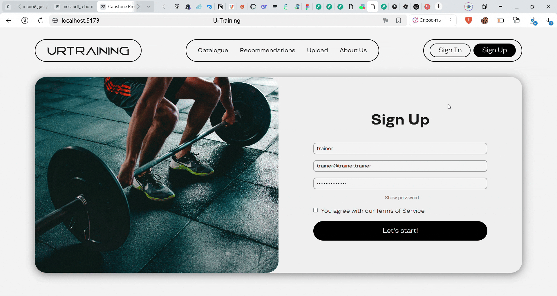
4. Make terms agreement mandatory for registration #
We’ve updated our sign-up process - you’ll now need to agree to our terms before creating an account. This helps ensure all users are on the same page about our service policies.
5. Add a password visibility toggle #
Now the user can see the password if needed. Now you can double-check your password as you type.
Deploy #
Fronted part is deployed HERE.
Backend part is deployed HERE.
ML part is deployed HERE.
Testing #
Vectordb tests #
We added a test suite for the vector database backend using pytest and FastAPI’s TestClient. External services like the embedding model (HuggingFaceEmbedder) and vector index (FAISS) were mocked to isolate logic and ensure tests run reliably without network or hardware dependencies.
The tests include:
- API endpoint tests:
/create_index,/add_documents,/search_index,/get_embedding,/health, and more. - Validation tests: Using Pydantic to ensure proper request structures and default values.
- Negative tests: Invalid dimension, unsupported metrics, malformed JSON, and access to non-existent indexes.
- Edge cases: Deletion of non-existent indexes, empty responses, and login/session behavior.
- OpenAPI tests: Verifying that API documentation is accessible and properly configured.
Commit: Vectordb tests
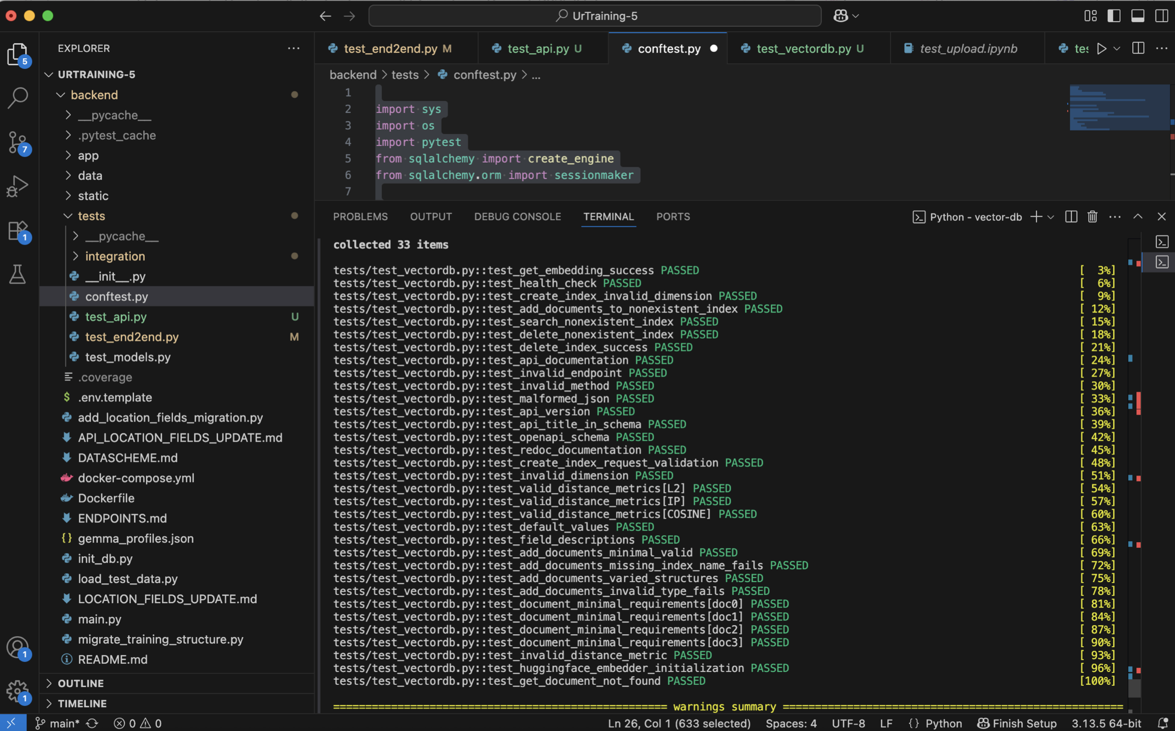
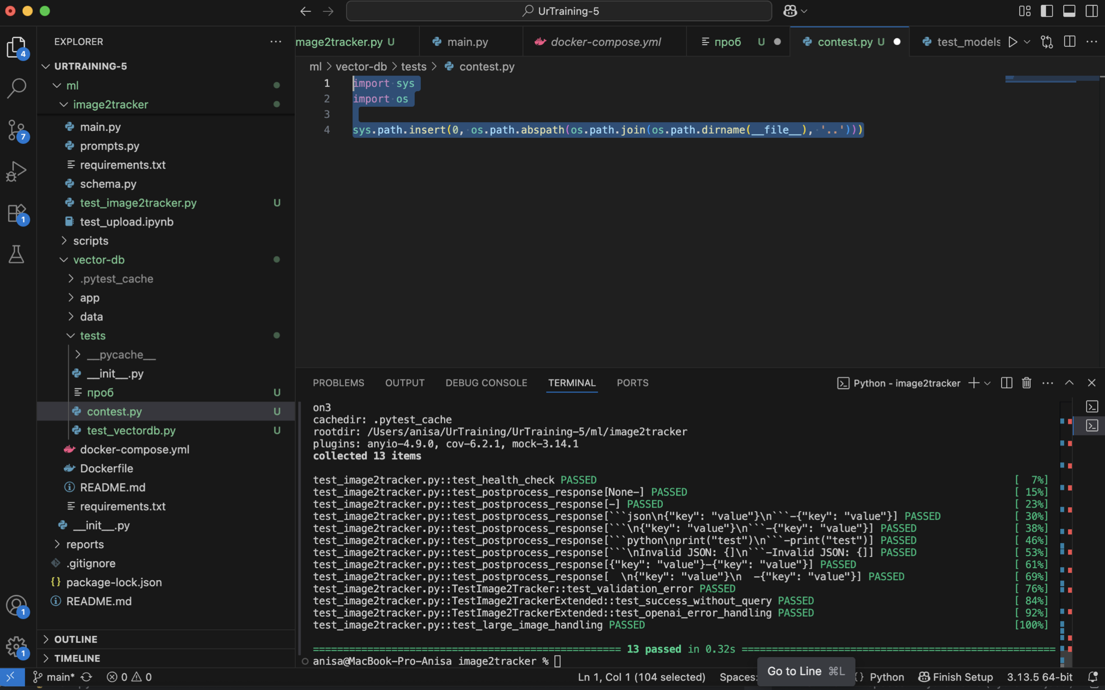
Image2tracker tests #
We created a test suite for the /image2tracker endpoint, which processes base64 images and returns task plans using OpenAI’s API.
Key test areas:
- Health check: Ensures the root
/endpoint returns expected status and metadata. - Postprocessing logic:
postprocess_response()is tested with various formats (e.g., Markdown blocks, malformed content, plain JSON) to clean and extract meaningful output. - OpenAI integration: Mocked responses simulate typical and erroneous outputs from OpenAI’s API.
- Edge case handling:
- Submitting empty or malformed requests.
- Handling of large base64-encoded images (up to 10MB).
- Graceful degradation in case of OpenAI errors.
Commit: Image2tracker tests
Weekly Progress Report #
| Team Member (Role) | Contribution Description | Contribution Link |
|---|---|---|
| Ildar Rakiev (Backend/Frontend Lead) | Developed and integrated the training plan uploading system, implemented backend support for training plan creation, enabled auto-login after registration, added immediate display of user survey post-registration. | Training plan uploading system, Backend integration for training plan creation, Auto-login after registration, Survey of the trainer/trainee’s case appears immediately after registration |
| Makar Dyachenko (Frontend/Design) | Improved error handling and visual feedback on the frontend, enhanced UI styles for multiple components including user profile, improved token validation logic, and made functional updates to improve user experience. | Error display, Style improvements, User Profile Style, Token Checking Improvements, Functional Improvements |
| Salavat Faizullin (Backend) | Improved backend documentation, implemented progress tracking functionality, and added validations for email and trainer-related fields to ensure data consistency and user input correctness. | Improve documentation, Progress tracking, Email field validation, Trainer fields validation |
| Egor Chernobrovkin (ML) | Created visualizations for the image2tracker module and implemented Claude-based automatic feedback generation for improving user engagement with machine learning components. | image2tracker visualisation, Claude feedback generation, Add CORS policy for image2tracker |
| Alexandra Starikova (ML) | Developed backend endpoints for dynamic modification of training courses, supporting real-time course personalization and adaptability. | Endpoints for the course modifications |
| Ilona Dziurava (PM) | Prepared the project report, organized and facilitated a team meeting, coordinated task distribution, managed the product backlog, collected and analyzed user feedback, improved the README, and structured the team workflow to ensure efficient collaboration. | README update, This report :) |
| Anisya Kochetkova (Testing) | Created and maintained automated tests for key ML components including vector database operations and image2tracker logic to ensure stability and reliability of the ML pipeline. | Vectordb tests, Image2tracker tests |
Challenges & Solutions #
The hardest challenge this week was finding suitable users to collect meaningful feedback from, especially trainers. Since our application includes a dedicated flow for trainers, it was essential to validate that part of the user experience. However, identifying and reaching out to trainers who were willing to test the product proved difficult.
We refined our messaging to better explain the value of the product and reduce the barrier to participation. Although the number of trainer responses was limited, the feedback we did receive was valuable and helped guide improvements to the trainer flow.
Conclusions & Next Steps #
During Week 5, we focused on gathering real user feedback, analyzing it, and iterating on our MVP to improve usability and stability. Usability testing sessions were conducted with external testers, allowing us to uncover both critical bugs and areas for UX enhancement. Feedback was collected via informal interviews.
The team analyzed the responses and prioritized improvements in the backlog. Several UI/UX refinements were implemented, including removing unnecessary re-login requirements, user-friendly error handling.
Our documentation was updated to reflect the current product state, including a refined README and improvements to our API documentation. Additionally, initial improvements to the ML model were made based on validation results, and we began exploring new evaluation metrics to better assess its fairness and accuracy.
Next Steps for Week 5 #
Final Project Polish
- Complete final bug fixes and polish any rough UI/UX edges.
- Conduct thorough end-to-end testing to ensure application stability.
Code Freeze
- Set and enforce a code freeze deadline to ensure focus on presentation and critical fixes only.
Documentation Finalization
- Finalize the README with project overview, feature list, tech stack, setup instructions, and deployment link.
- Ensure all API documentation is complete and up to date.
- Update design documentation to match the final product.
Presentation Preparation
- Create and polish slides.
- Assign speaking roles and begin rehearsals.
- Prepare and test the live demo environment for reliability during the final presentation.
Week 6 will be dedicated to delivering a polished and complete project, ensuring readiness for final presentation.
We confirm that the code in the main branch:
In working condition. Run via docker-compose.